This is the Friday website review edition of the Daily Golden Nugget. The purpose of this website review is to look over a random retail jeweler's website to evaluate if they are correctly applying what we know about the internet, online marketing, and business. We'll see if improvements can be made, or if we can learn something from them.
Each week I start by searching Google in a random town for a typical phrase that a consumer would search for. This week the search phrase is "jewelers logan ut," and here's the search results I saw:

It looks like S.E. Needham Jewelers is our review candidate for this week. They have the top spot in the Google Local 3-pack and 4 of the 10 organic listings. Their website is:
http://www.seneedham.com/
This is what it looked like when I first visited:

(click to enlarge)
My initial reaction was "Oh, this is old and ugly looking." As you can see, the design has a ridged box look. I wanted to get a quick feel for the site to see how old it was and quickly clicked through the links in the header. The second link, the EDUCATION link, goes to the dead page http://www.seneedham.com/News.
"Great, yet another poor website and bad review" is what I was now thinking. But it turns out that my initial reaction was completely wrong. S.E. Needham Jewelers is keeping their website updated and using a lot of online services to help people find them.
As I dug deeper into the site, I started to realize that the look of the site and that incorrect broken link in the header were two big issues that might be unjustly turning away first time visitors. The broken header link to http://www.seneedham.com/News should be linked to http://www.seneedham.com/education.
Product Catalog
Their online catalog has an older look to it, but it also functions well. Many of the items have more than 1 image along with descriptions and specifications in table format. Here's a screen grab of one product:
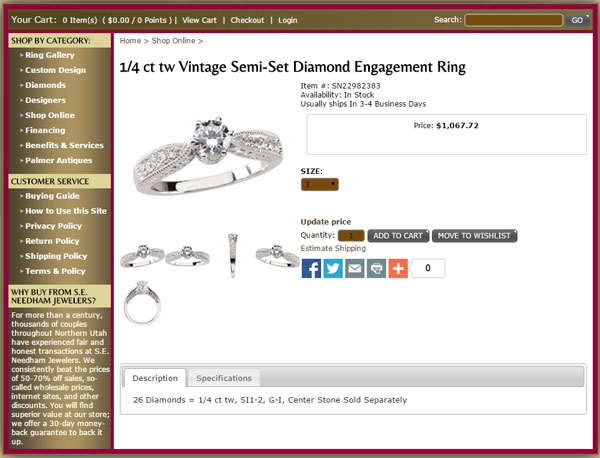
Their catalog would be much improved if the photos were larger. Right now even the zoom in features isn't much larger than the photos you see on the screen by default.
Their checkout process allows to pay either through PayPal or with a credit card using an americommerce.com payment page. According to the Internet Archive this version of the S.E. Needham Jewelers is the 4th incantation of their site since it was launched in 2001. What we see today was set up in mid 2013. Since then, Americommerce became SparkPay.com by CapitalOne. S.E. Needham Jewelers should consider having their website redesigned using one of their newer jewelry website templates.
Poorly Operational Pages
There were a few areas I found completely annoying. They have a Ring Gallery page using the Gabriel&Co embedded catalog code. Their website design requires that the left navigation be hidden on this page as you see here:
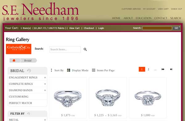
This is when I realized that their top menu links were not thought out correctly. They should have had a link back to another area of their catalog. The way it is now, you need to go back to the home page and then remember how you got to the catalog in the first place.
Their Designers page includes a lot of designer logos as you can see here:
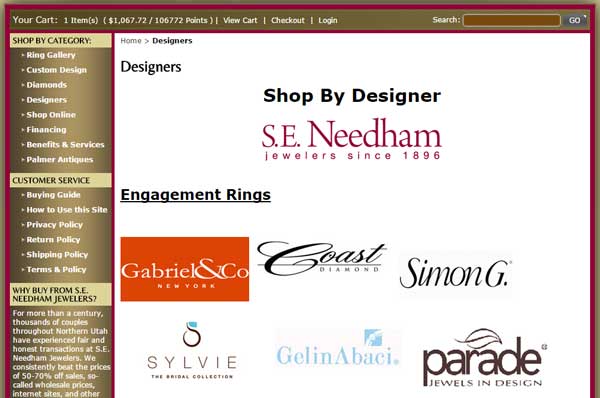
Like I've seen on so many other jewelry sites, these logos all link to the designer's website. I don't like this strategy at all because those designer websites usually have retailer search features that could lead the customer to a different jewelry store. Once you have someone on your website you should take every step to make sure you keep them as a customer. That means you shouldn't send them to other websites for more information.
They've also attempted to include their Palmer Antiques Etsy account as an embedded page in their website. Here as partial screen shot of it:
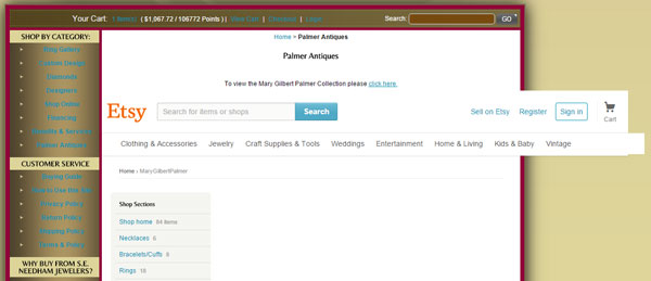
They are using the Etsy embed feature, but the widget does not appear correct on their site. This would have looked better if they hid the left navigation, like they did on the Gabriel&Co page.
Updated Content
It looks like they are keeping the home page of the website updated. The rotating banner includes their current Proposal Film Festival contest with a link to the full details for it. I assume they update this on a regular basis.
Online Reviews
They've signed up with a 3rd party review company to help them build online reviews. This company provides an easy way for the jewelers to build reviews and show them on the website. Here's a screen shot of the page with the reviews:
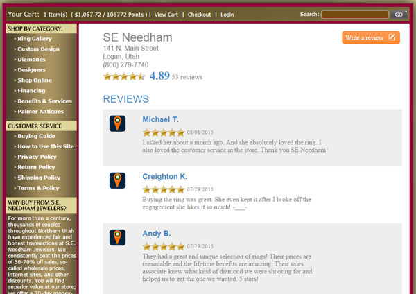
I am happy to see that they are participating in this reputation building service, and it is helping to contribute to the building of their Google and Yelp reviews. There are a few companies that provide 3rd party reputation building using reviews like this; in fact, it's one of the services my own agency provides to our clients.
Yelp Account
Speaking of building their online reputation, I complement them in claiming their free business Yelp listing. They've added their store information and several photos. However, what they have failed to do is reply to their negative reviews.
Here's one of their negative Yelp reviews:

This person is complaining that the jeweler didn't have the right tool to open a Suunto watch. I know that some watches require special tools to take the backs off. What S.E. Needham Jewelers should have explained in person, and certainly what they should reply online, is that they are not an authorized Suunto watch dealer, and therefore don't have the appropriate tools or training to change a battery. Changing a watch battery might seem like a simple task, but sometimes it simply isn't.
No matter where your online reviews are, you should always thank the people who leave positive reviews and answer the people who leave negative reviews.
Other Social Mentions
I'd also like to point out the work they've done to reach customers on other social networks.
Their Pinterest account has 3200 pins in 25 different boards. That's fantastic for a jeweler, take a look at it here:
https://www.pinterest.com/seneedham/
Their YouTube account has 23 videos in it. It looks like they ran their Film Festival in 2011 and archived the submitted videos to it. They also have a few promotional videos there. Take a look at it here:
https://www.youtube.com/user/needhamjewelers
Their Facebook page is mostly filed with links to their blog. I do like that they are heavily sharing their blog posts to their Facebook page, but they need a balance between the number of blog posts they share and the amount of pure direct engagement they have with their nearly 2000 Facebook fans. Here's their account:
https://www.facebook.com/seneedhamjewelers
It seems like they were using their Twitter account until December 31, 2014, although they were only using it to post links to each blog post. They should start using it again, but it should be more than just links to their blog. They could tweet about new products, their contest, and promotions. They also need to learn how to use hashtags with their tweets. Here's their account:
https://twitter.com/needhamjeweler
That's it for this week's review; I'll see you next time...
FTC Notice: I randomly choose this website and won't be telling the retailer jeweler that I'm doing a review. Unless someone else tells them, they will only find out about this review if they examine their Google Analytics and Google Webmaster Tools. I'm not doing this to solicit business from them, but rather as an educational exercise for everyone. This review is completely impartial and all my comments are listed in the order that I discovered them.


