This is the Friday Retail Jeweler website review. The goal for today is to examine a random jewelry website, pull it apart to see how it functions and evaluate the good and the bad that we can learn from.
Every week my staff gives me a random city in the United States and I use Google Chrome in incognito mode to search for local jewelers there. This week the target city was Spokane, Washington.
My search phrase was "jewelers in Spokane WA"
These are the search results Google returned:
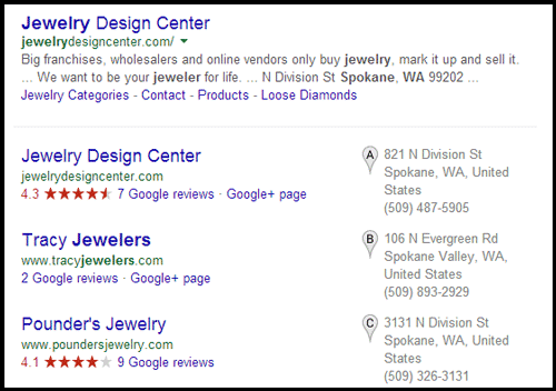
Jewelry Design Center will be my review candidate today since they have both the top organic position and the top business listing. This is their website:
http://jewelrydesigncenter.com/
Here's what their home page looks like. Click it to view larger:

(click to view larger)
They have a well designed responsive website. The tall screen shot above doesn't really explain what the site looks like. Although my screen capture software sees the true height of the page, from your point of view on a desktop computer it won't look so unusual.
Here's what the home page looks like on a smartphone:
(click to view larger)
I mostly like how they designed their website. According to their source code, this is a WordPress site using a combination of plug-ins and a theme they customized. I can tell this took several months to build before it was launched in October 2013.
According to Archive.org, Jewelry Design Center (JDC) has redesigned their website 8 times since it first went live in 1998. That's quite an achievement for any business to average a new website every 2 years like they have. Although that might seem overly ambitious to redesign every 2 years, my own recommendation that I've said many times in live seminars, and previous Nuggets is to redesign your website every 18 months.
Speaking of redesigning every 2 years, their home page design is already starting to show it's age. Seriously, the long scrolling design of their home page became very popular very quickly about the end of 2012 and through 2013. Many fast moving tech agencies were using that scrolling design, but I'm already seeing that fad start to decline. JDC should consider changing their home page functionality within the next 12 months.
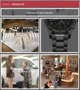
As for the inside pages of their site, I like their use of photos for navigation. They have a top menu, and they chose to fill their site with really good photography and overlay that photography with words to entice users to click.
This screen shot from their product page shows 4 images with word overlays:
(click to enlarge)
I have to go back to the original SERP because I noticed something that should be pointed out. Take a look at this screen grab:
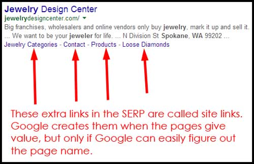
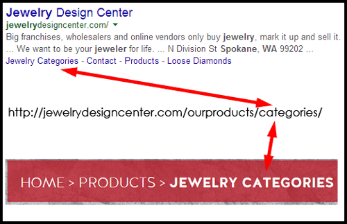
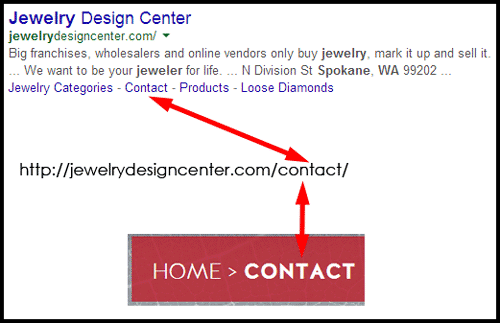
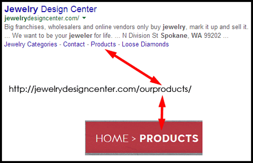
The JDC SERP listing has 4 Site Links in addition to the link to their home page. The format for site links has changed over the years but Google still creates them automatically according to how easy your pages are to figure out.
You can help Google figure out site links by matching your URL, the page title, breadcrumb trail, and the header 1 tag on your page. For JDC, it looks like Google figured it out according to the URL and breadcrumb as I'm showing in these 4 screen grabs:
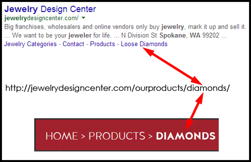
There's more happening in that last screen shot of the Loose Diamonds site link than you might realize. The JDC website uses the word "diamonds" in the URL and in their breadcrumb. On the diamond page itself the phrase "loose diamonds' is only used once.
This is an example of how Google understands how users search and click online much better than any of us. Google knows that jewelry stores often sell loose diamonds, and that people search for loose diamonds. Instead of showing a site link for the ambiguous word "Diamonds," Google changed it to the phrase that better matches customer expectations... "Loose Diamonds"
In conclusion, what we have here today is a retail jeweler that provides a very high value design service and they are trying to use their website to convey that value. They almost got it right. Their website looks far better than other retail jewelers, and Google obviously likes them too.
Here's where I think their website fails them... but it's not because the website is bad. Their website isn't correctly telling their story.
I noticed that the SERP said "Big franchises, wholesalers and online vendors only buy jewelry, mark it up and sell it," which Google pulled from their home page even though JDC wrote specific meta descriptions. Throughout their website they offer an amazing 100 day return policy and a lot of information about how good they are as a jewelry design store.
It seems like they want custom design to be their most important service, yet the navigation of their website is far too similar to every other retail jeweler I've looked at, showing the typical services in the typical order, and showing a general product catalog first.
They almost have it, but what they need (and what you should also be thinking about for your own website) is to figure out what you want to be known for and make sure to put that product or service first every time it's listed with other products or services. Understanding how to organize this correctly is beyond the normal understanding of a website designer, and it delves more into business consulting and website analysis.
That's it for this week's review. I'll have to put JDC on my calendar to check back in with them next year or so.
FTC Notice: I randomly choose this website and won't be telling the retailer jeweler that I'm doing a review. Unless someone else tells them, they will only find out about this review if they examine their Google Analytics and Google Webmaster Tools. I'm not doing this to solicit business from them, but rather as an educational exercise for everyone. This review is completely impartial and all my comments are listed in the order that I discovered them.


