
Last week I wrote my weekly jewelry website review while I was waiting for my flight to France in Newark Liberty Airport, in Newark, NJ. Because I was sitting in the airport, I had the opportunity to present that review from the point of view of an actual mobile user.
As I usually do, I chose the first organic result from the SERP last week as my review candidate. It turned out that the website was not mobile-friendly. According to Google and the impending #mobilegeddon, that website won't appear in the SERP after April 21, 2015. So this week, I'm going back to that same search and I'll choose the first mobile-friendly retail jeweler websites from the organic results.
The long SERP you see below was merged together from a series of screen shots I took from my iPhone when searching for "jewelers newark nj" on google.com:

I'm skipping the mobile-friendly organic results for Yelp and going right to Delson's Jewelry. Tapping that result in the list brought me to this mobile home page:
(click to enlarge)
That home page is incredibly long to look at on a desktop computer, but it doesn't seem so long on a smartphone.
The Delson website uses a responsive website design to achieve its mobile-friendliness, however, according to Google's announcement, their video here, and what I documented in this previous Nugget, Delson is not as safe as they might believe they are.
Header of every page
The same header is on every page. It's unnecessarily tall and it includes a Search Box and a Login Link as you can see here:
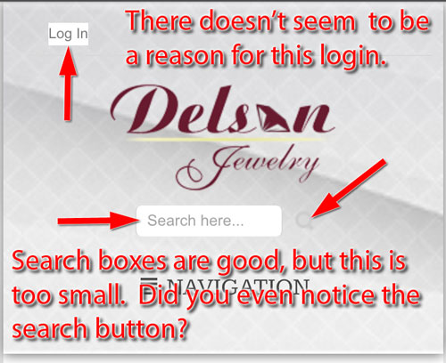
Search boxes are good, but this is too small. Did you even notice the search button? It's a gray colored magnifying glass that blends into the background. While the search box and the button certainly do function on the smartphone, they are not user friendly.
The login link is quite unusual. Typical reasons to have a login include setting up wish lists and e-commerce, but their website has neither. The best I can figure is that they overlooked hiding this link from their purchased website template.
Tapping on the login link brings you to this page:
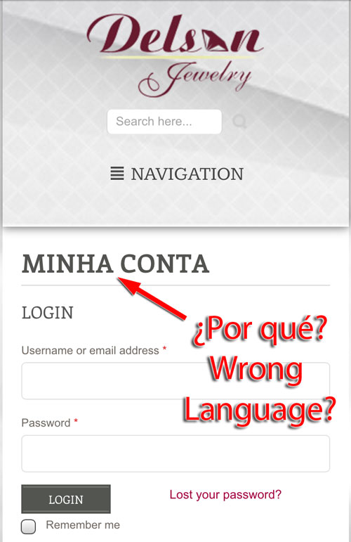
I had to use Google Translate to figure out that "Minha conta" is Portuguese for "My account." One of the blog posts on the website is also in Portuguese. I'm guessing that the owner, Delson DeLima, is Portuguese, or that they have a substantial Portuguese clientele in the area.
If your intent is to attract customers who speak different languages, it's better to use a language module on your website so you can rewrite all the pages and content in those other languages. Otherwise you end up in disorienting usability situations like what's happening here. A message in the header "We speak [language]" in the other tongue is also very common and will make individuals aware that your are, at the very least, bilingual. That header can then click to to the alternate, translated pages. This shows genuine, consistent care for the surrounding cultures your store is a part of.
Home Page Images
The images on their home page are clean, and they are easily usable as you can see here:
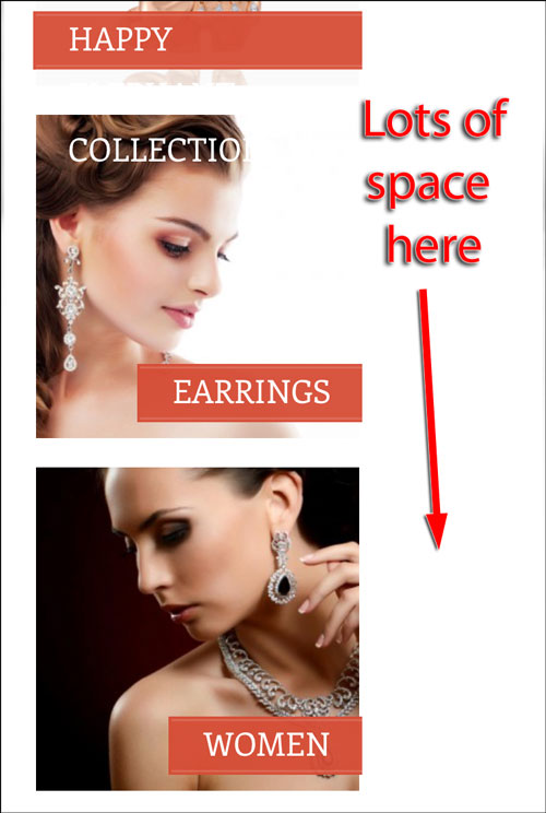
My only issue is that the images could resize correctly to fill the screen. Click here to read a little more about mobile image resizing.
Home page text
One of the biggest problems I see with responsive website design is the lack of font size testing. Google wants the text on your mobile site to be easily readable without needing to pinch-zoom.
Although the text on the Delson's website is readable without zooming, the light color and slightly smaller size is more comfortable to read when you do zoom.
However, if you actually do take the time to read the text on their home page and you'll be able to tell that they have more things wrong with their site than simply not properly testing their responsive design. Take a look:
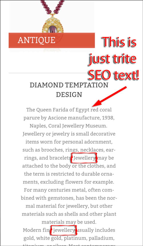
I'm sure we can all agree that "Jewellery or jewelry is small decorative items worn for personal adornment," and there's no reason to have that on their home page. I assume that they hired an SEO company to write that block of text, because I cannot imagine a real jeweler writing such drivel.
Notice the use of the spelling "jewellery" in that text. The SEO agency didn't take into consideration the American market's spelling of the word 'jewelry,' which shows a lack of consistency and proofreading by the jewelry store owner. SEO agencies may not have the care for language that they should, especially if you are paying them by the word.
Home Page Weather
I have to assume the weather widget was built into the template they purchased; otherwise I don't see a reason why it would be important for a jewelry store customer to know the local weather.
Here's a screen grab from the bottom of EVERY page of the website:
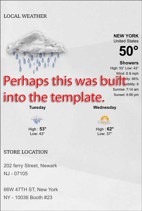
Weather widgets make sense for utility websites or parks and recreation sites, but jewelry...? This looks like filler.
Mobile Matters
I think I've beaten this website up a bit today, and I didn't even get past the home page. The takeaway from this review is to realize that responsive website designs are not the perfect answer, and to consider what you are presenting to your clientele with purposeful steps.
Don't just assume that your responsive website is safe from Google's mobile-friendly ranking criteria. Review the site for yourself and see if you find it usable. Then log into your Google Webmaster Tools account here: https://www.google.com/webmasters/tools/mobile-usability to see what Google has to say about it.
That's it for this week's review, until next time...
FTC Notice: I randomly choose this website and won't be telling the retailer jeweler that I'm doing a review. Unless someone else tells them, they will only find out about this review if they examine their Google Analytics and Google Webmaster Tools. I'm not doing this to solicit business from them, but rather as an educational exercise for everyone. This review is completely impartial and all my comments are listed in the order that I discovered them.


