 In this edition of the Friday Website review I'm stopping off in Bristol, TN. To prevent my Google Personalization results from getting in the way, I used the Google Chrome browser in Incognito Mode. My search string was "jewelers in bristol tn."
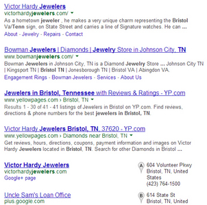
Here's a screen grab of the top SERP results I saw...
(click to enlarge)
That's a pretty standard looking SERP. None of the listings have stars to make them stand out. The top two choices are both jewelry stores. For each of these weekly reviews, I normally just select the first listed jeweler in the SERP, but this time I actually felt quite compelled to click Victor Hardy Jewelers.
I think that compelling feeling was subconsciously induced because Victor Hardy is listed in 3 of the top 5 results. Looking closely at the above screen grab, you'll see their website listing, their YellowPages listing, and their Google+ Local listing.
The YellowPages.com website continues to appear in the results every time I work through these reviews, and it certainly seems like a worthwhile effort for you to claim your business listing and update your information.
Let's continue on to their website: http://www.victorhardyjewelers.com; you might want to open it up to follow along as you read this review.
Incorrect SEO Issues:
The first thing I noticed about their website was that their domain name pointed to victorhardyjewelers.com rather than www.victorhardyjewelers.com.
Upon investigation I found that both versions of their website work:
http://victorhardyjewelers.com/
http://www.victorhardyjewelers.com/
You should avoid this situation on your own site. This usually requires a server configuration to force all visitors to see the www or the non-www version. But you shouldn't allow for both versions to coexist.
It might not seem like a big deal, but that little "www" difference leads to inconsistencies in how people link to our website, which dilutes any real link building efforts you are striving for. Additionally, Google will view both versions of your site as the same site, creating a confusing duplicate content issue.
Usability Issues:
The day I looked at the site, their home page was very confusing to look at. They had a rotating set of images across the top, followed by 2 other large images that were unpleasant to look at. I'm not sure what their intended goal was, but their home page was unusually long because of the way these images were placed. Big, clunky, graphics that don't really go together are spread all over their page like a quilt made by 5 different people. Your graphics shouldn't be fighting with each other over which gets the viewer's attention.
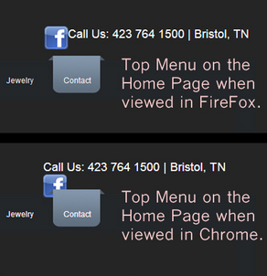
Their top menu caught my attention very quickly because, in Chrome, I noticed that the hover feature for the Contact page caused an overlap of the Facebook icon in the header. But it worked correctly in Firefox and IE. The screen grab below shows how it looked:
It turns out that their home page header is different than all the other pages of the website. This screen grab below shows a Twitter icon in addition to the Facebook icon, but now it's quite obvious that there's a display issue in Chrome.
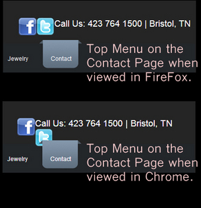
What we can learn from this small issue is that it's important to test your website in all web browsers. Even the smallest elements of your website can appear out of place unexpectedly.
What I Didn't Like About the Site:
Take a look at this page:
http://www.victorhardyjewelers.com/jewelry.html
Here's the screen shot, click to view larger:
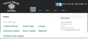
For a jewelry store, this is a pretty plain looking page. Not a single jewelry photos. Each of those 7 link clicks over to a dedicated page using the flipbook layout you see below. These flipbooks are using Adobe Flash, which means mobile devices can't see them, and even desktop computers could get messages that their software needs updating before looking at them.
This next screen grab looks strange because it's broken, click to enlarge:
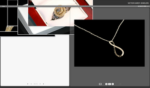
Clicking through the other 6 jewelry links either brings you to broken pages or other flipbooks.
This whole jewelry area of their website is quite a disaster for a jewelry store that's supposed to be selling beauty and evoking emotion.
That's it for this week's basic review. The key takeaway is that you should test your website in multiple browsers, and think about the overall usability of what you do with your website. Don't just trust your web design judgment, and what you like, ask others to give you an honest opinion too.
FTC Notice: I randomly choose this website and won't be telling the retailer jeweler that I'm doing a review. Unless someone else tells them, they will only find out about this review if they examine their Google Analytics and Google Webmaster Tools. I'm not doing this to solicit business from them, but rather as an educational exercise for everyone. This review is completely impartial and all my comments are listed in the order that I discovered them.


