 This is a special edition of the weekly retail jeweler website review. It's special because it's on Thursday rather than the normal Friday. The goal of this review is to show you how other retail jewelers are using their website. Sometimes these reviews are good, sometimes really bad. No matter how they work out, the hope is that you'll see something you can use, or fix, on your own website.
To find my review candidate this week I searched for "jewelry stores in baton rouge" using the Google Chrome browser while in incognito mode.
The top paid results were Kay.com, Tiffany.com, and BlueNile.com. The first organic listing below that was for Lee Michaels Fine Jewelry, but I'm going to skip them because I reviewed them previously.
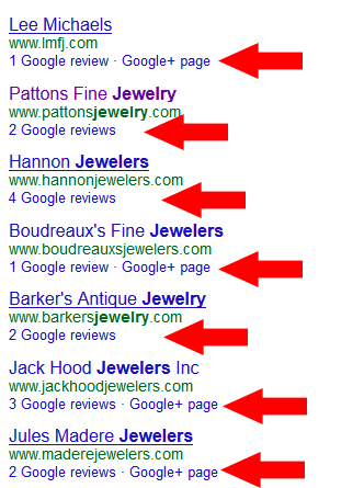
The next jeweler in the organic Google+ Local listing was Pattons Fine Jewelry. I'd like to point out that each of the 7 jewelers listed in the +Local results had at least 1 Google review, but none of them had visible star ratings. That because, at the time of this writing, Google would only show the star rating when you have 5 or more reviews.
Looking closely at the results list shown below, you will see that Hannon Jewelers has 4 reviews. If I were them I'd carefully ask 1 more customer to write a review for them to get those stars. As you will find out in tomorrow's very special Daily Golden Nugget, those stars really do boost business.

For now, I'm concentrating on this website: http://www.pattonsjewelry.com; you might want to open it up to follow along as you read this review.
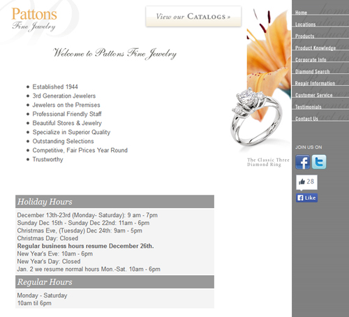
This is what their home page looked like when I wrote this review:

You'll notice that they have their Holiday Hours prominently displayed on their home page. This is a good tactic during the holiday season, but this might also cause a higher than normal bounce rate.
Posting your store hours on your home page is a great way to help those rushed holiday shoppers, but it also means they will not read any other pages of your website. Google Analytics will register this as a bounce, i.e. someone who doesn't like your website.
Normally a high bounce rate is a sign of something wrong, but any higher bounce rate Pattons should be viewed as good customer service... If I were Pattons, I would make sure to delete those store hours on January 3rd.
Usability Issues:
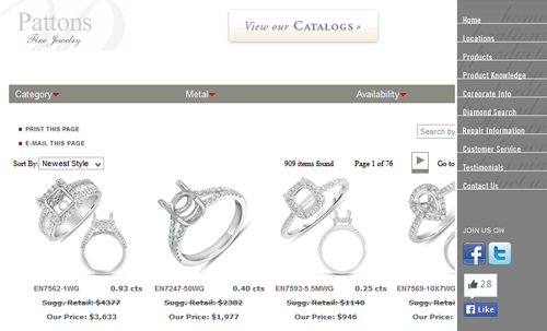
Take a close look at the image below and you'll see an unusual issue with their product catalog. You can see it directly on their website here: http://www.pattonsjewelry.com/products.cfm

The right side navigation overlaps the 4th column of products when viewed in the web browser. On the other hand, if you click the "PRINT THIS PAGE" link it prints the 4 columns of products, unobstructed, without the navigation.
Usability issues like this usually come about because someone didn't fully test the website.
Where Improvements Could Be Made:
While browsing around their website I found their Product Knowledge page. It's actually the 4th link in their right side navigation menu.
Here's the page:
http://www.pattonsjewelry.com/prodknowledge.cfm
It's filled with links to several online resources from JIC.org, Imperial Pearls, JA, and even PGI's preciousplatinum.com website.
All of the links on that page will open a new browser window. This is a great approach to prevent the visitors from leaving the Pattons website. However, I would have preferred to see all this educational content embedded within the site itself. One easy approach would be to use the IFRAME tag built into HTML, or even a more advanced DIV tag.
Using an IFRAME would make all those website appear within the Pattons site.
On this same page, they also have a list of 10 designer brands they carry. Each of these also links to that designer's home page using a new browser window. I disagree with this method because I'd rather see a jeweler include dedicated pages for each designer within their website.
Time and time again I've seen jumps in visitor traffic when retail jewelers create dedicated designer pages right on their website. There's an even greater jump when you add specific designer products into your catalog.
More importantly, retailers with these dedicated designer pages report an increase in customer requests for those designers. Naturally, if you have good sales associates, an increase of requests should lead to an increase in sales for those designers.
What I Didn't Like About the Site:
Take a look at their "Corporate Info" page here:
http://www.pattonsjewelry.com/corporate.cfm
It's pretty anemic with only 2 sentences and photos that are too small to appreciate. They claim to be "Specializing in Excellence since 1944" but they don't tell their story or show nice photos. They should change the name of this page to "About Us" and flesh it out with 500 or more words proudly written about their store history.
Take a look at their "Repair Information" page here:
http://www.pattonsjewelry.com/repair.cfm
This one dumfounded me. They scanned 9 pages from a JA spiral bound jewelry repair training book and posted them to the website. I'm not sure what they hoped to achieve with this, especially since many of those scans include directions like "Create a Visual Aid for your Customers."
What I believe they were trying to do was set themselves apart as a qualified jewelry repair shop. A better method to highlight these 9 services would be to take photos of their one before-and-after repairs and explain each one on a dedicated page.
Incorrect SEO Issues:
Issue 1: The title of every page of their website is exactly the same: "Pattons Fine Jewelry"
Instead of naming them all the same they should have a unique page title that explains what the page actually is. For starters, they could have matched the page name with the same words in their navigation menu.
Issue 2: They are using Meta Keywords on every page. Meta keywords are not used by any of the search engines. They are ignored completely. If they remove all of these, it will give a very small page speed increase.
Issue 3: They are using the same Meta Description on every page. This is what they say: "Patton's Jewelry, Baton Rouge and Alexandria Louisiana jewelry stores, diamonds, platinum, birthstones, diamond guide, wedding, engagement rings, jewelry care, valentines, and more."
Meta Descriptions should be limited to 150 characters, that description is 181 characters. Another glaring issue is that they are trying to insert their favorite keywords into their page description. This is an old attempt to manipulate search engine results that doesn't work. Google will ignore this meta description and either create their own randomly, or worse, not even bother to include Pattons in the organic listings.
That's it for this week's basic review.
FTC Notice: I randomly choose this website and won't be telling the retailer jeweler that I'm doing a review. Unless someone else tells them, they will only find out about this review if they examine their Google Analytics and Google Webmaster Tools. I'm not doing this to solicit business from them, but rather as an educational exercise for everyone. This review is completely impartial and all my comments are listed in the order that I discovered them.


