 How can you tell the difference between regular text on a web page and a hyperlink?
The traditional answer is that hyperlinks are blue and underlined, but that's not always the case anymore.
As website designs become more sophisticated, it's common for hyperlinks to be in different colors, bold, different font-- all as alternatives to underlining.
My personal opinion is that hyperlinks should always be underlined because that's the default method on the internet, and somehow we all have that understood as part of our DNA now.
However, being a hard numbers guy, I decided to do a little study of the most popular websites and blogs on the internet. I didn't choose jewelry sites, but popular sites that many people would visit.
These are some of the sites I looked at:
adobe.com
amazon.com
apple.com
cnn.com
entrepreneur.com
imdb.com
mashable.com
moz.com
msn.com
wikipedia.org
wsj.com
As you can see, I wanted to review popular sites that people might be looking at regularly because these types of sites are usually testing groundbreaking website designs.
Personally, I wasn't happy with the results. I created a large spreadsheet to track my survey results. I looked for underlined links, bold links, link colors, if they changed color when hovering, and even if I felt they were easy to identify as a hyperlink. Here's what I found...
Underlined Hyperlinks
I was surprised to see that only 29% of the websites I surveyed had underlined hyperlinks as their default. But I suppose underlining isn't everything since only 16% of the survey sample had both underlined links and were easy to identify.
Hover Underline Hyperlinks
Even though only 29% had underlined links by default, 71% of them displayed the underline when hovering over the links.
Easy To Identify
I know that most people tend to skim through websites rather than reading everything. You can slow someone's ability to ready by increasing the number of paragraphs you have on a page. You can also use bold formatting to call attention to something important. You can also use hyperlinks as an attention getter, and people might slow down to ready the sentence before and after the link.
With this in mind, I purposely skimmed all the websites first to see if I could quickly identify the hyperlinks. I found that I was able to identify the hyperlinks correctly 38.7% of the time. And then I was able to identify another 25.8% once I acclimated myself to their design and color scheme.
Sadly, there was still about 34% of the websites that were completely confusing to look at and distinguish the difference between real text and a hyperlink. I had to hover over the links with my mouse to find them, which means I would have easily missed the links if I wasn't intentionally looking for them.
Most Popular Link Color
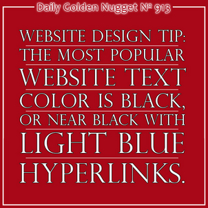
The default hyperlink color is blue. That's pure blue with the HEX code of #0000FF. Blue is still the most popular color with 64.5% of the sites I looked at having some shade of blue. Light blue was the most popular color among 54.8% of the sites I looked at.
Color Schemes
I found it interesting that almost all of the popular sites I looked at were primarily white backgrounds with black or almost black text. As such, it turned out that 81% of them had lighter color hyperlink colors than the text color. The black and light blue color schemes worked well, but then there were strange schemes that used gray text with light orange, or light green which I found incredibly difficult to use, or even look at.
If I were designing a new website today I would take this information and use it to guide my new design. One way to help lower your bounce rate and increase your website engagement is to make your website easier to use, and websites become easier to use when they have a similar look and feel to other popular sites.
A design with black texts and light blue hyperlinks is most popular, regardless what the rest of the website color palate seems to be. I should point out that this was a limited survey of my own. You might want to conduct a similar review.
It also seems like the there's no standard to underline your hyperlinks or not. As I said, it's in our DNA to automatically think underlined text is a hyperlink, and I recommend it. But it's certainly seems like that option can go either way, just as long as your links are easy to identify without the underline.


