 This is my Friday Jewelry Website Review where I look at a random retail jewelry store's website in hopes that what I find will help you improve your own website.
Each week I randomly choose a city and do a Google search using the Chrome browser in incognito mode. This is the best way to ensure that the search results I see will be similar to what a random person would see when they search for a jeweler in that same town.
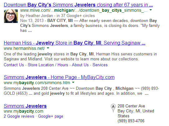
This week's search was "jewelers bay city, Michigan," and these are the top 4 results I saw:

At first glance it looks like Simmons Jewelers is the top choice, but take a look at that number 1 spot. It's an announcement that Simmons Jewelers is closing after 67 years. The announcement was made on the MLive website by Heather Jordan. Notice how the SERP snapshot above shows her photo and the byline "by Heather Jordan - in 37 Google+ circles."
What you see there is exactly what Google Authorship is all about. Using your Google+ account and a few confirmed links between Google+ and your website, you too can have your photo appear in SERPs. It doesn't take much, and you don't have to be popular at all. Look again at Heather's byline and notice that only 37 people are friends with her on Google+.
So this is Google Authorship in action, and it's why you should be getting involved with Google+. If you're struggling with how to get started you can read my Nuggets on Google+ every Monday from now on.
I would have chosen the Simmons website, but I'll have to go with the second choice of Herman Hiss.
Here's the website: http://www.hermanhiss.net/; you might want to open it up to follow along as you read this review.
Their website is using one of the common WordPress themes. It's generally easy to use, and it's responsive to the size of the screen you are using. In other words, the website has a different layout on my smartphone than on the desktop.
Their home page has a large black button inviting me to sign up for their newsletter. Clicking that button brought me to their Newsletter page here:
http://www.hermanhiss.net/newsletter/
I'm not sure if they archive their newsletters on their site or not, but simply having this page certainly does make me believe there should be a list of past emails.
I signed up for their newsletter and received a confirmation email within moments. I clicked the link in that email to double confirm my wish to receive their newsletter and was brought back to the same newsletter page on their website. Another moment went by and I received a 'congratulations' email.
This email signup process was well done, and it was managed by a WordPress plugin they are using. The blank archive on their site makes me think I'll never hear from them again.
My email seminar presented at JCK Las Vegas in the summer of 2012 showed how important it is to archive your newsletters on your website. Assuming your newsletters designed with a balance between text and images, Google will love them, and each one can attract almost 70 unique visitors to your website each month.
If you publish a newsletter, make sure to archive it on your own site. That's where Herman Hiss went wrong on theirs.
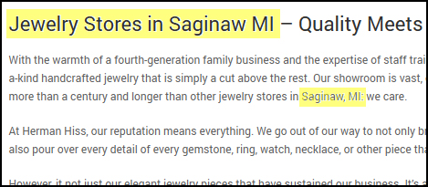
Back on the Herman Hiss home page, I want to point out something else. There's a few paragraphs of text towards the bottom of the page with important keyword information in it. Take a look at this:

I've highlighted the "Jewelry Stores in Saginaw MI" and "Saginaw, MI" parts of the text. The fact that these are here means someone understands search engine optimization. As a reminder, I searched for "Bay City" but Google knows that Saginaw and Bay City are close neighbors, which is probably why Herman Hiss appeared in the results.
When you check your own analytics, you'll always find that "jewelry stores in ___{your city}_____" is among the top phrases to bring visitors to you. You definitely should follow the Herman Hiss strategy on this and add that phrase to your home page as well.
I started to experience some confusion as I browsed from their home page. Follow this...
Their Services page says they are a jewelry store, and it explains their services. See it here:
http://www.hermanhiss.net/services/
But then I started browsing through the list of designer lines they carry. There's a dropdown menu below the Store button on the top menu.
The designers listed are:
* Brighton - No photos on this page, and it says that Brighton makes jewelry, but it also says they make leather accessories and lipstick cases.
* Juno Lucia - Large photo of jewelry on this page
* Mariposa - Aluminum tableware
* Pandora - Jewelry, but no photos even though Pandora allows 5 photos on your site
* Reed & Barton - Formal silverware and glassware
* Riedel - Fine glassware (Note: the heading on this page says "Riedel Glasses in Bay City, MI" which is how Google might have actually connected this site to my search. Clever SEO technique they are using.)
* Simon Pearce - Hand-blown glass
* Vera Bradley - Handbags
* Waterford Crystal - Traditional cut glass vases and stemware
By the time I finished looking at all those designer line pages, I forgot I was supposed to be browsing through a jewelry store. Even their Loyalty Program page shows photos of giftware, not jewelry.
For a retail jewelry store it's important to show jewelry on the website, but if I had to guess, I would say that Herman Hiss sells fine giftware, not jewelry.
Perhaps the lesson here is that you shouldn't put up a website simply to put one up. You should think about the goals of the website, and how it makes you look. Your website should always portray a balance of the products and services that you offer. Too much of one product or service will skew what type of business website visitors think you are.
Lastly, I found a Testimonials link in the footer of their website. I almost didn't notice it. Many people never scroll to the bottom of a website. Testimonials are a good way to help close a sale. If someone was willing to write a testimonial for you, don't bury it in a hidden location on your website. Put them somewhere more obvious, even spread throughout your website, and on your home page.
That's it for this week's basic review.
FTC Notice: I randomly choose this website and won't be telling the retailer jeweler that I'm doing a review. Unless someone else tells them, they will only find out about this review if they examine their Google Analytics and Google Webmaster Tools. I'm not doing this to solicit business from them, but rather as an educational exercise for everyone. This review is completely impartial and all my comments are listed in the order that I discovered them.


