
Reading the latest website optimization and marketing methods online, and putting them into practice on your own website is a daunting task for most business owners. Many question their own actions and simply don't know where to start. For this reason, every Friday I present these mini case study website reviews. My goal is to find a website that has a few obvious (to me) problems, or flops, and then I suggest first steps fixes to get them on the right track again.
Learning from mistakes, yours or some else's, is often easier than trying to figure things out on your own. I also try to document my first impression in these reviews as a way to simulate what your own millennial generation website visitor might be thinking.
The search query I used this week was "jewelers south jordan Utah," and these were the results I saw:
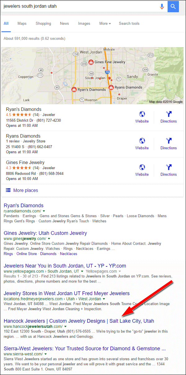
I decided to skip the three jewelers listings in the Google Local pack because they have reasonable websites. A little further down in the results I found Hancock Jewelers, and they will make a better #FlopFix candidate. Their website is http://www.hancockjewelersutah.com/.
SERP Listing
Before even looking at their website, it was their SERP listing that got my attention as a potential flop. Here's a close-up of their search listing results showing corresponding numbers to my comments below:
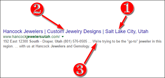
- Salt Lake City, Utah - The Hancock store is located in Draper, Utah yet the title of their home page is trying to capture attention from people in Salt Lake City. Unfortunately for them, this strategy is not working. I found them at the bottom of page 3 of the SERPs when searching for jewelers in Salt Lake City. The town of Draper is next to South Jordan, which is probably why Google included it in the results.
If they want to tackle more business from Salt Lake, they will need to give Google a good reason to list them in the results. They could start by adding a few testimonials from people in Salt Lake City, and even soliciting Google and Yelp reviews from people in SLC. - Custom Jewelry Designs - Whatever you use in the title of your home page should be the most important aspect of your business. They've chosen to identify themselves as a custom jewelry designer, but as I started browsing around their website, I found little supporting proof of their custom design skill. If I were a real customer, I'd find the title to be misleading and with very little incentive to contact them for my custom design work.
- The meta description shown in the SERP does not match the requested meta description that they show in their website code, which says "Hancock Jewelers of Draper is Salt Lake City's source for custom jewelry design and jewelry repair. Fine Quality Engagement Rings and Investment Jewelry."
I tried several different search phrases to see if Google would return that description, but it didn't. The description isn't a bad one except that their home page doesn't provide any details about custom jewelry design. The title of every page of your website should match the meta description for that page, and then both of those need to be reinforced by the information mentioned on the page. However, Hancock doesn't mention their custom design service so Google forcibly rewrites the meta description we see in the SERP.
The lesson learned here is that you need to match your titles and descriptions to the real information you have on your individual pages, but when it comes to your home page it's probably better to simply call yourself a generic, local retail jeweler and let your widely generic home page information support that statement.
Home Page First Impressions
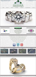
This is what the home page looked like when I first visited:
(click to enlarge)
The large diamond ring you see at the top of the home page is part of a rotating slideshow of images. I do like all the photos in the slideshow and I assume that they are examples of their custom work even though they do not include descriptions or captions. However, I'm only assuming that because of my detailed analysis. They should not expect that customers will understand what they are looking at without at least a caption.
I'm a little confused by the large green "Request a Quote" button in the center of their home page. Clicking it simply brings you to their normal contact form without any directions on how to request a quote. This is a confusing flop. I assume they are trying to guide users to requesting a quote for their custom design service, in which case the quote request page should explain exactly what information Hancock will need before a quote can be provided.
A better quote request form would include fields asking about the metal type, gemstone possibilities, jewelry type, description, and even a way to upload a sketch of the potential design.
The next section on their home page is where Google grabbed that meta description from, it says "We're trying to be the "go-to" jeweler in this region. We are here to serve you to make a big difference." Personally, I never like to see the phrasing "trying to be" anywhere on a website. Using that phrases immediately tells customers that you are second, or even third best at what you do. If you are "trying" to be better, then who is the current leader in the area and why wouldn't I want to use them instead.
Rather than using phrasing like "trying," it's easier to just explain who you are and what you do. Let your online reviews and customer testimonials help sell the quality of your service. Your online reviews will reflect how good you are.
Home Page Social Icons
I found a few problems with the social icons they have on their home page, shown here:
The Facebook icon is linked incorrectly to this malformed URL:
https://www.facebook.com/pages/Hancock-Jewelers/274589495965947https://www.facebook.com/pages/Hancock-Jewelers/274589495965947
Notice how their Facebook address appears twice. Their website programmer made that flop, and it should be easy to fix. Below the icon, the word Facebook is correctly linked to:
https://www.facebook.com/pages/Hancock-Jewelers/274589495965947
They also have a Twitter icon on their home page but that links to the Twitter website and not their account. There are two potential flops here, either they don't have a Twitter account or they forgot to go back and link this. Either way, they should not have the Twitter logo there until they were ready to properly link it.
The Pinterest icon is correctly linked and it looks like they have an active account with more than 5,200 pins in 26 boards.
Home Page Video
They have a long boring video at the bottom of their home page with boring background music but no captions to explain what we are looking at. They show a few rings in the video, which I assume are their own custom designs, and then they show several loose gemstones without any context of why they are showing them.
According to the Hancock YouTube account, the average viewing duration for this 2:13 video is only 1:12 as you can see here:
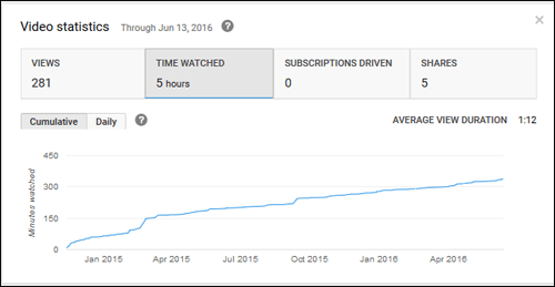
Honestly I was very bored watching it after about a minute but continued through for the sake of this review. They'd probably have better customer satisfaction on their home page if they replaced this video with photos of the items in the video along with appropriate captions.
Dropdown Menu
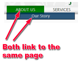
At first glance, the top menu navigation shows 7 buttons, 3 of which have dropdown menus showing sub pages of the site. I first suspected a problem when reading the About Us page and trying to then click over to the Our Story page. Although the dropdown menu suggests that there's a second page, called Our Story, both menu items click to the same location as illustrated here:
The Services button is next in the top menu, and it looks like it has 7 sub-pages shown here:
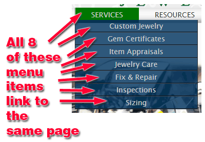
Once again, all 8 of these menu items link to the same Services page, which doesn't have a lot of detail about each of those sub-topics. Therefore I have to conclude that this is a flop that needs to be fixed. That linking needs to be fixed if those pages indeed exist, otherwise that dropdown menu should be turned off.
The Resources button is the next in the top menu with 4 sub-pages shown here:
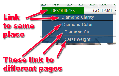
In this case, the Resources link and the Diamond Clarity sub-page are linked to the same place. This setup is correct. When you have multiple sub-pages appearing in a dropdown menu you can use the main menu button, in this case Resources, to lead to landing page for that group, or you can link it to the first page in the group. They used the latter approach. The other 3 sub-pages correctly link to their respective diamond educational pages.
With this in mind, I could reevaluate my flop statement for he About Us page and Our Story sub-page, but I won't. If your dropdown menu only has 1 item, then you either need to link it to a real page or remove it. There's no sense having 1 dropdown menu item if it leads to the same place as the parent menu item.
Product Catalog
After browsing around their website and reviewing their broken menu navigation, I was surprised to go back to their home page and stumble upon their hidden product catalog. They have 4 images on their home page to represent the bracelets, pendants, rings, and earrings that they sell. Instead of linking the images to their product catalog, they only linked the words above them as you see here:
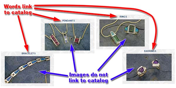
Most users will click on an image or a caption before they will click on a title above an image, which is why I missed these with my first quick examination of the home page. The font size of the category titles are also a bit small and difficult to click.
The fix I suggest here is to add links to the images and increase the font size for those category titles.
That's it for this week's website review; I'll see you next time...
FTC Notice: I randomly choose this website and won't be telling the retailer jeweler that I'm giving them these flop fix ideas. Unless someone else tells them, they will only find out about this Nugget if they use Google Alerts or examine their Google Analytics and Google Search Console. I'm not doing this to solicit business from them, but rather as an educational exercise for everyone. This #FridayFlopFix is completely impartial and all my comments are based on previous experience in my website design and marketing agency, and from my personal research data.


