
Welcome to the Friday website review edition of the Daily Golden Nugget. Every week, I randomly search for retail jeweler websites to review as an educational exercise. Over the last two weeks, in the wake of Google recent announcement regarding mobile readiness, I've written several Nuggets explaining how you should be following Google's new mobile guidelines.
For my review this week, I felt it was only natural to look for a candidate website on my smartphone instead of from my desktop. How serendipitous it is that I began writing this Nugget while sitting in Newark Liberty International Airport in Newark, NJ. I was able to search for retail jewelers in Newark from my iPhone while writing this review on my iPad. This is typically how I get work done while traveling, and many of your jetset customers are already doing the same.
On my desktop computer, I always use Google Chrome in incognito mode to prevent my search history from influencing my search results. Without incognito mode, many of my own jewelry store clients would appear in the SERPS regardless how far away they are from my candidate search town.
Using Chrome on the iPhone, I attempted to put it in incognito mode and search for "jewelers near me." My iPhone totally screwed up! No only did it not find any jewelry stores in Newark, NJ, it jumped my detected location to Paris, France and ricochet my search to google.fr from google.com. Admittedly, I'm sitting here waiting for my flight to Paris. Is it possible that Google knows I'm at an international airport and is giving me results based on my next hop location? I don't know, but it is strange.
Instead of reviewing a Parisian jewelry store, I cleared my search, returned back to google.com and search for "jewelers newark nj." I took a series of screen shots and merged them together into this long SERP you see here:

I was a little disappointed that the results didn't indicate how far I was from the listed stores, but that might be because my phone believes it's already 4000 miles east of here. The first jeweler in the local pack is also the first jeweler in the organic list, Vinhas Jewelers. Tapping that organic listing brought me to this home page:
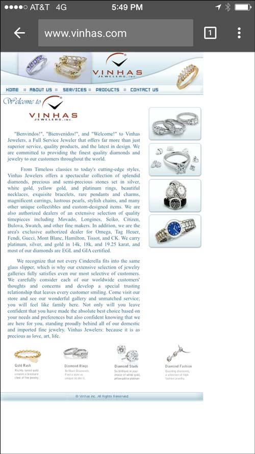
The above screen shot is exactly what I saw. The page appeared smaller than my screen size. It could have expanded at least 1/2 inch more to better fill my screen. The text is impossible to read without pinch zooming. Google wants you to avoid small text like this. Anything that requires pinch zooming to read is considered bad.
Without zooming in, I can't tell if the 4 button shaped photos on the right side are actually buttons or if they are just images. The blue face watch caught my attention, but tapping it did nothing, so I guess it's just a photo.
This next screen show shows how far I zoomed in to comfortably read the text and the read the top navigation menu.

I then tapped on the Products link and was very slowly brought to this page. It was painfully slow, and as you can see, I had 4 bars with AT&T on 4G. Once again, the smaller page you see here is how the page loaded. Another factor Google is looking at now is whether or not your website will resize to the "viewport." In this case, you can see the outline I added to the image represents the viewport of my iPhone. The website had plenty of space to expand.
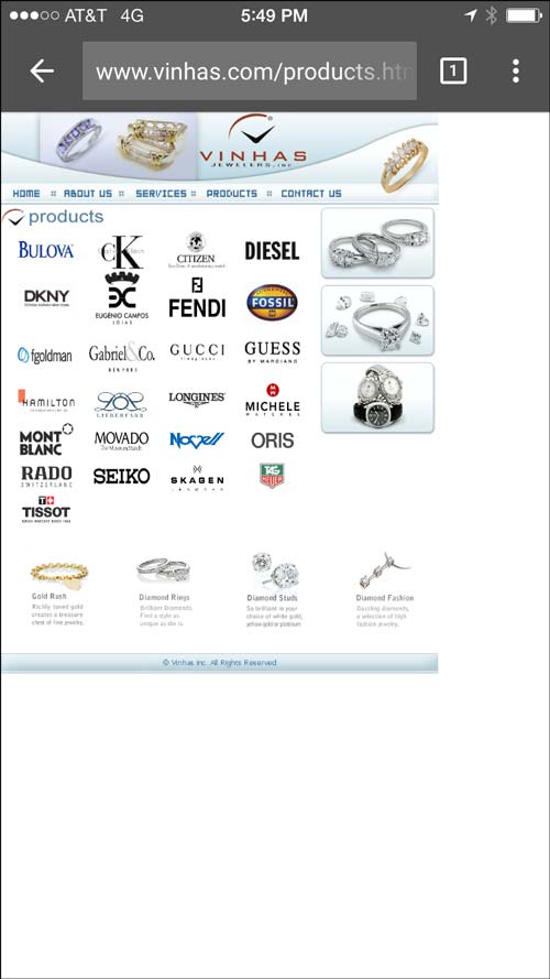
Without zooming, I attempted to tap on the CK logo, but instead I hit the Eugenio Campos logo right below it. This is the page it brought me to:

On a smartphone this appears to be a dead site. Zooming in closer you will see this message:

This is yet another thing Google wants you to avoid--plugins that don't work on smartphones. I don't know if this is an Adobe Flash website or another random script plugin, either way, this is a bad customer experience.
Using the browser back button on my iPhone, I returned back to the previous page. I zoomed in this time before tapping on the Calvin Klein logo. This is the page it brought me to:
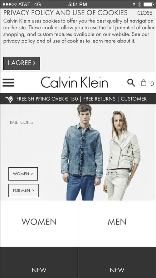
The Vinhas website didn't indicate exactly what part of the CK line they carried in the store. I felt a little upset that they chose to link to the calvinklein.com home page instead of directly to the product line. Considering the trouble I'm already having using the Vinhas website on my smartphone, I'm not really interested in struggling through the CK mobile website to find jewelry or watches.
Using my browser back button once again I return to the page of designer icons. Pinch zooming each time, I tapped a few of the other designer logos. Each one was linked to a different website with similar results like the first two.
I eventually realized that the four photos at the bottom of the page had descriptions. The images showed "Gold Rush," "Diamond Rings," " Diamond Studs," and "Diamond Fashion." Oddly, none of them linked to anywhere. They were just there at the bottom of the page without any rhyme or reason.
Similarly, the photos on the right side of the screen really looks like buttons with those rounded edges, outline, and shadows. But they also do not link to anything. Here a closer screen shot of these two:

Sadly, most of the websites I see every week are not mobile friendly at all. I tried writing some mobile website reviews a while back, but they all had the same problems you see here today.
Google announced that as of April 21, 2015 they will decrease the mobile search result ranking of any website that's not mobile friendly. As of today, the Vinhas site is first place in organic ranking while other mobile-friendly website rank under lower. I expect the Vinhas site will not appear in the results after April 21st.
Google says that their new mobile ranking results will only affect the search results from mobile devices. The desktop SERP won't be changed.
In next week's review, I'll take a look at a responsive website design and compare that to Google's new mobile guidelines.
Until then...
FTC Notice: I randomly choose this website and won't be telling the retailer jeweler that I'm doing a review. Unless someone else tells them, they will only find out about this review if they examine their Google Analytics and Google Webmaster Tools. I'm not doing this to solicit business from them, but rather as an educational exercise for everyone. This review is completely impartial and all my comments are listed in the order that I discovered them.


