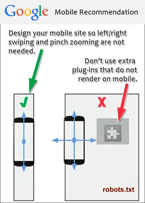
In this edition of the Daily Golden Nugget, I'm showing you a few things to watch out for when creating your mobile website. These mobile recommendations come directly from Google from this video.
No Pinch Zooming or Plug-ins
There should never be a need to zoom in on a mobile website. The website content should naturally fit the size of the screen as you see here:

Also, you should not use any plug-in that does not work on a mobile device. The most obvious issue to watch out for is Adobe Flash, since that doesn't work on an iPhone or an Android. Additionally, you should always test all the other plug-ins you are using to make sure they fully function on a mobile device.
No Fixed Widths
Don't create a mobile website that uses a fixed width. Mobile devices come in thousands of different screen sizes. There really are thousands! Although I prefer to design mobile websites to fit on my iPhone (currently a 6), I know that they are going to be viewed on the entire ranges of iPhone sizes from the old 3 to the 6+. Speaking of a wide range of sizes, Android manufacturers have at least 5 different screen sizes every year for the last 7 years or so.
Additionally, every mobile app with a built in browser (like Facebook, Twitter, and LinkedIn) will create unusual web page window sizes.
In other words, there's no way to design a perfect mobile size. Your only real option is to have your web developer use "em" measurements in the design instead of specific "pixel" size measurements. Understanding how the "em" measurement works is quite confusing, but you don't have to worry about that. Just ask your web developer to build it that way... you'll sound pretty smart.
Size Matters
Don't use images on your mobile website that were designed for your desktop website.
Google is measuring your website's PageSpeed, i.e. how long it takes for it to download to a mobile device over a cellular connection. The biggest worry on a mobile website is the size of the images and how long it takes them to download.
Take a look at the mobile website I captured here:

The Mark Schneider banner in that screen capture is 960 pixels wide by 400 pixels tall. It was sized for their desktop site, yet their responsive website design is visually shrinking it down to fit the smartphone screen.
I will say that, in this case, the web developer took an extra step to minimize the kilobyte size to 40.5KB. That's a very low resolution graphic, and it's the correct resolution for a smartphone. However, those beautiful Mark Schneider rings look pretty grainy when you view this on the desktop.
Now take notice of the Hearts on Fire photo in the above screen shot. That photo is 310 pixels wide by 250 pixels tall. Because of the way they have the responsive design working, that image is enlarged and looks grainy on the mobile site, but it looks fine on the desktop site. Also, it is 41.5KB in size even though the physical dimensions are much smaller than the aforementioned banner. In other words, this one was not optimized for mobile.
As you can see, you need to make image trade-offs when you use a responsive website design. Although responsive website design is one of Google's recommended mobile website methods, their further recommendation for correctly sizing images for mobile and desktop actually contradicts the responsive approach.
Mobile Matters
It was only last week that Google announced they would start including mobile friendliness as a ranking factor through mobile search. They said that the ranking would start as of April 21, 2015, yet all the mobile search results I see as of today are exclusively showing mobile friendly sites. It wasn't like that earlier last week, so it seems like Google already jumped their own gun.


