This is the weekly website review where I choose a random retail jeweler and compare their website and online identity to what is commonly known about search engine optimization, online marketing, and customer usefulness.
I started this week's review with the Google search "jewelers athens oh" and saw these results:

The Local Pack included 3 results with no option to view more. Of those choices, only the first 2 were jewelers. I did a few more searches in Google Maps to see if there were more jewelers or pawn shops in the Athens, OH area, but it looks like there are indeed only two.
I was drawn to the sitelinks that you see in the organic listing for Keith Chapman Jeweler, and then I realized that the Local Pack incorrectly shows the jeweler's name as Chapman Keith Jeweler. This is clear sign that they have not claimed their business listing and have to yet to correct this simple mistake. It's a easy task to claim your business account and fix incorrect business names, addresses, and phone numbers.
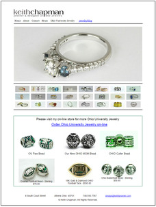
Here's what the Keith Chapman Jeweler website looked like when I visited it at
http://www.keithjeweler.com/

(click to enlarge)
Basic Structure & Sitelinks
This website has a basic structure with only 5 pages, including the home page. It's this basic structure that allowed those sitelinks to appear in the SERP. You can refer back to this Nugget to see how easy it can be to get your own sitelinks to appear in the SERPs. Keith Chapman was able to do it because their pages have the simple URLs of:
- /about.html
- /contact.html
- /hours.html
- /ohio-university-jewelry.html
Jewelry Blog
There's a link to a "jewelryblog" at the top of his website that links to a completely different domain name, http://designwithkeith.com.
It looks like Keith set up this website on WordPress in March 2015, which was about 6 months prior to this review. He made 12 blog posts between March 22, 2015 and April 11, 2015 then stopped.
My first suggestion here is to kill this WordPress site and move the content into the main website. Having two competing websites showing the same types of product or service will only work against you. How is Google supposed to know which of your sites is more important?
My second suggestion is to take it slow with your blog. Posting 12 times over 21 days is not helpful unless you plan on maintaining that aggressive posting behavior. It's better to limit your blog posting to once or twice a month unless you can guarantee that you'll be able to accomplish more, without fail.
E-Commerce Link
Those interested in the Ohio University Jewelry might be excited to see they can buy charms online, but getting to the e-commerce website might be a little more than frustrating. It's very difficult to click the link you see here:

I tested this in all my browsers to make sure it wasn't just me having an issue. You have to hold your mouse over the shown link in a precise way before you can click over to his e-comemrce store.
I dug a little deeper again to see what was causing this, and it's nothing more than a botched layout of website layers that interfere with the link. A usability issue like this would block people from getting to his e-commerce site, and certainly would limit his sales. This is a rookie mistake of website layouts that should have been noticed, and fixed, right away.
The e-commerce site is running through Square at the URL
https://squareup.com/market/keith-chapman-jeweler
This is what it looked like when I visited:

They are using a single page e-commerce setup with a very large header, a list of products, an About blurb and a map at the bottom. With this layout, I feel the header image is too big, which causes the products to be hidden below the fold of the browser page and requires the user to scroll down a lot before they see the products.
This is the 3rd website that Keith Chapman Jeweler is using, and once again I'll suggest merging this back into their primary domain name so the three sites are not fighting for search engine placement in top ranking.
As a general rule, when you are trying to sell the same products and services, you should always combine all your website efforts within the same "www.jewelrystoredomain.com" website rather than multiple WordPress, e-commerce platforms, and website properties.
That's it for this week; I'll see you next time...
FTC Notice: I randomly choose this website and won't be telling the retailer jeweler that I'm doing a review. Unless someone else tells them, they will only find out about this review if they examine their Google Analytics and Google Webmaster Tools. I'm not doing this to solicit business from them, but rather as an educational exercise for everyone. This review is completely impartial and all my comments are listed in the order that I discovered them.


