 This is the special Friday edition of the Daily Golden Nugget where I randomly review a retail jewelry store website to see what we can learn from it. Sometimes I uncover good things, and sometimes bad; either way, there's always something interesting to learn.
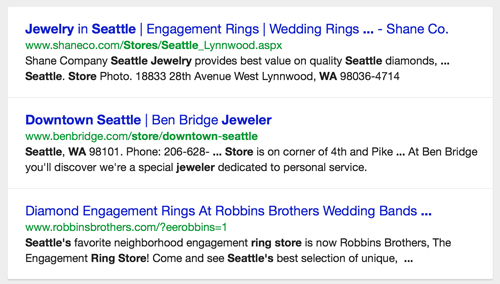
This week I'm doing this review from my iPad Air. I'm beginning this review with the Google Chrome browser using incognito mode. I started with a search for "jewelry stores in Seattle, Washington" and this search results screen was returned to me.

The Google search results format on the iPad and iPhone have a visibly different look than what you see on a desktop. I didn't modify that screen shot above at all, and the shadow effect you see is part of Google's "card" display which is common on mobile devices now.
Now look at the description for Shane Co in the SERP above. It says "Shane Company Seattle Jewelry provides best value on quality Seattle diamonds, ... Seattle. Store Photo. 18833 28th Avenue West Lynnwood, WA 98036-4714"
Take notice of the words in bold. Google makes them bold because they relate to my search phrase.
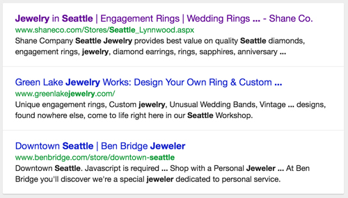
If I search for "jewelers seattle" I get this result instead:

This time the description matches the Meta Description from their page: "Shane Company Seattle Jewelry provides best value on quality Seattle diamonds, engagement rings, jewelry, diamond earrings, rings, sapphires, anniversary ..."
Once again the words in bold are the ones that closely match the search phrase.
Clicking on that link brought me to their website at this page here:
http://www.shaneco.com/Stores/Seattle_Lynnwood.aspx
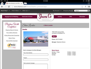
This is how the page looks on the iPad, click it to view larger:

Shane Co has 14 stores around the United States, but I bet they never thought to really look at how their "local" search results look, and where people land on their site once they are found.
Since I started doing these weekly reviews last year, I think this might be the first time that the SERP results link brought me to a jeweler's Contact Us page rather than their home page.
It's happening here because Shane Co doesn't have their store address in the footer of every page of their site, but in their case that's actually not a bad thing. It would certainly appear as web spam if they tried to stuff 14 different town names into the footer of every page.
If you own 4 or more jewelry stores you probably should take the same approach as what Shane Co did here, but if you own 3 stores, I personally feel it's a good idea to list those 3 town names in the footer of all your pages.
My feeling is that if you have 1 or 2 stores, then you should include the full addresses for both stores in the footer.
Take another look at the screen shot for the landing page above, which, as I said, is their Contact Us page. Do you think that Contact Us page truly represents who they are as a company?
I would call that a typical Contact Us page for a retail jewelry store, but it doesn't represent the store very well as the landing page someone first sees. What they need here is some local optimization, and rethinking of their usability.
What they should do is figure out what to tell a new visitor and somehow include it on their Contact Us page. It might need a little reformatting of the page to make it work.
This certainly is a brief overview of how to take the user's point of view when searching for a local jewelry store. Have you ever actually done a local search for your own store? Go ahead and test both of the search phrases I used above, repeated here for convenience:
* jewelers {town name here}
* jewelry stores in {town name here}, {state name here}
Look at how Google displays your store in the SERP and click on the link to see how your website first appears. Does it convey the message you want to convey in 10 seconds or less? If not, then fix it.
That's it for this brief website review. It's turned out to be a pretty simple analysis that you can apply to your own website quickly.


