
Welcome to the Friday retail jewelry store website review. For this week's review, I'm searching for "jewelers Tempe, Arizona" using Google Chrome in incognito mode.
If this is the first time you're reading my reviews, then let me explain that I review a different random retail store website every Friday. These are sites have no relation to me or the website agency services my company provides. These are just straight forward, cursory reviews of what a website looks like, how it functions, some SEO analysis, and if the site makes sense.
These are my personal opinions, but this is exactly what I would have told the jeweler if they called for a free consultation.
This is the search results I saw when googling "jewelers tempe, arizona"
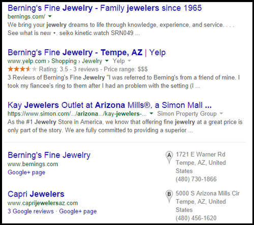
It looks like Berning's Fine Jewelry has done a good job with their SEO process. Their website is in the 1st organic spot and their Yelp page is in the 2nd organic spot. Did you happen to read this post from 3 days ago about why Yelp and other business directories are ranking better? Check it out.
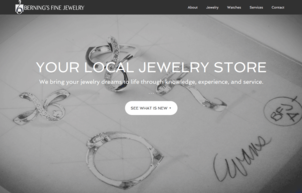
The Berning's link brought me to this home page here:
http://bernings.com/
(click to view larger)
I was immediately impressed with this very simple design because it's not something most other retail jewelers are doing. The background immediately says "custom design" without using those words. Their most prominent headline includes the words "local jewelry store," which is the phrase people usually search for.
They didn't overburden their website with a logo or a huge "Welcome to Perosi Jewelers" type message. Instead, they placed a small logo at the top left corner of their screen, exactly where users expect it to be.
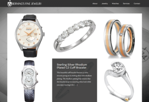
When you scroll down or click that "What's New" button, you'll see a Brady Bunch Grid of products right on the home page that looks like this:
(click to enlarge)
Hovering over each photo reveals a little more detail and allows you to click for more information. Although I liked this setup, I feel they made a mistake with their linking. The first item you see in the Brady Bunch Grid is the diamond wedding ring in the top center position. I would have linked that photo to a product catalog, but they are linking it to their jewelry insurance page.
When I look at tracking reports, I can see that people spend little time reading a page but they will quickly click large photos. In fact that's exactly what I did when I first landing on their home page. I didn't even read the copy that appeared for that wedding band; I just clicked it. Suddenly I was wondering why I was reading a page on jewelry insurance.
Okay, their home page usability is a little glitchy, but now I want to see their product catalog so I'm going to click the "Jewelry" link in the top menu which brings me to this page:
http://bernings.com/jewelry/ that you see here:
(click to view larger)
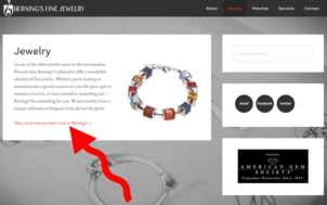
I was a little disappointed with this page as well because I really expected to see a catalog of jewelry. Instead of a visual crowd pleaser, I am served a single photo and a block of text. But wait, there's a red link that says "Take a look and see what's new at Berning's." I'm pointing to this link in the above screen shot.
Clicking that link then brings me here:
http://bernings.com/category/jewelry/
Keeping in the mindset that I'm looking for a product catalog, from a usability point of view I'm assuming the "Take a look and see what's new at Berning's" link will bring me to a page of new arrivals. The URL looks promising with the "category/jewelry" because that's what a normal e-commerce site would use to organize their products into groups.
Instead, this is actually a blog page as shown here:
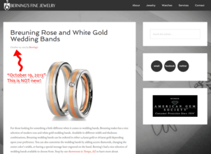
(click to view larger)
Let me switch gears a little and just mention that this website has a simple responsive design that you can see here:

(click to enlarge)
I haven't looked at their SEO settings or the code to see what's happening behind the scenes, but I did check out the company that programmed their site and was let down by what I found.
Here's the home page for their web programmer. Notice anything?
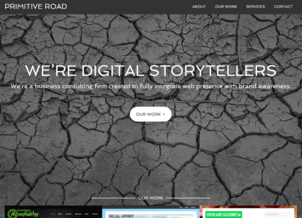
(click to enlarge)
Their developer's website is the identical website design as Berning's. I'm suddenly let down by the entire website because now I see Berning didn't spend a lot of time thinking about their site at all. They hired a programmer and slapped together a site using a fancy pre-existing template instead of customizing it for their own use.
They then applied a few simple SEO steps that all jewelers should be employing without any consideration for the overall usefulness of their website.
So, even though I started out pretty impressed by the look of this site, I'm feeling very disappointed overall. They have the makings of a good looking site, even though it's a template. What they should do is ask a few friends to navigate through the site while they watch. This is the most simplistic type of usability testing that you could do, and it's a great help for figuring out what content should be where and where links should be positioned on your site.
FTC Notice: I randomly choose this website and won't be telling the retailer jeweler that I'm doing a review. Unless someone else tells them, they will only find out about this review if they examine their Google Analytics and Google Webmaster Tools. I'm not doing this to solicit business from them, but rather as an educational exercise for everyone. This review is completely impartial and all my comments are listed in the order that I discovered them.


