Every online marketing company has their own version of reports. It's one of the requirements of any marketing or SEO service. You, as the website owner, want to know what they are doing and what you are paying for.
Some agencies provide their own really nice looking reports with charts and graphs, while others provide lists of pages and keywords with percentage increases and decreases. On many occasions I've found that agencies created reports using reporting software that they programmed to make themselves look good.
With my own online marketing and SEO clients, I've chosen to pay for the reporting services from Raven Tools. Some of the Raven reports make my staff and I look like SEO gods while other reports make you scratch your head wondering what the devil we are doing.
It's important to learn how to read whatever type of SEO or online marketing report you are given. Find out what the measurements are for good and bad, and which measurements are indifferent. Watch them month after month.
Honestly, I find all of the reporting services to be quite frustrating. The fact is that SEO methods change so fast that it's impossible for the reporting companies to keep up. Every time Raven Tools updates their reporting engine, they also depreciate the value of the old reports which makes all the information look like bad results. It's very frustrating.
Although I like the neat and tidy reports provided by the different services, there's really nothing better than learning how to read Google Analytics and Google Webmaster Tools yourself. Google gives you a lot of information that is always up to date regardless how SEO methods change.
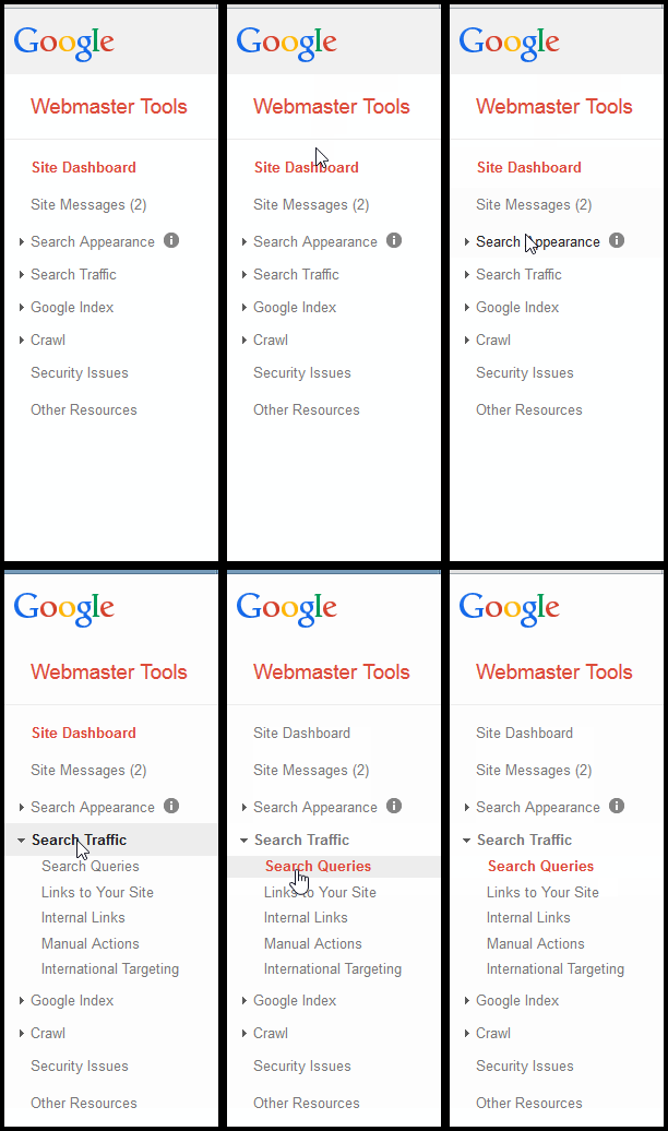
The first thing you should learn to read is your Search Queries report in Google Webmaster Tools. At the time of this writing, you can access that report under Search Traffic -- > Search Queries, as shown in this animated image:

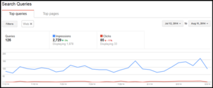
Here's an example of the Search Queries report:

(click to enlarge)
The blue line in that report shows you the number of times your website appeared in Google SERPs. The hope is that this line should always show an average increase, however, there are times of the year when this line will rise and fall no matter what you do.
For example, the holiday season always shows a drastic increase followed by a really depressing massive decline in January. Also, the summer months always have declining traffic for retail jewelers because your customers are spending money on vacations and outdoor activities instead of buying jewelry.
Although the Search Queries report gives you a good idea how your site appears in search, it alone can't be used as a gauge to measure the effectiveness of your SEO activity. For that, you would need to compare the Search Queries report over a 90 day period, or better yet, compare the report from the previous year.
It's especially important to compare previous years Search Queries reports for the holiday season and summer months in order to measure the effectiveness of your SEO efforts. However, this comparison isn't easy because Google Webmaster Tools data is only available for the previous 90 days. So you have to save these reports on your own.
Let me call your attention to the above chart again. Take notice of where it says "Filters" in a gray button and the word "Web" in a box next to it. This tells us that we're viewing the query report for Google's normal search results.
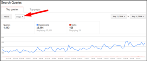
Now take a look at this similar report:

(click to enlarge)
This version of the report shows how well the website is ranking in Google Images search. Notice how I also changed the reporting period to the 90 day maximum so we can clearly see a rise in the impressions that this website has received.
The rise in impressions shown there was a direct result of implementing the image alt and title techniques explained in this Daily Nugget. Although impressions from organic image search increased a lot, the impressions for the regular Google organic search didn't increase much over the same period. This shows you how one SEO tactic will benefit in one way, but not in others.
What I haven't mentioned yet is the red line you see in the above charts. All of the on-site search engine optimization work you do to your website will help increase the level of that blue line, but it's the meta description that "sells the click" and increases that red line.
When I say "sell the click," what I'm referring to is a well written sales message that tells the person exactly what they will find on that page and why they should click on it at all.
Here's the important lesson in today's Nugget: You would hope that the number of clicks reported on the red line will increase as the organic blue line rises. If not, then someone with good writing and marketing skills needs to go back through all your pages and rethink the meta descriptions.
I'm going to continue this reporting discussion tomorrow with a shallow dive into some Google Analytics reports. See you then...


