I decided to give myself a little challenge today with this edition of the Daily Golden Nugget, Friday Website Review. I'm back in Bordeaux, France today, and in honor of that I decided to search for any town or location within the United States that was named after Bordeaux, France. I only found one, and apparently it's a small settlement in the US Virgin Islands, so I decided to check it out.
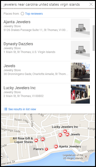
Sadly, it really is just a settlement without a large town, and certainly no jewelers. According to Google Maps, the neighboring town is Carolina. So I searched for "jewelers near carolina united states virgin islands."
This didn't yield results. Carolina is on the island of St. John, which is mostly a national park. All the jewelers in the US Virgin Islands are on the island of St. Thomas.
Using Google Maps, I browsed around for a few jewelers. Normally I select my website review candidates based on organic ranking, but this time I decided to select the four jewelers who's Google Maps markers (that's those red dots) appeared to me first. Here's the screen shot:
I'll take a quick look at all four of these jewelers:
Ajantia Jewelers
Dynasty Dazzlers
Jewels
Lucky Jewelers
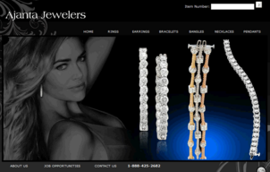
Ajantia Jewelers (http://ajantajewelers.com/) has a simple product catalog site. This is their home page:
(click to view larger)
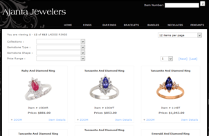
This is the ring section of their product catalog:
(click to view larger)
At first glance the Ajantia website is nice enough. It lacks real content, but at least it has a large product catalog.
I then moved on to Dynasty Dazzlers at http://www.dynastydazzlers.com/ and was very confused by this home page:

It turns out that they are a duty free shop with a horrible first home page that makes you think the site is only one page. It takes about 13 seconds to sequentially fade in the 6 photos you see above. It feels like an eternity. It turns out that this is just a splash page that eventually redirects you to the real home page shown here:
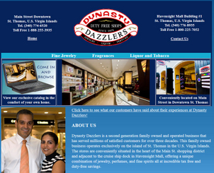
(click to view larger)
I clicked the "Fine Jewelry" link on their top menu and was brought to the website http://jewelry.dynastydazzlers.com/.
To my surprise, it had the same exact product catalog as Ajantia Jewelers, shown here:
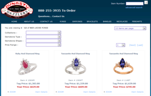
(click to view larger)
Well, that sucks! When I saw this catalog on the Ajantia site, I liked it because it has a description and technical information shown here:
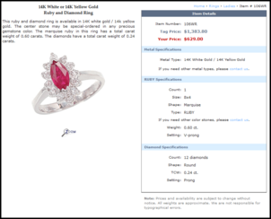
(click to view larger)
This is probably provided by a vendor, which means this is probably being used on many other jewelry websites in addition to these two. This surely must be a situation that Google Panda would penalize, and therefore those product catalog pages wouldn't help to bring new customers to either website via organic traffic.
Additionally, those website visitors will be very disappointed to find the exact same product catalog on both sites. Both sites are exactly the same, and that might make people think both stores carry the same merchandise. This is bad for business, and the vendor responsible for this should have provided territory protection to one of these jewelers.
I then moved on to Jewels at http://www.jewelsonline.com/. Here's their home page:

(click to view larger)
This is the best website of this group, but I wondered why it didn't rank higher in the list, especially considering the duplicate catalog above.
While I browsed around their site, I realized they were not using their address effectively. It seems like Google doesn't know exactly where they are, and I'm going to guess because of their Locations page shown here:
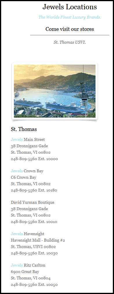
That's the only page on their site with full addresses listed, and it doesn't help them get ranked for the 5 stores they have in the Caribbean. They should rethink the use of their address, and they should certainly update their Google My Business pages.
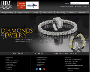
The last jeweler I'm looking at today is Lucky Jewelers and their website http://www.luckyjewelers.com/. This is what their home page looks like:
(click to view larger)
Initially I liked their product catalog because most of the item photos are the same size and it looks like many of them were shot with the same orientation. Even though the photos are not perfect with how they were shot, they obviously tried. It certainly took a long time to photograph their inventory, and this is the perfect example of what I now refer to as a "first real step" towards having a good photography for an e-commerce site. It's good to have photography like this and learn the difficult process.
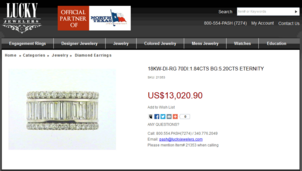
What I don't like is that all the product descriptions are in all UPPERCASE as you can see here:
(click to view larger)
Uppercase typeface is bad formatting on the internet, and it hints of decades past with mainframe computers that only accepted uppercase characters from a terminal. I also noticed that many of the product descriptions are using abbreviations that only the store employees would understand.
The above product has the description "18KW-DI-RG 70DI:1.84CTS BG:5.20CTS ETERNITY"
There's no way a customer is going to understand what all that means. They're more likely to view it as gibberish or a mistake. Additionally, even Google's amazing powers of deduction and spelling correction would not be able to make heads or tails of this information.
Honestly, it seemed like a data upload from their point of sale system. Uploads from your POS are always good for keeping your inventory up to date on the website, but they work against you because of this type of formatting.
I've worked with The EDGE POS jewelry software before and I know that it used to force uppercase descriptions. According to the source code of the website, this was a data upload from the Logic Mate POS, a competitor of The EDGE.
The lesson learned here is that you need to clean up the product descriptions that your POS uploads. Preferably, you should be fixing them in the POS. I like these data uploads because they are a big time saver, but these gibberish descriptions won't help make a sale.
That's it for this week's website reviews. Until next Friday...
FTC Notice: I randomly choose this website and won't be telling the retailer jeweler that I'm doing a review. Unless someone else tells them, they will only find out about this review if they examine their Google Analytics and Google Webmaster Tools. I'm not doing this to solicit business from them, but rather as an educational exercise for everyone. This review is completely impartial and all my comments are listed in the order that I discovered them.


