 For this week's website review, I looked for "jewelers San Angelo, TX" in Google using incognito mode. Instead of looking at jewelers on the first page of the SERPs, I jumped to no man's land of search results: the dreaded second page.
These were the top organic results for page 2:
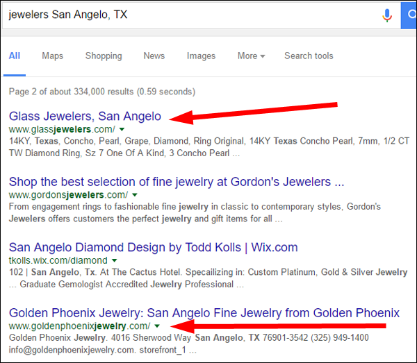
I quickly looked at the sites for Glass Jewelers and Golden Phoenix Jewelers. It was hard to choose which one to review today because both were pretty bad looking and need a lot of help, so I'll do a quick review of both of them.
Glass Jewelers Website
The Glass Jewelers website is http://www.glassjewelers.com/. This is what it looked like when I visited:
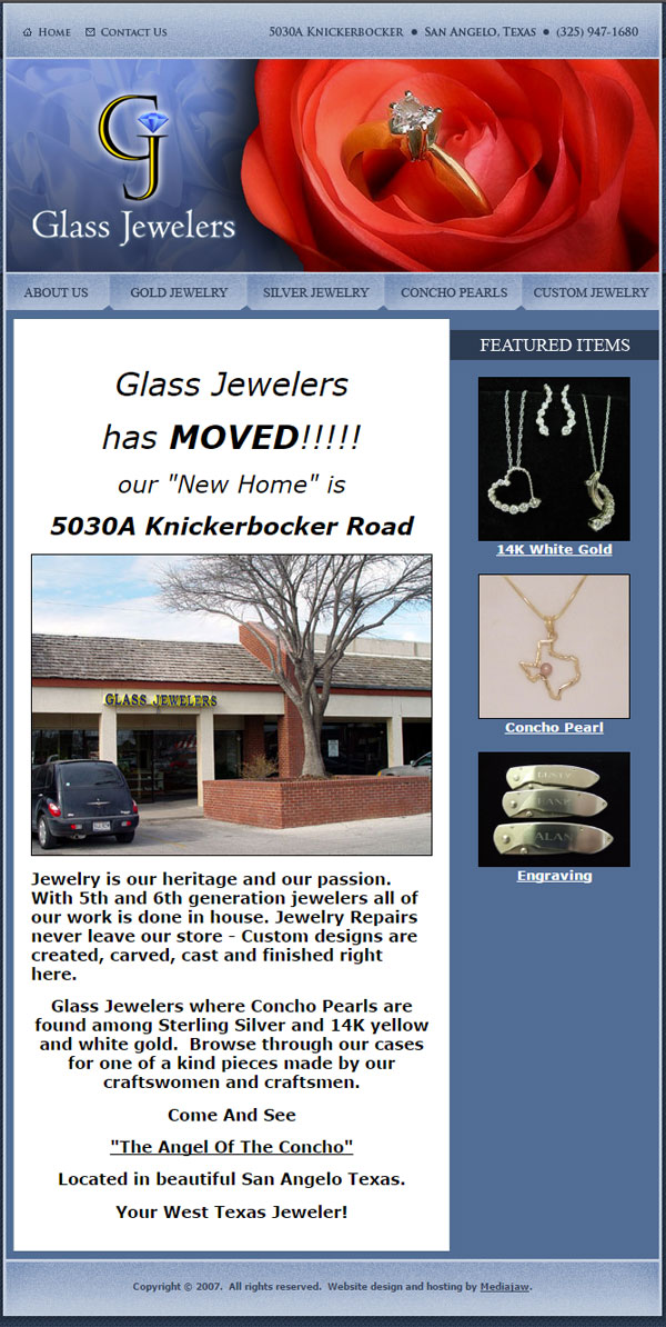
This website has a very narrow design. The body of the page has a static 667 pixels width. That's the typical website width we used back when I first started programming website in 1994. On the other hand, this narrow width would work well on a smartphone today, but I don't think they planned that because the copyright date at the bottom says "2007."
Outdated copyright dates are a pet peeve of mine. Old dates like this are a good hint that the website hasn't been updated in a while. On the other hand, according to the main headline, they recently moved, but I had a feeling the headline was outdated.
I jumped over to the Wayback Machine to look up this website's history and this is what I found:
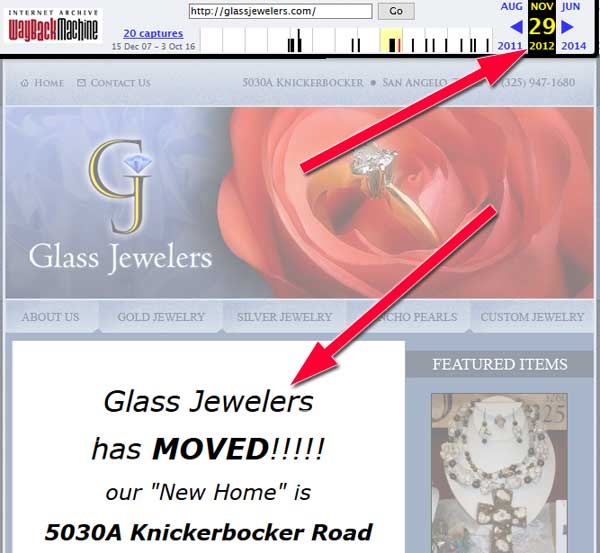
According to web.archive.org, this website was last updated on November 29, 2012. As of this writing, that's almost 4 years ago. Not only is the website outdated, but I also discovered that the storefront photo you see in my first screen shot above is from their old store location.
I do like when retail stores show a storefront photo on their website. Good places include the home page, about us page, contact page, and directions page. Any one of those pages is a good choice, but not all of them.
This website has three pages of product information; here's a partial screen grab of what they looked like:
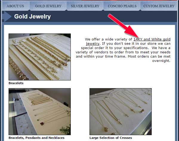
This layout was already out of date when they built this site in 2007. The red arrow in the above screen shot is pointing to a hyperlink to an eBay account that no longer exists. I found a few broken links like that on their product pages.
Assuming this jeweler is still in business, they need to start over with a new website.
Golden Phoenix Jewelry Website
The Golden Phoenix Jewelry website is http://www.goldenphoenixjewelry.com/. This is what it looked like when I visited:
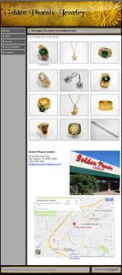
(click to enlarge)
This website has a static 970 pixel width and a copyright from 2011. Once again, these are clear hints that this website hasn't been updated in a whle.
They poorly planned the information layout of this website. A good website is usually designed to provide a little information on the first few pages with links for people to dig deeper for more details. A website should not repeat information from one page to the next.
What you see on the Golden Phoenix homepage is the same information found on the Gallery page and the Contact Us page. They could simply delete those other two pages and not lose anything off their website.
The 12 products shown in the above screen grab offer little value; only one has a brief description. The photos are nice to look at when you click to enlarge them, but they don't help a potential customer understand what types of jewelry this store sells. Six of the 12 photos have green gemstones, which might make someone believe that this store primarily sells emerald gemstone jewelry.
The website doesn't specifically say that they sell diamonds or engagement rings, but they have an educational page on "The 5 Cs" of diamonds. Their 5th C is for "Cost." Here's how they explain it: "Cost is definitely something to consider while looking at diamonds." I find it a little odd that they included Cost as their 5th C. I don't think that makes for a good sales pitch at all.
Most of the older websites I find do not have invitations to join a mailing list. Customers will only sign up for your newsletter if you offer something of value. The newsletter page on Golden Phoenix say "Join the Golden Phoenix Jewelry Mailing List for occasional updates on new arrivals. Please be sure and check your email to confirm your subscription." I tried signing up for their email list to see if it would work, but I never received their sign-up confirmation. I assume they stopped paying for that service years ago and just left it on their website.
Assuming this jeweler is still in business, they need to start over with a new website.
Design and Hosted by Mediajaw
I found it interesting that two jewelers in the same town had their website created by the same web developer, Mediajaw. These older websites are a poor reflection on the capabilities of Mediajaw, especially since their website looks modern (http://www.mediajaw.com/).
I have a feeling that Mediajaw has offered website upgrades to Glass Jewelers and Golden Phoenix several times over the years, and those offers were probably shot down as a waste of money rather than a necessary enhancement of their online marketing.
Like I said, both of these websites need to be redesigned from scratch.
Fading Away
Both of these websites are suffering from the same problem: abandonment.
I use the Wayback Machine website to check the age of a website, but Google keeps a record of the last time your website was updated. Your website will slip in ranking as it ages. Old websites like these would have a very tough time getting to the first page of search results without a lot of work, and several regular updates.
Businesses in rural areas have a better change to rank highly simply because there are fewer competing businesses. When it comes to larger communities and urban centers, Google pays a lot of attention to the recent updates to a website.
No matter how good your website is today, no matter how good the ranking is, your ranking will fade away shortly after you stop updating it.
That's it for this week; I'll see you next time...
FTC Notice: I randomly choose this website and won't be telling the retailer jeweler that I'm giving them these flop fix ideas. Unless someone else tells them, they will only find out about this Nugget if they use Google Alerts or examine their Google Analytics and Google Search Console. I'm not doing this to solicit business from them, but rather as an educational exercise for everyone. This #FridayFlopFix is completely impartial and all my comments are based on previous experience in my website design and marketing agency, and from my personal research data.


