
Every Friday, I venture out into the unknown to find a website that needs some help; I call them flops that could use some fixing. My hope is that you, the reader, will be able to learn a thing or two from someone else's mistakes, so that's what I look for.
This week I searched Google for the phrase "jewelers in Chapel Hill NC," and got these results:
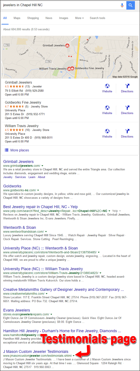
Because my goal is to find underperforming websites, I immediately jumped to the bottom of the first page. The listing for J Mason Custom Jewelers caught my eye because it's a testimonials page rather than their home page.
Here's a good rule of thumb for how local businesses are listed in Google: A business home page should always come up on the first page of Google when searching for your business category. In this case, I searched for the business category "jeweler," but Google returned the testimonials page for this site. That's a sure sign that something is wrong with their search engine optimization.
Let's investigate J Mason Custom Jeweler and their website:
http://www.jmasoncustomjeweler.com/
First Impressions
This is what the home page looked like when I visited:
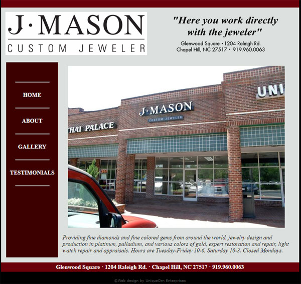
The large storefront image you see on the home page was part of an 11 photo slideshow. Time and time again these slide shows, also known as sliders, have proven to either increase the bounce rate of the home page, or customers just click past them.
The time you spend setting up these sliders is a waste of your own time, because customers don't usually wait around for the entire slide show to finish.
As you can see in the above screen shot, this website has only 4 pages: Home, About, Gallery, Testimonials. As it turns out, the Testimonials page has the most text on it, which is probably why Google included it in the SERP.
This design is extremely old looking. If I had to guess, I'd carbon date this website back to the mid 90's, but according to web.archive.org it was launched on December 12, 2010, and hasn't been updated since.
Another oddity I noticed was that the pages are "shtml" rather than "html" or "php" or something else more modern. That shtml file extension was the original way to program the internet back in the early 90's, which is why I guessed a carbon date back then.
There's nothing wrong with using shtml as a file extension; it's just very old school when there are plenty of better options available today.
Upon close inspection of the source code, I notice that the site is written in HTML 3.2 and was created by the old Netscape 4.0b5 website editor on Windows 95. Perhaps my guess was right, and this was originally created in the 90's. I will further guess that this website was using a different domain name when it originally launched in the 90's.
Testimonials Page
Google likes to read the words you have on your website. The more words you have, the better chance Google will have of understanding what kind of business you are, the services you offer, and the products you sell.
The word count on the J Mason home page is only 40. The word count on the About page is 60. The Gallery page has 310 words. The Testimonials page comes in with a word count of 1050, making it the best possible place for Google to learn about this business.
Here's a partial screen shot of the first few testimonials:
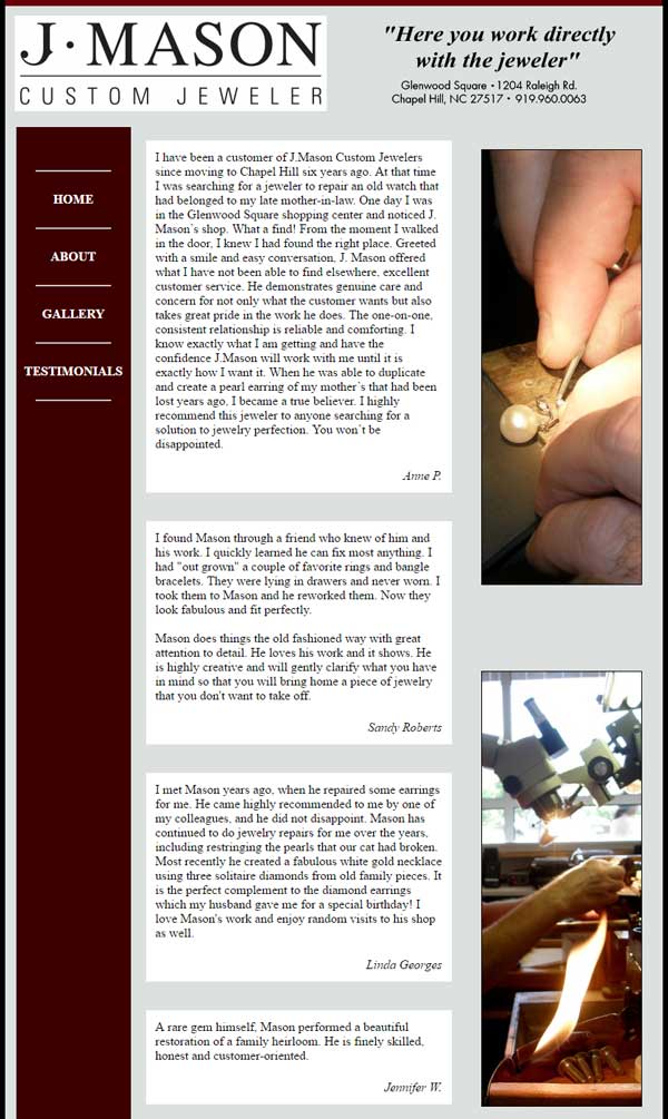
It's through these testimonials that Google figured out that J Mason was a jeweler, and thus included it in the SERP for Chapel Hill. In all likelihood, if not for this testimonials page, the J Mason website would appear on the 2nd or 3rd page of the Google SERP.
This is actually a good example of why you should have customer testimonials on your website. Testimonials are a good source of unique content, written about your store from someone else's point of view. Oftentimes a testimonial will include details about your service that you might not otherwise think to include on your website.
I recommend that all businesses have a way to collect customer testimonials and display them on the site like this.
Gallery Page
The Gallery page shows several photos of the custom jewelry created at J Mason. I'm a big critic of jewelry photography, but I was pleasantly surprised by the photography on this page because they captured a good depth of field and fine detail of all the jewelry.
Here's a screen grab from the top of their Gallery page:
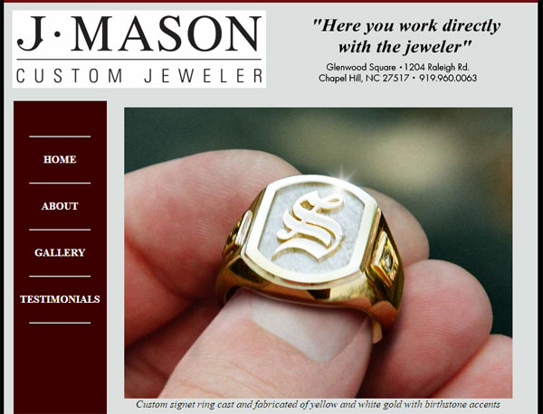
Even though the photos looked good, I did notice that all the photos seemed to have a slight grainy quality to them. That graininess usually comes from color correcting or unsharpening during a photo editing process, but these photos don't look Photoshopped.
That graininess also happens when you scan a printed photo. Considering I dated this website back to the mid 90s, I can't help but wonder if these photos were shot on a 30mm film SLR and then scanned for the website. Digital cameras were not affordable until 2001 and even then most people didn't start buying digital cameras until about 2004.
J Mason should update this gallery page with some of their latest work.
I also noticed that all the photos have useless filenames. This ring has the file name "ss43.jpg:"
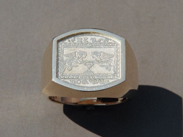
I'm guessing that SS43 means "sterling silver item number 43." Remember that Google is looking to read words on your site, and filenames are included in the words that they read. This photo would have a lot more SEO value if it's name was "sterling-silver-signet-ring.jpg."
Another thing I like about this Gallery page is that they included captions below every photo. All too often, I find jewelry websites that just show photos and leave you guessing on what you're looking at.
The caption for this SS43 ring says "Handmade in yellow gold with precision milled die pattern". Apparently my guessing that this is sterling silver is wrong. Although the ring looks silver, it's supposed to be yellow gold.
Although J Mason does have captions for every gallery image, they slightly missed the mark with how they wrote those captions. Although it's obvious that the above SS43 photo is a ring, the caption doesn't say so; therefore Google has no idea what that photo is.
A better caption would be "Handmade signet ring in yellow gold with precision milled die pattern" The extra two words, "signet ring" would be just enough to tell Google what it needs to know.
All of the captions on this page should be rewritten to include the basic jewelry description of ring, pendant, necklace, or bracelet.
Closing Thoughts
I will give J Mason some accolades for building their first website in the mid 90's some time. That's the stone age era of the internet. They had the chance to build upon it and have something amazing by now.
Sadly, it's 20 years later and they have the same website. It's time for them to start over from scratch.
I could have easily chosen a different website for today's review, but I felt the example of the testimonials page and the gallery image filesnames and captions was good to present as a case study. Both are good takeaways.
I'll see you next time...
FTC Notice: I randomly choose this website and won't be telling the retailer jeweler that I'm giving them these flop fix ideas. Unless someone else tells them, they will only find out about this Nugget if they use Google Alerts or examine their Google Analytics and Google Search Console. I'm not doing this to solicit business from them, but rather as an educational exercise for everyone. This #FridayFlopFix is completely impartial and all my comments are based on previous experience in my website design and marketing agency, and from my personal research data.


