
Welcome to my weekly website review. Every Friday, I randomly look for a jewelry store website that has a few problems, that I call flops, and then I suggest ways to fix them. These short website reviews are not meant for the store itself but rather you, the reader. My hope is that you will discover something here that you also need to fix on your own site.
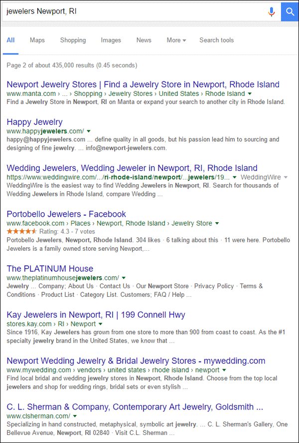
This week I used the phrase "jewelers Newport, RI" to search for my review candidate. Instead of choosing a jewelry store from the first page of the Google results, I dug into page 2 of the results to look for a candidate. These were the top page 2 results:
Let's take a look at Happy Jewelers and their website http://www.happyjewelers.com/.
First Impressions
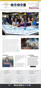
This is what the home page looked like when I first visited:
(click to enlarge)
I chose this website because several things on their home page jumped out at me. I the description in the Google SERP was quite pitiful, which usually means their SEO is bad. The first thing I saw on the home page was the outdated social networking icons, and then I got annoyed by the different height slider images.
There's an image on the home page that looks like a video. When clicking it, I was sent to their Instagram page instead of a video. Not good!
Three issues I noticed right away in their footer were the mention of Memorial Day store hours when it's now July, an email address with a different domain name (info@newport-jewelers.com), and the copyright notice of 2015 when it's now 2016.
These were just the first few things that got my attention on this site. I'll break each one down in detail...
Bad Google SERP
Here's a close-up of the bad Google SERP for Happy Jewelers:

This is an example of a page description that Google randomly generated based on the search phrase. Google auto-generates the descriptions when your own meta description is missing or doesn't accurately represent the content on the page. In this case, it's the former, and that's the real problem with the SEO on this site.
None of the pages I looked at had a meta description, which is really sad because WordPress has a lot of good SEO plugins that will do most of the work for you. My recommendation is to install the Yoast SEO plugin. I've used it a few times and liked it.
The Yoast SEO plugin will guide you on the correct format and word usage for your meta descriptions and the content you have on every page.
Even if they install the Yoast plugin, there's no guarantee that Google will stop making up those page descriptions. You see, Google is trying to be helpful by analyzing the search phrase, matching it with the written content on a page, and then cross referencing the meta description. They rewrite the meta description whenever they feel that your description isn't good enough to lead someone to your page.
Outdated Social Networking Icons
Not a day goes by where I don't come across a website that is using depreciated social media icons. Facebook, Twitter, and Google+ have changed their logos and corresponding icons several times in the past few years. Yelp, YouTube, and most recently Instagram have also gone through reinventions of their look.
All 7 of the social media icons in the header of Happy Jewelers are outdated as shown here:
They should look like this:
It might seem innocuous, but attention to small details like this will be more inviting for website visitors. While all the old logos are still quite familiar to most people, these older icons make the website look old, which translates to out of date.
While I'm on the topic of social media I quickly checked all of these accounts. Putting social icons in your header is a way to tell people that you update your social media regularly and have good information out there that they should look at.
Let's see if Happy Jewelers is keeping up to date...
Instagram:
As of this writing, their most recent photo upload was 7 hours ago. That's pretty good!
Google+:
Their most recent post on Google+ was February 14, 2014; and prior to that they posted on September 10, 2013. They should remove this Google+ icon or move it to the footer since they don't update this network often.
Pinterest:
They have 11 boards with 365 pins as of this writing. Many of the photos saved to their account were pinned from their Yelp account, but they really flopped here!
First of all, they should not be pinning photos from Yelp, they should be pinning photos from their website.
Second, they were logged into their Yelp For Business account when they pinned these photos. This is a problem because every one of these Yelp-pinned images links to the website http://biz.yelp.com, and therefore every image you click jumps you to the Yelp business login screen instead of the pretty picture.
To fix this, they would have to delete all their existing pins and re-pin them again from their website.
Facebook:
Most of the Facebook posts to their account over the last few weeks were shared from their Instagram account. It looks like all of their Instagram photos are also cross-posted to Facebook, a strategy I do not recommend.
On Instagram, they are also using too many hashtags that look very bad when cross-posted to Facebook. Overusing direct feeds from one social network to another never looks good. The solution here is to reorganize their time so they post some things directly to Facebook rather than posting them to Instagram all the time.
Twitter:
Their approach to Twitter is all wrong. Although they tweet several times every day, they are cross-posting from Instagram, Constant Contact, or some other service. Twitter best uses hashtags to gain attention, but those cross-posts don't include any.
They need to fix this by tweeting directly.
Yelp:
They had a paid Yelp account at the time of this writing. They have 182 photos posted in their account; those same photos that I already mentioned were incorrectly pinned to Pinterest. Yelp really isn't the right network to post photos. That system just isn't suited for more than 30 photos. The rest just get lost and people never see them. It's better to post photos to Google+, Facebook, and directly to Pinterest.
They are also using the Yelp paid ad right now that looks like this:

I have nothing bad or good to say about the paid Yelp service. My general opinion is that all paid marketing brings in potential customers, you just need to track the ROI and reevaluate the success on a regular basis.
YouTube:
As of this writing, it was 10 months ago when they last uploaded a video. It looks like they only use their YouTube account for promotions and contest announcements. They should rethink this strategy. A lot of people go to YouTube for how-to videos, so why not create a series of different jewelry care videos and upload them to keep this account fresh and active?
Different Height Slider Images
Let me first say that you shouldn't bother with slider images on your home page anyway, but if you must copy what all the popular kids are doing then at least use uniform sized images.
They have 5 slider images on their home page, each with a different image height that you can see in this home page composite I created:

I've drawn a red line to mark the tallest image and I filled in red blocks to show the different heights.
As the slider images changes the entire height of the page changes and the text moves. It's extremely annoying to be reading a paragraph and suddenly it scrolls up or down on its own. This makes people lose their place as they read and should be avoided.
The fix here is to resize and crop all the slider images to be the same height and width.
Holiday Notices
The footer of their website includes the address, phone number, and contact email for each of their 3 locations.
They also have the store hours listed for the Newport location with a message saying "CLOSED TODAY OBSERVING MEMORIAL DAY" that you can see here:
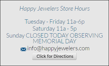
I feel it's very important to include your regular store hours on your website wherever people may look for them. It's also important to correctly manage your special store hours, but in their case it looks like they forgot.
This holiday message wouldn't bother me so much if it said Independence Day, which was just a few days ago as of this writing, but Memorial day was more than 2 months ago now.
Changing Your Domain
Another oddity I found in their footer was a different domain name being used by their factory location that you can see here:
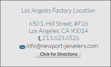
From what I can tell, they once used newport-jewelers.com as their domain name instead of happyjewelers.com. The newport-jewelers.com brings up the same Happy Jewelers website, which is a bad configuration for a website.
Pointing 2 or more domains at a website can create duplicate content and confuse the search engines. This could cause ranking penalties.
Instead, the better approach here is to use the newport-jewelers.com domain in some local offline marketing and track the response rate to people typing that domain directly into the browser.
Copyright Notices
The last flop found on the home page is the copyright all the way down at the bottom. It still says 2015. The copyright notice isn't something you should have to manually update every year. There are plenty of programming trick that will change that copyright date automatically.
Every time I see old copyright notices, I can't help wonder if they truly haven't updated their website since that previous year. These old copyright notices are also a hint to savvy website visitors that your website might be out of date.
WordPress and WooCommerce
This website was built with WordPress and a slightly customized WooCommerce plugin.
None of the products I looked at in the catalog had an "Add To Cart" button which makes me think their shopping cart is not active. It looks like they are using the website to display the product they carry in the store.
I'm a big believer in managing an online product catalog to show customers what's available in your store, and I believe that all jewelers will need ecommerce to simply stay in business.
However, don't trick people into thinking that you have ecommerce active when you actually don't.
With a quick glance at the Happy Jewelers website, you would assume that you can place an order online because of the shopping cart icon in the top right corner of the screen. You can see it here:
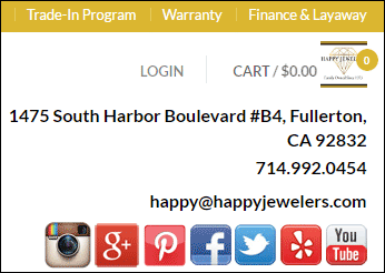
The login link also suggests that you can create an account, login, and maybe even create an online wish list, but none of that works.
As a general rule of thumb, unless you have an active ecommerce system to sell online, do not show the shopping cart icon on your site.
Conclusions
This website needs a little work to bring it back up to normal speed. Although their product catalog setup is pretty good, I didn't mention a few issues I found in there too.
Ecommerce and online interactive customer accounts are the future of the jewelry industry. Other industries are further ahead and meeting customer online expectations.
To help you with your own ecommerce, I published a 7-part video series on the topic. The information in this presentation should be actionable until at least 2020. Watch it here: https://youtu.be/Zj40eSa3hfA
That's it for now; I'll see you next time...
FTC Notice: I randomly choose this website and won't be telling the retailer jeweler that I'm giving them these flop fix ideas. Unless someone else tells them, they will only find out about this Nugget if they use Google Alerts or examine their Google Analytics and Google Search Console. I'm not doing this to solicit business from them, but rather as an educational exercise for everyone. This #FridayFlopFix is completely impartial and all my comments are based on previous experience in my website design and marketing agency, and from my personal research data.


