
What's good and what's bad? What works and what doesn't work? This is what I try to reveal every Friday as I work through my Flop Fix website reviews. I always start them with a Google search in a random town around the U.S. in search of an independent retail jeweler that could use a little help while also allowing me to publically explain what can be learned from their mistakes.
This week, I began my search for "jewelers Honesdale, PA" and saw these results:
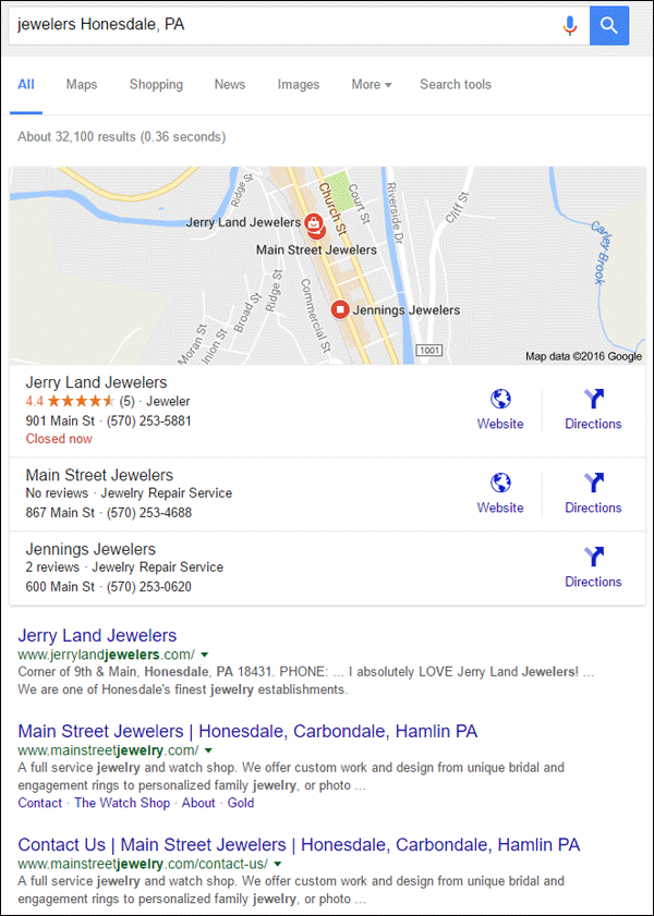
Honesdale, PA is a small town with limited number of jewelers. Several pages of the search results were filled with links to different online properties connected to Jerry Land Jewelers, which appears in 1st place in the above screen grab.
I usually like to skip the 1st place winners, but this for this week I'm glad I took a look, because their website does need some work.
Take a look at the Jerry Land Jewelers website here:
http://www.jerrylandjewelers.com/
First Impressions
This is what the home page of the website looked like when I first visited:

(click to enlarge)
This home page is very cluttered with small text, several boxes, and a header with so many options that it's more likely to confuse a visitor instead of helping them make the right choice.
It's so confusing that I'm not even sure where to click first. The top menu has 13 choices when it should be limited to 5 or 6 at most. I also noticed that the top menu has links for Services, Watch Repair, Gold Buying, Antique Restoration, Our History, and Contact Us which are also repeated in the footer of the page.
Instead of trying to cram all your links in the top navigation menu, keep only the most important at the top and put the rest in a sub menu or in the footer. While you might think that having a lot of navigation choices provides good options for customers, that method often backfires. Having too many choices in any navigation area is more likely to cause confusion and higher bounce rates than help people find what they are looking for.
Unsatisfying Pages
Take a close look at this next screen shot. It shows the top menu with links for "Let's Shop!!! | eBay Store | Emotion Diamonds | Diamond Inventory"

Take notice how the link for their Home page is oddly placed in the middle of the menu. I have a feeling that they inserted links at the beginning of the navigation each time they tried expanding their website. Let's take a look at each of these expanded pages...
Let's Shop!!!
I'm not sure what this page was supposed to be, but it was completely blank when I looked at it, see:
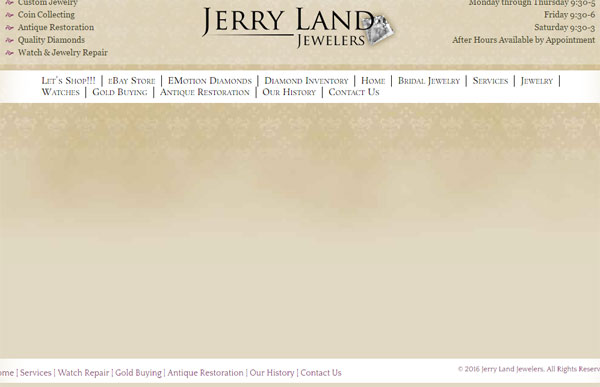
I expected it to be a product catalog of some type, but found an empty page instead. This is the first link on their menu and anyone clicking it is likely to be annoyed and unsatisfied.
eBay Store
I expected the link for their eBay Store to either lead directly to eBay or show the items they have on eBay, but this is what I saw instead:

There you see a link to their Testimonials page and a large hero graphic, but nothing about eBay at all. Not even a link to eBay.
My expectation was to visit an ebay store, but my hopes were squashed.
Emotion Diamonds
After two disappointing pages my emotions are a little down already, so I'm hoping the Emotion Diamond page won't disappoint...
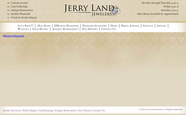
Skunked again!
The Emotion Diamonds page is empty except for a link that also says "Emotion Diamonds." There's really no need for a redundant link on this page. They should have linked the top menu directly instead of setting up this interstitial page.
That link leads to a completely different website run by Ashi Diamonds, the makers of the Emotion Diamonds line. Here's a screen shot of that home page:

The Emotion Diamonds website is a template website that Ashi builds for any jeweler that wants it. The inventory is built into the site and Ashi populates the pages with the store's appropriate information to create this parallel website.
This Ashi website has a shopping cart which makes you believe you can order online. However, when you start working through the checkout screens it tells you to call the store to finalize your payment. This contradicts the whole reason to have a shopping cart in the first place.
More and more retail jewelers are starting to set up online catalogs of their own inventory, but it's taking a while for the industry to catch on In the mean time, there have been several large vendors, like Ashi, that have created their own micro website systems for jewelers to use. I view these micro sites as a stop-gap measure that should only be used while the jeweler gets ready to launch their own ecommerce site.
Although large vendors understand the need to create online experiences for jewelry buyers, retail jewelers haven't fully embraced these new ideas. These micro sites help the vendors but not the retailers. Unfortunately, there are too many retail jewelers that feel these micro sites are all they need, but they are wrong. In the long run, the continual use of these micro sites will decrease sales, not increase it.
Diamond Inventory
Many retail jewelers have diamond inventory widgets embedded onto their website. All of the loose diamond dealers I know have online diamond search scripts that are designed to be embedded into a website. That's what I expected to see on the Jerry Land diamond page, this is what I got instead...
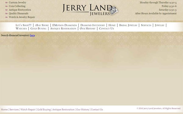
Once again, it's another blank page with another link somewhere else. Clicking the link brings us to this page:
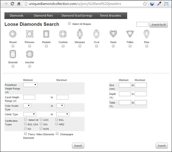
This page IS the diamond search widget that should be embedded within the Jerry Land website. The loose diamond vendors are usually very good at providing directions to embed these widgets into the website so there's no reason for this incorrect setup.
Other Issues
Clicking around the site, I found several other issues that contribute to the overall bad experience that someone will have navigating their website.
The Bridal Jewelry page has another link to the I Do Collection website, which is another Ashi micro site.
Then on the Services page I found a link that says "Click here for all our watch repair services" that is broken. It points to http://jerryland.gxedev.com/watch-repair/which was probably the development address for the website. Mistakes like this are common when no one reviews every page of a site immediately after launch.
The Watches & Repairs page has a link to the Bulova and Belair websites. Both links look like they originally lead to a retailer specific landing page for authorized watch dealers, but both of those links now lead to the home page of those sites instead. Off-site links like this are always tricky to maintain. I suggest that someone click around a website at least once per month in search of potentially broken links that need updating. Customers do click these links, which leads to more disappointment.
Today's Summary
The Jerry Land Jewelers website has several usability issues. From small text to misleading pages and even broken off-site links, this site is sure to annoy most users within a minute of their arrival.
According to the Internet Archive WaybackMachine this version of the website was first discovered in March 2013. It's in desperate need of a redesign and a close review of how everything works.
Too many retail jewelers are content with a website they built years ago without every stopping to see if that website is really helping or harming their business.
Just having a website isn't good enough anymore. A few years ago, your customer might have even forgiven you for having a poor website but still come into your store to shop. Now it's more likely that you will be laughed at and not taken seriously because your website is out of date and not user friendly.
The Jerry Land Jewelers website needs a refresh and it needs someone to help them understand that these mistakes are probably hurting their business.
That's it for today's lambasting; I'll see you next time...
FTC Notice: I randomly choose this website and won't be telling the retailer jeweler that I'm giving them these flop fix ideas. Unless someone else tells them, they will only find out about this Nugget if they use Google Alerts or examine their Google Analytics and Google Search Console. I'm not doing this to solicit business from them, but rather as an educational exercise for everyone. This #FridayFlopFix is completely impartial and all my comments are based on previous experience in my website design and marketing agency, and from my personal research data.


