
This is Part 2 of a multi-day Daily Golden Nugget series packed with tactics to help you in your 2015 holiday marketing. The series started yesterday with the overview of 2015 holiday marketing strategies. I'm breaking down each section of that overview into a more detailed Daily Nugget.
Beginning with...
Create a Uniform Branding With Your Ads
Accomplishing wide scale brand recognition isn't easy. Your life goal might be to achieve household name status, but right now you should simply settle for a smaller scale brand recognition that ties your advertising together.
Most small businesses don't plan their marketing to achieve long term recognition of their overall identify. Obviously, the same logo is used everywhere, but it takes a lot more work to build an association with a color, pattern, or even a smell. Even if you haven't thought about branding your full identity, during the holiday season, you can simply concentrate on building a uniform look for all your ads.
A uniform look can be applied to your print ads, emails, social posts, and product photos. This uniform look will help establish a micro ad campaign for the season. To make it work, you'll need to choose fonts, colors, backgrounds, patterns, and the overall composition of the photos and ads.
I've gone through my previous holiday archives to bring you these great examples from the Sundance Catalog.
This is a screen grab from an old email that Sundance sent me:
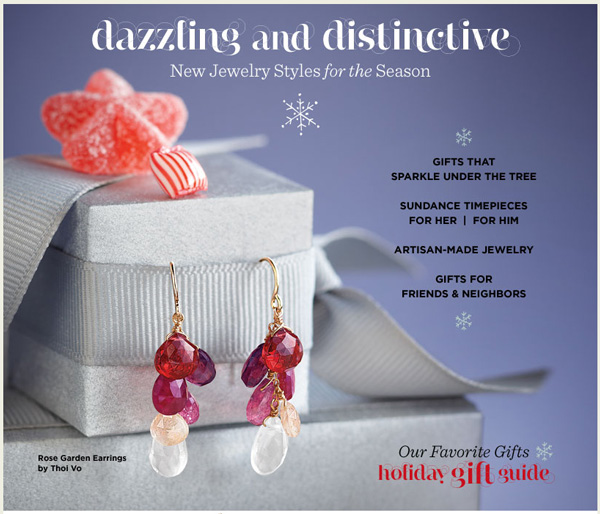
Clicking anywhere in that email brought you to the product catalog page for those earrings shown here:
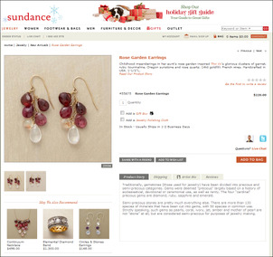
(click to enlarge)
You might not notice the subtle connection between that email and product page on the website. In fact, they didn't modify the product pages too much, other than the "holiday gift guide" header that's at the top of the website.
Here's another email Sundance sent advertising the same earrings along with a matching necklace:
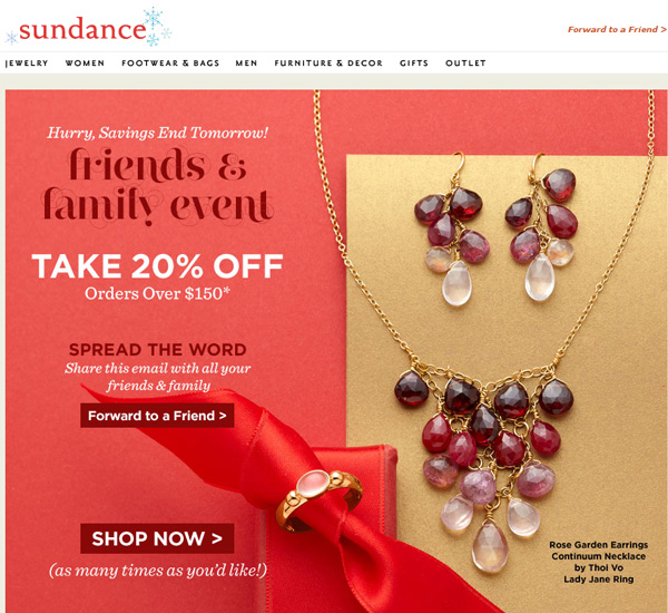
In that email, clicking on the earring took you to the same earring product page you see above. Clicking on the necklace brought you to the product page for that necklace. Also, when you click the big SHOP NOW button you were brought to this jewelry catalog page:
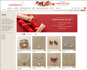
(click to view larger)
The jewelry catalog page maintains the red theme connection introduced in the email. It also maintains the font styles that were unique for the marketing campaign that year.
Notice the red and white candy in the header; that's another design element they used that year. They use that same candy in several jewelry photos throughout their site as a way to unify all their jewelry ads. Look again at the first email screen shot above again, see the candy now? Here's a screen shot of their home page from that same holiday season where you can see the candy canes and the jewelry together:
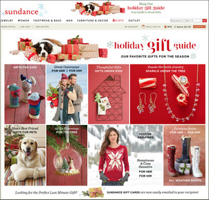
(click to enlarge)
Takeaway points
In case you didn't notice, the email screen shots I show here didn't include any prices; you have to click through to the website to see the pricing information and full descriptions of the jewelry.
Based on these great examples, here are some specific point you should keep in mind:
- The jewelry in the photos are all in focus
- They used different photography for both emails
- They used different photography in the product catalog
- The photography was shot in such a way to allow for sales messages to be added
- Their ads forced the readers focus on the jewelry, not the text
Sundance used their emails and social campaigns that year to introduce new lines of jewelry and gifts without giving away too much information in the ads. All their ads brought people back to their website for more information and pricing. Their website used different photography than what they used in the ads, yet they maintained their color scheme, fonts, and attention grabbing elements.
These techniques help to establish an immediate familiarity between the ad they clicked and the website. In other words, they created a branded theme for their ads.
Perhaps if you rethink your own ads this year, you'll find ways to create a similar focus on the jewelry and drive traffic to your website.


