Welcome to the weekly website review. Normally this is published every Friday, but it got pulled up one day to make room for a special Nugget scheduled for tomorrow.
The goal of this weekly website review is to shed light on how many retail jewelers out there are still using old website techniques, old SEO methods, and old designs. I search a random city in the USA every week for a jeweler and usually select from the top of the organic listing.
In my experience, given the choice between an older looking and never updated website, and a newer site that's mobile compatible and updated often, the latter site will rank higher. It's my hope that retail jewelers will realize the benefit of keeping their website updated, and how easy it would be to gain local search positioning by simply doing this, yet every week I find several retail jewelers that are using 5+ year old websites.
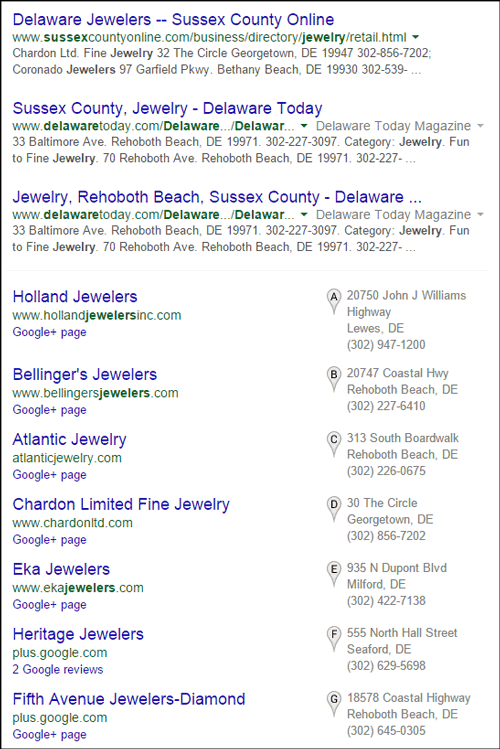
That said, let's dive into this week's review and see what ideas we can get to help improve your own website. I'm using Google Chrome in incognito mode to search for "jewelers Sussex, Delaware." Here's what I see in the results:

The first three organic results are online directories followed by a list of local stores. Because I'm in search of a local store I'll just ignore the three directories, but first let me say a little about them. As part of your local ranking procedure, you need to review how your name, address, and phone number appear in all online directories, even small local directories like this one.
Google aggregates all the online directory information it finds to measure the accuracy of how they show your information in Google Maps. Small things like, St. vs. Street, or phone numbers displayed as (973) 413-8211 one place but 973-413-8211 in another can all cause confidence issues with Google. So make sure to clean up all of your directory listings so they match exactly the same.
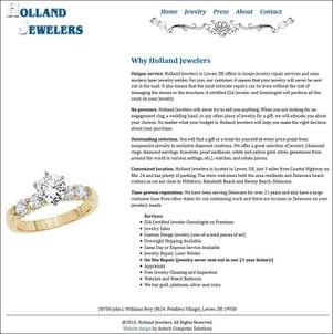
That said, I'm going to choose Holland Jewelers from the Local Pack. Here's their website:
http://www.hollandjewelersinc.com/

(click to enlarge)
This is a very simple 5 page website. The links for the 5 pages are across the top, the left side of each page has a single image in it, and the right side is a large block of text.
A few years ago customers used to ask me for "light and airy looking websites with a lot of open space," and I think this was an attempt at that approach. According to the time stamp on the website, it was launched in April 2012, but I can't help but feel the design predates that by a lot.
Even though a retail jeweler might hire a web designer for a new site, there's no guarantee that the designer is up to date with the latest technology and trends. As a web design company, this is a problem we face too. We always have to watch what's evolving on the internet and offer new ideas to every customer. It's quite challenging to continually reeducate yourself, and many local website designers and programmers will not have the time needed to do that.
One of the ways you can help choose a website designer is by critically looking at their own website. Is it old looking, cluttered, or disorganized? How does it look compared to other website designers you are currently evaluating?
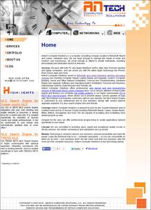
Antech Computer Solutions is the company Holland Jewelers hired to create their simple website. Sadly, the Antech website reminds me of website designs from the early 2000's. Take a look:

(click to view larger)
However, I digress, so let me get back to the Holland Jewelers website...
Website Overview
The website spends a lot of time talking about what they do and why they do it, but it only shows 22 photos of jewelry and it doesn't talk about the experience or emotion with wearing jewelry. From a marketing point of view they talk about a lot of "features," but they don't list any "benefits" of jewelry ownership.
Knowing that the website was launched in April 2011, I see that their Home page and About Us page are misleading. Their home page says they've been in business for 21 years, which I'm assuming is more like 25 years now. Their About Us page says "moved into downtown Rehoboth Beach until just 5 years ago," which I assume is now 9 years ago.
Including phrases like "21 years ago" and "5 years ago" on a website is a bad idea because your website will be out of date next year. The likelihood of you remembering to update the site is slim, and if you do remember, you might not have the time to do it anyway.
The better approach is to simply say "we've been in business since 1990" and "we moved to our current location in 2009."
SEO Issues
First, the page title of their "Press" page says "Untitled Document." This is a sure sign that whoever set up their basic SEO settings didn't finish their job. The other 4 pages of their site have adequate basic SEO settings for the page titles and meta descriptions that would have worked better in 2011 than today.
Even though they have first place Google Local Pack ranking, I'd cut these 5 pages into smaller ones and fine tune the page titles and meta descriptions.
I'd also add more product photos along with descriptions. In fact, I'd ad some of those additional product photos to the home page because that slab of text is boring to look at.
Lastly, they are not tracking their site with Google Analytics. I didn't see the analytics tracking code on their website anywhere. Even though their website's been live for 4 years, they have no data to help them create a new site. Because I track everything, it hurts me to see a jeweler who isn't bothering to track anything.
That's it for this week's review, tune in again next Friday for the next one.
FTC Notice: I randomly choose this website and won't be telling the retailer jeweler that I'm doing a review. Unless someone else tells them, they will only find out about this review if they examine their Google Analytics and Google Webmaster Tools. I'm not doing this to solicit business from them, but rather as an educational exercise for everyone. This review is completely impartial and all my comments are listed in the order that I discovered them.


