
Searching for a website candidate for this week's Friday Flop Fix was a little challenging. I began my search, as usual, looking for a random website candidate in a random city in the United States. My randomly chosen city this week was Orange, CA. My specific Google search phrase was "jewelers Orange, CA" for which I was given the search results you see below.
I've included my commentary in the screen capture:
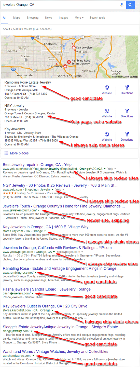
The first site store listed on the page, Rambling Rose Estate Jewelry, would make a good review candidate.
However, I felt there wasn't enough to learn from that site, so I kept looking down the list and came across Pasha Jewelers.
Again, there's not much to learn from their site, so I kept going and I next found Sledge's Estate Jewelry. This is a newer-looking website with a few issues, but focusing a review on it would also be quick.
Lastly, on the Google Page 1 results I found the Watches & Wares website, which also has a newer look with a few small issues.
I've decided to offer a few flop fixes for each of those 4 websites this week.
Rambling Rose Estate Jewelry
The Rambling Rose website is http://www.ramblingrose.net/. This is what it looked like when I visited:
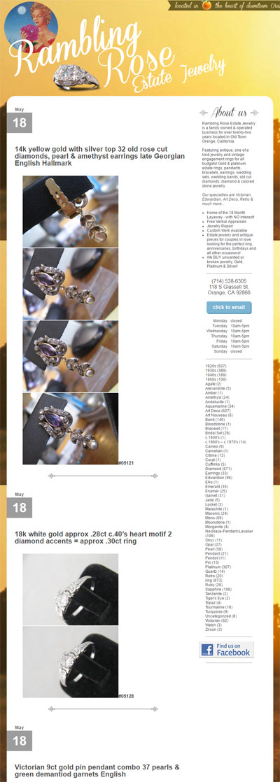
This is a basic WordPress website with frequent updates. Every few days, they add between 1 to 4 new pages to the site.
WordPress allows you to create new pages by setting the title of the page, the description, and assigning a stub (a directory) for the post to appear under. When used correctly, WordPress will match the URL of every page to the title that's assigned. This is a standard SEO tactic, and it's good practice that shouldn't be abused. It looks like Rambling Rose is aware of this SEO tactic and is including their full product descriptions in the title field.
Here's an example of one recent post:
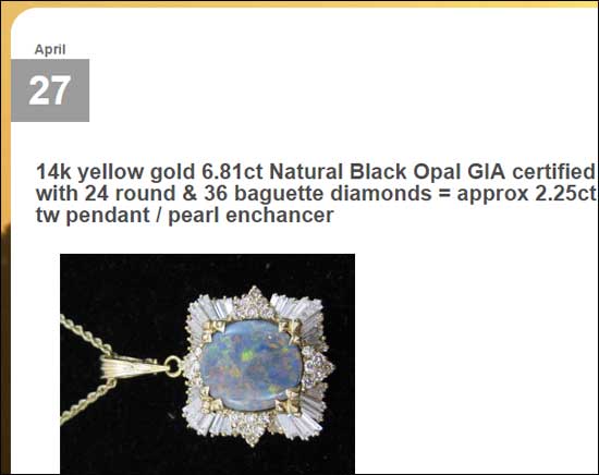
This "pearl enchancer" has this very long URL:
http://www.ramblingrose.net/diamond/14k-yellow-gold-6-81ct-natural-black-opal-gia-certified-with-24-round-36-baguette-diamonds-approx-2-25ct-tw-pendant-pearl-enchancer
I do not like this approach at all, and consider it a flop. The title of a web page should be a simple headline that eludes to the details found on the page. The fix is to move their full description into the body of the page so it appears next to the photos and then write a shorthand headline of the item.
They switched over to this WordPress format back on July 5, 2012 and they have more than 1,030 products on their website now. The navigation on their website is also a flop. The only way to discover all the products is to click through 70 pages of blog posts or click the search keywords found in the right hand column of the site. This is a very user unfriendly website because it requires a lot of time for someone to click and look around.
The fix for this is to create a new navigation menu across the top of the site to make it easier to browse through their product catalog in sections rather than as individual blog posts.
Pasha Jewelers
The Pasha Jewelers website is http://pashajewelers.com/. This is what it looked like when I first visited:
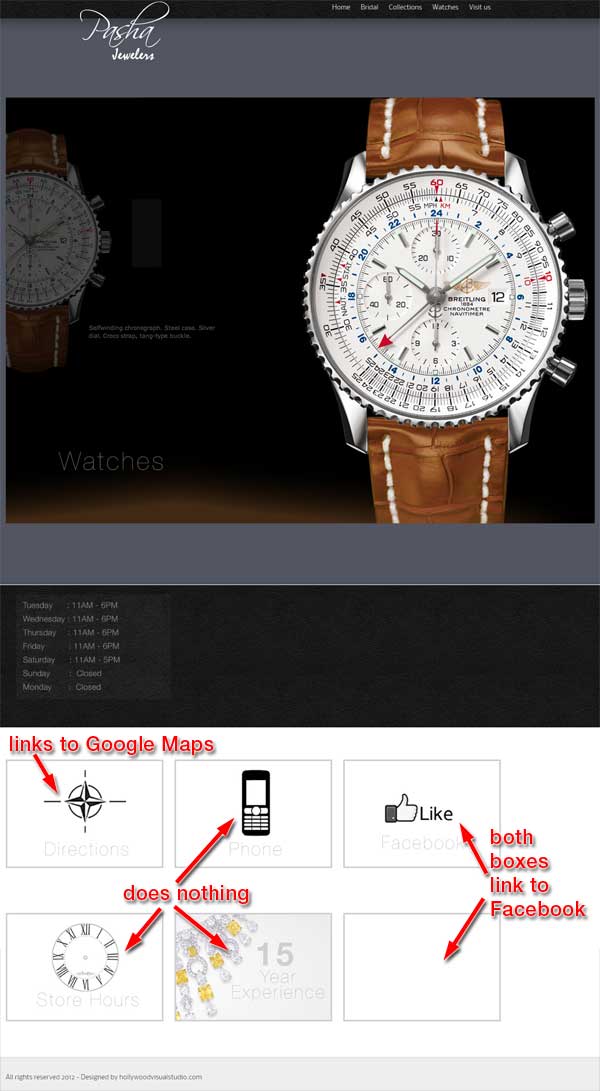
My best guess is that this website is unfinished. It was launched in September 2012 and hasn't been updated since. Three of the boxes at the bottom of the home page do not link to anything and two of them link to their Facebook page.
Their website consists of a home page, bridal page, collections page, watches pages, and a visit us page. Other than the navigation links and the "All rights reserved 2012" text in their footer, there is absolutely no other text on their website. The bridal page has 8 photos on it as shown here:
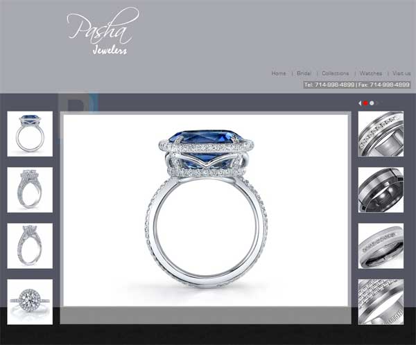
The collections and watches page have the same layout with only 8 photos each.
The overall flop here is that they started their website more than 4 years ago and never finished it. The fix is simple... Get back to work on this. The design could use a little cleaning up, but they have the start of something good here.
Sledge's Estate Jewelry
The Sledge's Estate Jewelry website is http://sledgejewelry.com/. This is what the home page looked like when I visited:
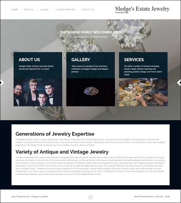
This is another WordPress site that I wouldn't have included in this week's #FridayFlopFix, except I found a bug in their responsive website design of their jewelry gallery page. This is what their product detail pages look like when viewed on a desktop computer:
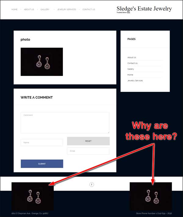
That screen grab shows the product image accidentally appearing two more times in the footer of the website. Here's what it looks like on a smartphone:

The same accidental two photos also appear on the bottom of the responsive mobile version of the page.
This is probably a small flop that they would have noticed on their own if they had fully tested their website. It should be easy enough to fix with a small modification of their website template.
Watches & Wares
The Watches & Wares website is http://watchandwares.com/. This is what it looked like when I visited:
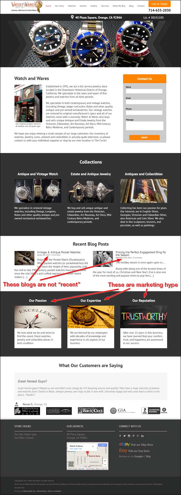
Once again, this is another WordPress website with a responsive design. I'm including them in my #FridayFlopFix because of the content on their home page that I've indicated above.
Specifically, the home page shows an area with their "Recent Blog Posts," but the two blogs listed are now more than 16 months old as of this writing. I consider it a flop to show anything on your home page that isn't current, especially when you are calling it "recent."
The easy fix is to hide this area of the home page until they get back into a routine of adding blog posts to their website.
The other flop I see on their home page is the use of unnecessary marketing hype. They have three sections titles, "Our Passion," "Our Expertise," and "Our Reputation." While the idea of these sections seems plausible, I feel these three traits could be represented as full pages on their website along with photos and video that depict their passion, expertise, and reputation.
The other reason I view this marketing hype as a flop is because I don't feel it adds anything more to the home page than what they already have. I have a feeling they just inserted information into those boxes because their design template had them built in. Those boxes also add a lot of scrolling to the responsive mobile version of the website that they could have avoided.
The fix here is to remove that marketing hype section and add three more pages to their website that would better represent the same messages.
That's it for this week's review; see you next time...
FTC Notice: I randomly choose this website and won't be telling the retailer jeweler that I'm giving them these flop fix ideas. Unless someone else tells them, they will only find out about this Nugget if they use Google Alerts or examine their Google Analytics and Google Search Console. I'm not doing this to solicit business from them, but rather as an educational exercise for everyone. This #FridayFlopFix is completely impartial and all my comments are based on previous experience in my website design and marketing agency, and from my personal research data.


