
Every week, I review the website of a randomly chosen retail jeweler. This week, I searched for "jewelers Ketchikan, AK" to find a review candidate. This type of search always triggers Google local results format, which includes the top three business listings for that area. Google understands that people are usually looking for local businesses whenever a keyword is included along with a town name in a search query. Google then shows results formatted like this:
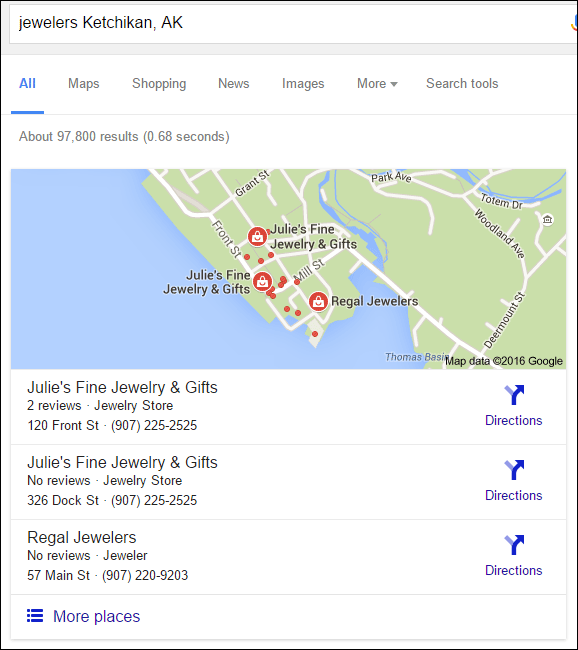
Ketchikan is known as Alaska's 1st city, it also happens to be home to dozens of jewelers. I was surprised with the number of jewelers that appeared in the search results for a city that mostly shuts down during the non-tourist season.
I initially thought the two listings for Julie's Fine Jewelry & Gifts shown in the above screen shot was an accidental duplicate business listing, but it turns out that Julie's has two stores within a 5 minute walk of one another: a smaller store by the pier and a larger store two city blocks inward from the harbor.
With so many competing local businesses, I would expect that they are heavily competing online as well, but it turns out that most of the local jewelers do not have websites at all. Many of the local businesses are seasonal, relying heavily on tourism, and don't feel the need for a website.
According to what I just read about Julie's Fine Jewelry, they are open all year round. It seems to me they could build a website as a way to keep connected with tourist and other locals who only live there part of the year. They could even increase their business with an ecommerce website like so many tourist area jewelers do.
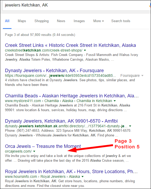
I looked through several websites before choosing today's review candidate. I found a lot of old sites that needed full revamping before I found Orca Jewels. Their website was buried deep on page 3, position 5, as shown here:
Initial impressions
The Orca Jewels website is http://orcajewels.com/
This is what it looked like when I first visited from my desktop computer:
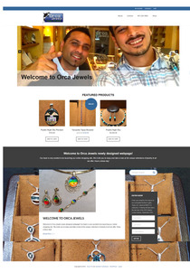
(click to enlarge)
They are using the Envy Pro theme on Wordpress. This is a parallax design that looked very awkward upon first glance. It was awkward because they have very little information on their 10 page website. All the pages of their website can be seen in this one corner screen shot:
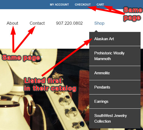
They've placed the Alaskan Art page first in their catalog navigation, which indicates that's their most important page. Here's a desktop screen capture of that page:
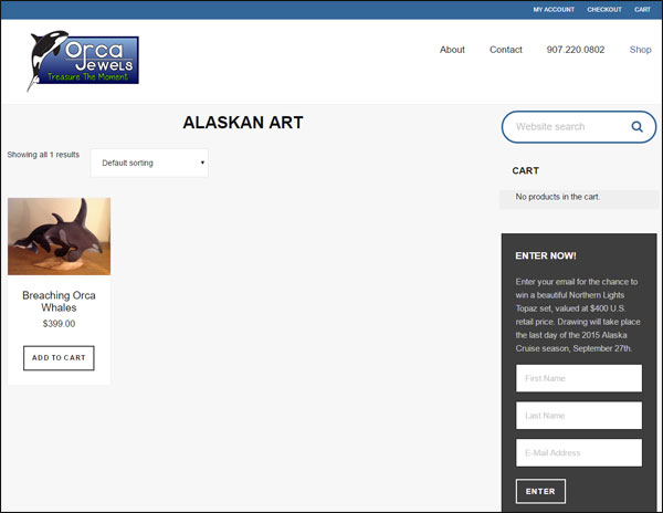
There's a lot of open space on that page, too much in fact, for it to look good on a desktop screen.
My overall first impression of their website is that they flopped and chose the wrong theme, or perhaps they are focusing too much on mobile-friendly design to the exclusion of desktop.
Outdated Contest
With the Alaska Cruise season running from May through September every year, this website should already be updated and awaiting this new season of tourist. Instead, every page of their website has this "Enter Now" contest box:
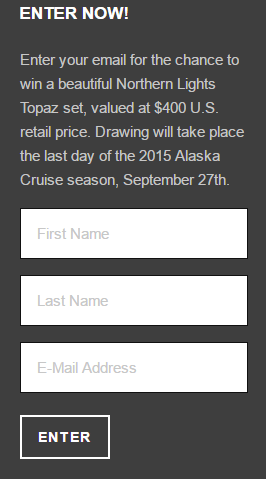
They could fix this small flop by simply changing the date on their signup box. As a marketing tactic, they should have posted the first name and town name of the 2015 winner, along with a photo of the topaz set they gave away.
Mobile Version
This website looks a lot better on a mobile device than it does on a desktop. Here's a snapshot of the home page:
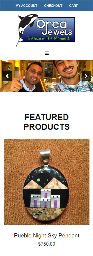
Even the Alaskan Art page looks good on a smartphone:

I have a feeling they tested their website on a smartphone and on small computer screens, perhaps tablets, while they were setting it up. The website doesn't look good on a wide-screen desktop; it looks okay on a tablet, and it looks very good on a smartphone. While it's important to design a website that looks good on mobile, you should still worry about how it looks on a desktop.
Overall Conclusions
From what I can tell, this website design was launched in mid 2015 and hasn't been changed since. They set up a 10-page website when all they really needed was 3 pages: Home, About, Shop. Their current setup organizes their few products into several pages, but it would look a lot better if they were all on a single page like this:
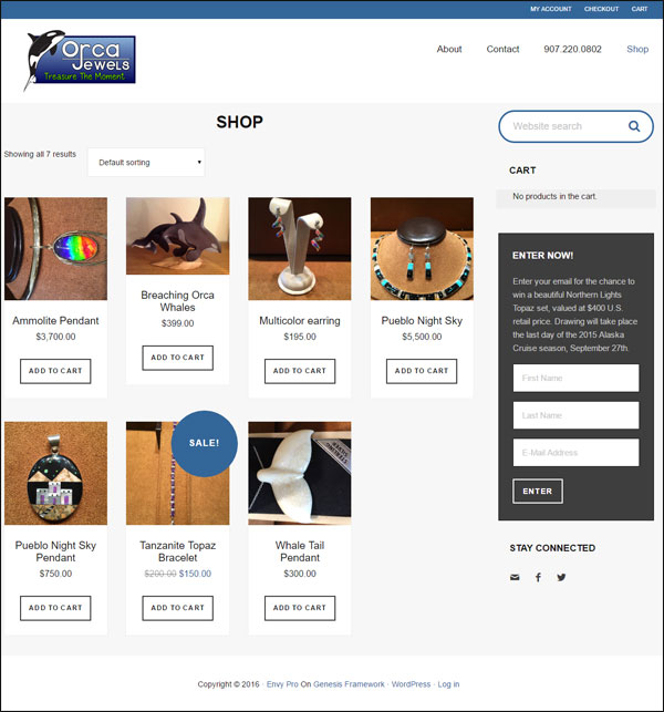
In years past, it was common practice to create all the potential pages that you might want on your website, and then to label them as "under construction." Although Orca Jewels didn't label their pages as under construction, the minimalist content gives the same empty and unfinished feel as the infamous "under construction" message.
The bottom line lesson to learn today is that you should never rush your website building process and therefore you should never build out pages until you have a real need for them. Although these minimalist pages look fine on mobile devices, they have little usefulness on the desktop.
Google wants your website to be both mobile-friendly, user friendly, and loaded with good content. My feeling is that the Orca Jewels website fails all three points, which is why I found it on page 3, position 5 of Google's results.
That's it for now: I'll see you next time...
FTC Notice: I randomly choose this website and won't be telling the retailer jeweler that I'm giving them these flop fix ideas. Unless someone else tells them, they will only find out about this Nugget if they use Google Alerts or examine their Google Analytics and Google Search Console. I'm not doing this to solicit business from them, but rather as an educational exercise for everyone. This #FridayFlopFix is completely impartial and all my comments are based on previous experience in my website design and marketing agency, and from my personal research data.


