 In this edition of the Daily Golden Nugget, I'll show you how to use a scrollmap to help analyze a product page. A scrollmap is a created by monitoring the up and down scrolling of your website visitors to reveal which part of the page are viewed most often. The brightest areas show what users have seen the most, while the darker areas show what has been viewed the least.
Although you can read today's Nugget as a single post about scrollmap usage, this is a continuation of a longer series designed to help you with your 2014 holiday marketing. I'm including all the previous parts in the series below.
Every page of your website will have a unique looking scrollmap. Several website companies provide scrollmapping services; I use CrazyEgg and Mouseflow for mine.
Let me start by showing you what a scrollmap looks like. This is what four of them look like side by side:

As you can see, it's a rainbow of colors from the lightest color (yellow) to the darkest (dark blue). The bright yellow areas show you what area of your web page is viewed most, which, as you can tell, is always the top of the page.
It should make sense that the top of your web page will be viewed the most, since that's how web pages load. Not only will every page of your site will have a unique scrollmap, but it might change during different seasons of the year, especially during the holiday season. Make sure you reset your scrollmapping tracking at around November 15th and then deactivate it around December 25th. This will give you a holiday period measurement that you can use as comparison during the rest of the year.
The CrazyEgg service has a limitation on the number of pages that can be tracked for heatmapping and scrollmaping, and you have to set up the tracking on an individual basis. On the other hand, the Mouseflow company will track all the pages of your site at once for heatmapping and scrollmapping.
Take a look at my review of CrazyEgg and Mouseflow to figure out which one will be best for you.
Other than the holiday season, you should also employ scrollmapping during other promotional periods. They are great for landing pages and product pages.
While looking at a rainbow scrollmap might seem interesting, I'm going to take one of those scrollmaps from above and apply it to a web page so you can see how this is useful as an analysis tool.
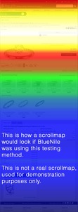
For training purposes, I've grabbed a screen show of one of the products from BlueNile.com and overlain it with a scrollmap. Here's what it looks like:

(click to enlarge)
Imagine that this was a real scrollmap test. The first thing I would notice when analyzing it is that the ring image isn't visible on every computer screen. This is defiantly a problem and I would want to redesign the page to elevate the ring image closer to the top of the page. Of course, with a site the size of BlueNile.comwe would need to review the scrollmaps on many other product pages before committing to that type of layout change.
According to this scrollmap example, it also looks like the price of the ring appears on most computer screens by default. The area in green shows that some people are willing to scroll down enough to see other recommended jewelry, but few people will scroll past that point.
Again, this is only an example, but if this scrollmap were true, it would be very surprising to see how few people bothered to scroll down to the fine ring details.
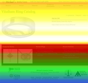
In this next random example, I've applied another scrollmap to a much simpler product detail page of a retail - store.

(click to enlarge)
In this fictitious example, we can see how the product image and simple description all appear in the brightest area of the scrollmap, which means 100% of our website visitors saw the most important details of the page. In fact, this is one of the sites I helped design in early 2014 after some of my own scrollmapping tests. My findings back then showed that the header needed to collapse on the product detail pages in order to squeeze the product image and detail towards the top.
The footer of this site is tall, with links for blog posts and other educational articles. With longer web pages, like the BlueNile example above, most of the page visitors will never bother to scroll to the bottom, and those footer links are lost. But with short pages like this, those links are seen by 75% of all visitors because the page was designed for just that purpose.
When applying the scrollmap to your own site, you need to carefully evaluate what your site visitors are seeing, and what they are missing. You should move the most important product details to the top, into the hot zone. This includes the price, the add-to-cart button, and additional options that will change the look or price of the item. Whatever is necessary to complete the sale should be at the top of the page.
Make sure your special offers, like free shipping, are immediately visible in the hot zone rather than burying it further down the page in the green or blue areas. Offers like free shipping will help close the sale, so they must be out in front.
Other than the product detail pages, you should also apply scrollmapping to your home page, blog pages, and the most popular landing pages of your site. For retail jewelers, it will take a few weeks to capture an accurate scrollmap, but it really does depend on how many people visit your site. Since more people will visit your site during the holiday season you'll be able to get a better understanding of usage much faster.
Scrollmaps are great for analysis; just remember that a map from the holiday season will reflect the shopping usage mentality rather than a normal shopping usage patterns.
Here's the list of previous Daily Nuggets that are part of this holiday 2014 marketing and analysis plan:
1. Selecting the best items for your holiday campaigns..
2. Plan your offline and email marketing.
3. Online marketing strategies.
4. Using domain names for offline tracking.
5. Tracking shared links and domains with UTM variables.
6. Reading Google Analytics Landing Page Reports
7. Reading Google Webmaster Tools Top Pages Report
8. Reading Google Analytics Exit Page Reports


