
This is the #FridayFlopFix website review. The goal of this review is to learn from someone else's mistake by randomly choosing and dissecting a website that has problems, and explain potential fixes. Hopefully there is something we can all learn from.
Websites with mistakes usually don't rank very high in Google, so when I search for review candidates I usually look lower in the SERPs, and even deep within the forbidden-nowhere-zone on Google... Page 2.
This week, I started my search with the phrase "jewelry stores murray, UT" and saw these results on page 2:
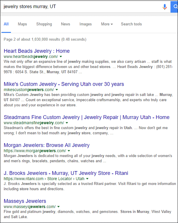
After a quick look at those websites, I'm choosing Mike's Custom Jewelry with the website http://mikescustomjewelers.com/ for this week's review.
First Impressions
This is what the website looked like when I first visited:
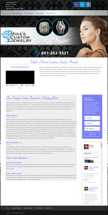
(click to enlarge)
After a quick glance over this page, I can tell that an inexperienced webmaster put the page together. The site uses a simple WordPress theme with inconsistent styling of fonts, character spacing, and white space. Additionally, we all know that jewelers sell products that are beautiful, and that you need beautiful photos to help make that sale. The main photo on the home page is far from beautiful.
Most people don't look at a website the way I look at a site. While I see individual problems, more people will say they don't like the look or feel of a site, but can't articulate why. Here's what I noticed at first glance that could contribute to the overall bad vibe that others might feel...
Blurry Product Photos
Take a look at the two ring photos they included in their home page hero image:
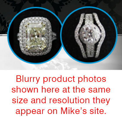
They are both very blurry which doesn't allow you to see the individual diamonds and destroys the beauty of each item.
Too Many Fonts
Professional advertisers and marketing students around the world will tell you that you should a maximum of 2 or 3 fonts in any of your marketing messages, including websites. I prefer to use as few as possible in my own designs, sometimes that's a single font family with multiple styles, and sometimes I choose one font family for the headlines and another for the body text. Over the years, several different online tools have popped up to help designers aesthetically match fonts. My favorite is Google Fonts.
In my own design circles, my friends and I don't talk about fonts any more. It's a dead topic because we all know how to use those online tools to help up correctly match fonts. For sanity's sake, I did a Google search and found out that the topic is pretty cold online too. Most of the articles I found were already more than several years old.
This article from 2012 asks how many fonts is too many on your website?
This article from 2009 gives you how many fonts you should use in your design for brochures and fliers.
Then I found a question on Quora from 2012 which also asked How many different fonts should you use in your website?
In general, all those sources mention that 2 or 3 fonts should be your limit. Here's what I found on Mike's website:
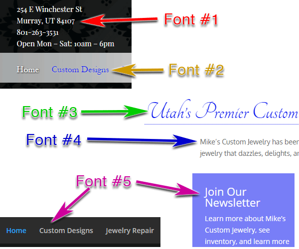
1. Playfair Display - This serif font is used for the store address in the header and as subheadings throughout the pages.
2. Hoefler Text - This serif font in used in the navigation but also used as subheadings throughout the pages.
3. Tangerine - This fancy script font is used in their main headline of their pages.
4. Oxygen - This is the basic sans serif font used in all their body text.
5. Open Sans - This sans serif font is used in the right announcement box and footer text.
I don't usually nit-pick on fonts but this website stood out because the webmaster used Playfair Display as a subheading immediately followed by Hoefler Text for the next subheading. Here's a screen shot of it:
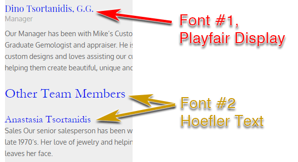
This is the small attention to detail that tells me someone using a WYSIWUG editor has no clue what they are doing.
Poor Use of Spacing
Some areas of their design have a good use of spacing between outer borders and text, while others are too close. Some areas of their design have a consistent use of spacing between the headlines and the body text, while other areas are different.
Here are some examples:
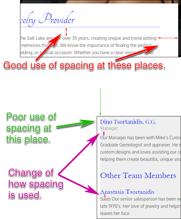
These types of spacing issues are all fixable in their style sheet or in how they use the WordPress WYSIWYG editor. They just need to pay more attention.
Mobile Responsive Site Issues
As is usual for a WordPress theme, their website has a responsive design. This means the content is supposed to shift around and fit nicely on a smartphone.
When I tested Mike's site on my smartphone, it looked like this:
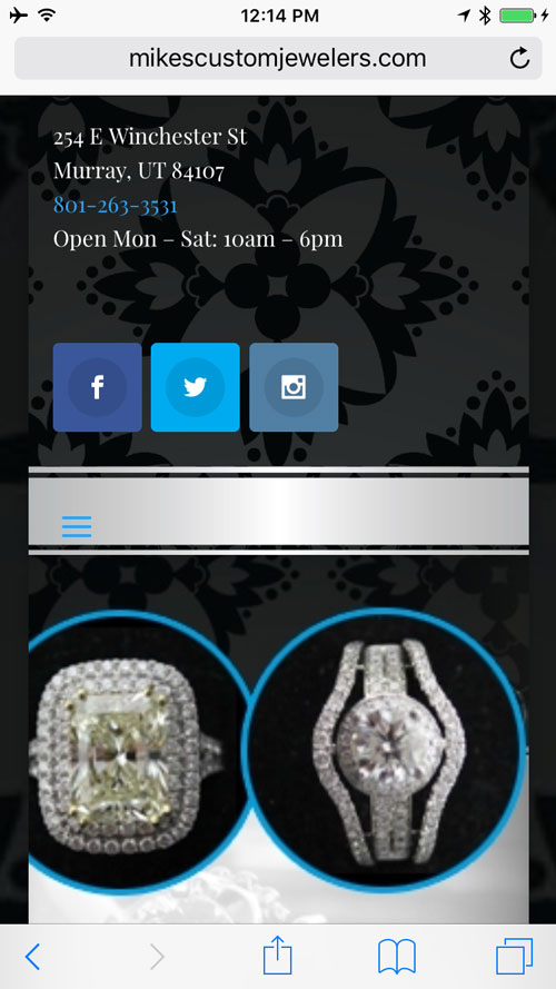
That screen shot is very confusing to look at because all you see is a store address, social icons, and two seemingly out of place (blurry) ring photos. There's no visible store name.
My assumption is that they didn't test their website on a smartphone at all.
It wasn't until I looked at the website on the smartphone that I realized that their store name isn't mentioned anywhere in the header or footer of the website. The address is at the top, but no store name. That's because they are including their store name and logo as part of the main hero image on every page. As you can see in the above smartphone screen capture, that practice backfired on them.
The lesson here is to test your website on mobile.
Lacking Content
Perhaps the most notable reason that Mike's website is on the second page of Google results is simply because it doesn't have any content.
Here's the word count for each of their 4 pages:
Home page - 589 words, 379 of which are employee bios
Custom Jewelry page - 168 words
Jewelry Repair page - 136 words
Testimonials page - 244 words
That's a total word count of 1,137 for the entire website. Additionally, except for the hero graphics at the top of every page, they don't have any other images of any type. No product photos. No close ups showing their previous work. Nothing.
I always suggest a goal of at least 350 words on every page of your website. Naturally that doesn't always work, but it should be the goal that you strive for.
On the other hand, the word count includes more than just the words you see in the web browser. The file names you use for your product images, and the hidden ALT/TITLE text that you apply to images and links is also included in your word count. Once you take that into consideration you'll quickly realize how easy it is to jump up to a 350+ word count for every page.
Mike's could greatly improve their website by adding a library of past work or ideas for customer to choose from for their own custom designs.
Social Media Disaster
Mike's website shows icons for Facebook, Twitter, and Instagram prominently at the top of every page. They also have a Facebook feed box on the home page showing their latest posts.
The week I wrote this review they had updated their Facebook account a few times. However, it doesn't look like their updates are constant at all because, prior to this week, they hadn't posted since Christmas Day before which they hadn't posted since October 19, 2016. They need to post to social media much more often to maintain consumer interest.
Their Twitter account looks abandoned. Here's a screen grab of their one and only tweet from back on December 13, 2015:
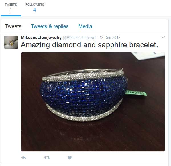
You should never include a social media icon on your website unless you are active in that social network. They should remove the Twitter icon from their header.
The Instagram account is also abandoned. The last time they posted was 66 weeks ago as you can see in this most recent gram as of today:
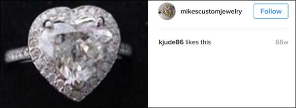
Again, if you don't plan on using the account, hide the icon and don't mention that the account exists. Otherwise you just make yourself look foolish.
Conclusions
Long gone are the days when you had no other choice but to hire a professional website programming company to build your website. About 14 years ago a typical small business website would cost at least $12,000. Ten years ago that price had dropped to about $7000 for a small business website. Today the cost is somewhere between $3000 and $5000 to have a professional company make a website for you.
On the other hand, you can follow all the advertising hype and buy into systems like the free WordPress plan, or Shopify, or GoDaddy's Sitebuilder, or Snap Retail, or SquareSpace, and countless others. All of those systems have easy barriers to entry with attractive low costs and seemingly easy to use interfaces.
What none of them tell you is the free time you usually need to learn those systems is not usually the free time a small business owner has. Then even if you learn how to use those systems, it's likely that you won't understand the requirements for keeping a website up to date, aesthetically pleasing, and user friendly.
In the end, the time you spend trying to build a website on your own, and then choosing to let it sit there unattended, works against your business. The money you lose trying a DIY website solution is more expensive than the $3000-$5000 you would have paid for the website to begin with.
Make smarter choices with your time, your money, your business, and your website. Hire a pro.
That's it for this week; I'll see you next time...
FTC Notice: I randomly choose this website and won't be telling the retailer jeweler that I'm giving them these flop fix ideas. Unless someone else tells them, they will only find out about this Nugget if they use Google Alerts or examine their Google Analytics and Google Search Console. I'm not doing this to solicit business from them, but rather as an educational exercise for everyone. This #FridayFlopFix is completely impartial and all my comments are based on previous experience in my website design and marketing agency, and from my personal research data.


