
For this week's website review, I began my search for a "jewelry store High Point, NC" and got these results from Google:
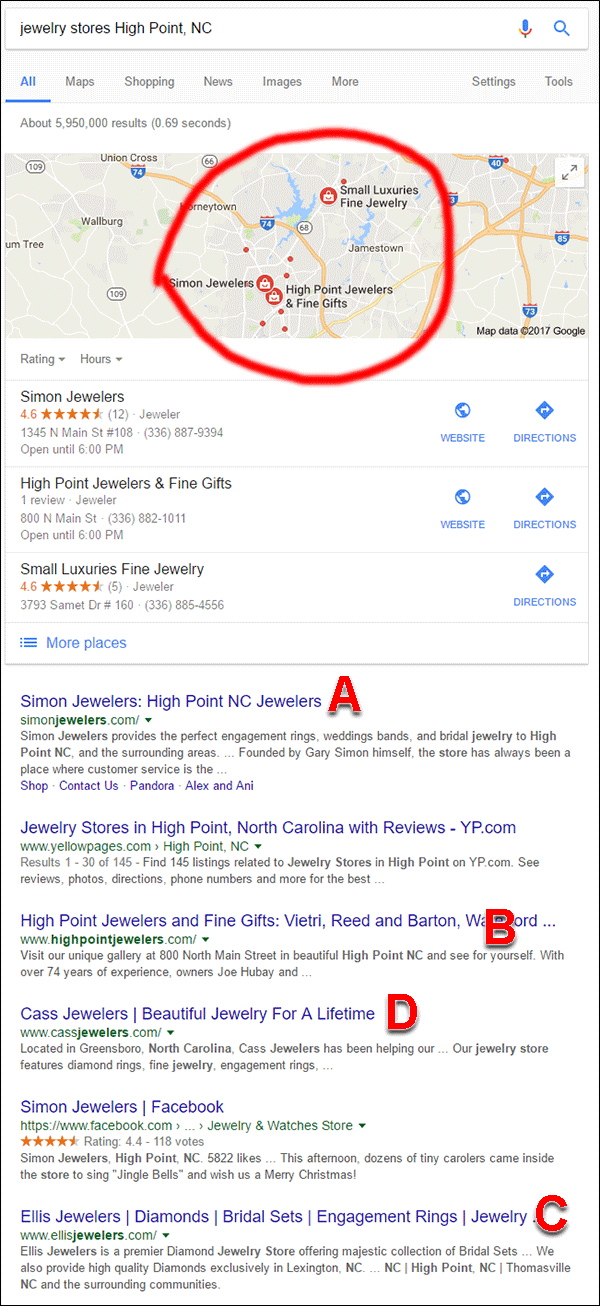
I've circled the map in the above screen shot to point out that there were many more businesses that matched my search criteria, but Google didn't list them in the organic results. I've also labeled 4 of the organic results as follows...
A. Simon Jewelers - They could be an interesting review candidate since the only page they seem to be updating is their Events page. They launched their site in 2013 and it looks like they haven't touched any other part of their site. They may have previously won the Instore Magazine award for America's Coolest Store, but their website certainly doesn't represent it. Check it out here: http://simonjewelers.com/.
On the other hand, I do like that they programmed social widgets in the footer of their site to pull in, and link to, their latest Pinterest, Twitter, Facebook, and Instagram posts. This is refreshing after last week's website that had a similar setup but did not link to their social networks.
B. High Point Jewelers - Although the copyright of this site says 2011, the design looks more like a website from 2001. I found an ecommerce gift registry system hidden on their site that looks like it's from the 1995 internet era. Even though I could spend all day writing about how much this website could be updated, I won't. It's better to just delete it and start over. Check it out if you don't believe me: http://www.highpointjewelers.com/.
C. Ellis Jewelers - This is a vendor (Star Gems) supplied website. All of these Star Gems websites look exactly the same and have looked exactly the same since 2009. I previously wrote about these Star gems websites here and here. I'm not sure why any jeweler is foolish enough to pay for these sites any more. If anyone wants to throw money away like that why aren't they throwing it at me? Check out this site for yourself: http://www.ellisjewelers.com/.
D. Cass Jewelers - This is the review candidate that I'm choosing today. As I started browsing their website, I realized they were located in Greensboro rather than High Point. Considering how many other dots were visible in the Google map that I circled in the above screen shot, I wanted to investigate why Cass Jewelers was appearing 4th in the organic list instead of one of the other High Point jewelers.
Why Don't These Sites Appear in SERPs?
I switched over to Google Maps to investigate how many other jewelry stores would appear in the area of High Point and Greensboro. Here's a screen shot of the map:

I count 19 jewelry related stores on that map. Some of those stores are pawn shops because Google does classify those as jewelry stores, too. Looking closely, I realized that only Simon Jewelers and High Point Jewelers are in High Point. Cass Jewelers is at the top of the map, and Ellis Jewelers is not shown on this map because they are much further south.
So why don't those jewelry stores appear in the organic results? Here's a close-up of part of the map showing some of the stores followed by my thoughts:
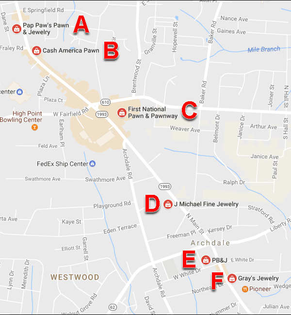
A. Pap Paw's Pawn & Jewelry - No website
B. Cash America Pawn - National chain, but their local website is not known by Google.
C. First National Pawn & Pawnway - No website
D. J Michael Fine Jewelry - No website
E. PB&J - They have a website, but Google didn't find it and they have not claimed their Google page.
F. Gray's Jewelry - No website.
As it turns out, most of the other jewelry related businesses in and around High Point, NC do not have websites, or Google has not yet found their website. That's why the organic search results I saw included Cass Jewelers even though they are about a 30 minute drive from central High Point.
It still surprises me how many small businesses don't yet have websites considering how easy it is to set one up with free services like Weebly and WordPress.
Cass Jewelers - Review and Dissapointments
The Cass Jewelers website is http://www.cassjewelers.com/. Here's what the website looked like when I first visited:
(click to enlarge)
The large image you see at the top of the site is one of those typical hero image sliders. Unlike most other websites that use ugly ads or small product photos, the images they had here were crisp and showed a lot of detail. Good job there.
My satisfaction was quickly deflated when I scrolled down a little and saw the outdated Instagram icon shown here:
Instagram rebranded itself in early 2016 with a new app and all new colors and icons. Although the old icon is still recognizable, it's also a hint that the business does not keep up with the times, and that their website is probably out of date. How useful are out of date websites for customers looking for current information?
This is what the icon should look like as of today:
I decided to check out their Facebook and Instagram accounts to see their last posts. I was disappointed to see that their most recent Facebook post was back on July 27, 2015. That was 18 months ago. Here's the post:
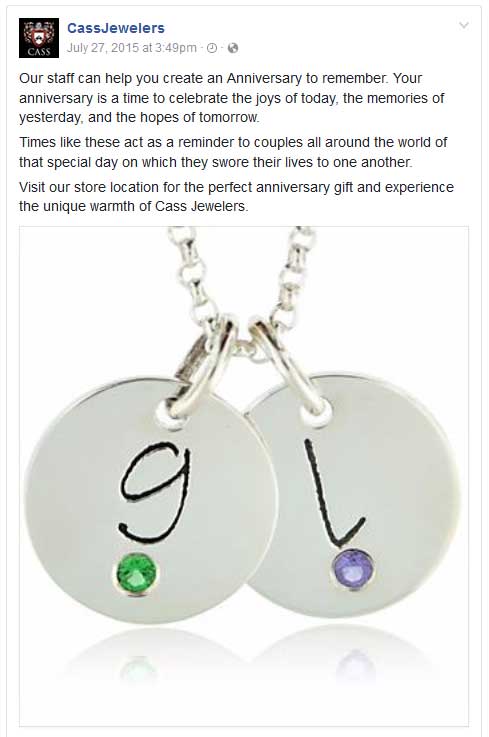
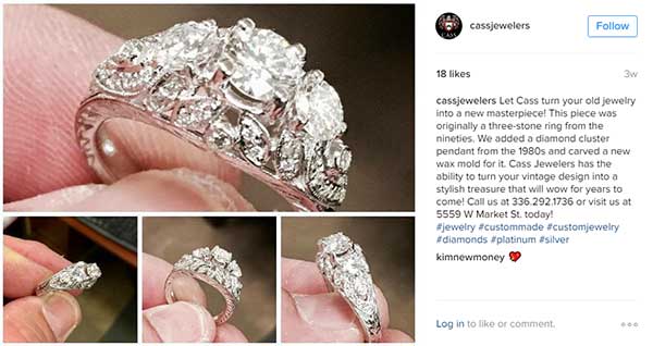
Their most recent Instagram post was only 3 weeks ago, and it looks like they update that account at least once every 5 weeks. Here's the most recent post:
As you can see in the above home page screen grab, there's an area of photos a little further down on the home page. The heading for that section says "Select Jewelry," which made me assume those photos were links into their product catalog. Instead, those images all link to the blog area of their site.
I'm glad to see they have a blog on their site, and that they were updating is on a regular basis for a while. Sadly, their last update was on September 28, 2015. There are two ways to make your blog effective for your website. First, you can either post something new on a regular basis, say, once a month, so Google knows you are always up to date. Second, you can post educational information that will never go out of date.
When using the second approach you should not include a date on your posts because you don't want readers to think the information is old when it's really evergreen.
Considering Cass Jewelers is appearing in the SERPs right now, they might not feel like it's important to keep their website updated. However, that could all change if more of their local competitors started building websites.
Returning back to the image slider at the top of the page, I noticed that a few of the images had "SHOP NOW" buttons shown here:
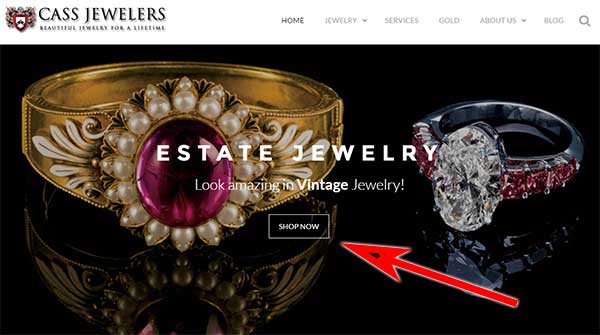
I expected this button would bring me to their online product catalog, but instead it lead to a big disappointment. This is where I was lead to:
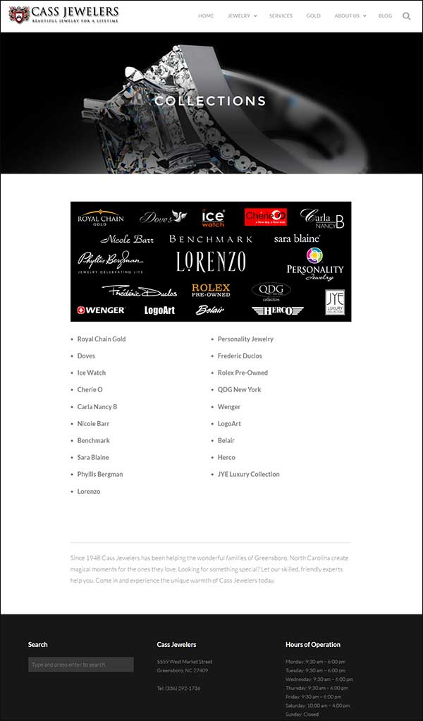
Instead of a product catalog that I could browse through, this page shows a bunch of jewelry designer logos and a bullet point list of designer names. Normally when I find a page like this all the names will be off-site links to the designer websites, which is something I don't recommend either. In this case, they created a dead end page that offers me no value.
Although I see the designer names, I don't know who they are or what types of jewelry they make. I recommend that they create individual pages for each of these designers so they can include some product descriptions on the website. Once they finish making these "designer line" pages they should then add a product catalog to their website so people can browse through their inventory.
Until they add a real catalog to their website, they should remove the "SHOP NOW" button from their home page. I wouldn't have been so disappointed by this page if the button had said something honest, like "VIEW OUR JEWELRY DESIGNERS." The way they have it now is misleading.
Conclusions
Although the unemployment rate in the USA is currently the lowest it's been for many years, small businesses are still struggling to recover from the Great Recession. I see a lot of big businesses spending a lot of effort on learning (and relearning daily) how to use new media for advertising, and how to socially engage with their customers. Consumer opinion matters a lot, and now the internet gives all consumers a platform for their voice to be heard.
If you want to make your business great again, you have to start with a great website. You can't just slap one up and hope it brings in business. You can't abandon it simply because you feel it's working well enough. There's a huge change that's about to emerge in the search engines as they pay more attention to how engaging your website is and how social you are online. Consumers tend to trust other consumers and online reviews before they will trust the advertising and direct solicitations that business pay for. Google realizes this and is working on increasing the importance of consumer generated content.
If you want your business to be great, you have to figure out how to incorporate social activities into everything you do, starting with your website.
That's it for this week; I'll see you next time...
FTC Notice: I randomly choose this website and won't be telling the retailer jeweler that I'm giving them these flop fix ideas. Unless someone else tells them, they will only find out about this Nugget if they use Google Alerts or examine their Google Analytics and Google Search Console. I'm not doing this to solicit business from them, but rather as an educational exercise for everyone. This #FridayFlopFix is completely impartial and all my comments are based on previous experience in my website design and marketing agency, and from my personal research data.


