
One of the marketing testing methods I use is to put myself out in the real world, away from my desk, to observe what an ad will look like when encountered out in the wild. Although I do test my digital marketing ads on different devices and browsers when sitting at my desk, it's difficult to get into the same headspace that a consumer would be in then viewing an ad or a website. This is my own interpretation of the proverbial "walk a mile in their shoes."
This is why I like writing my website reviews when I'm traveling. While sitting at an airport with 2 hours to kill, and no pressure or other distractions, I have a clear headspace with which to randomly browse on my smartphone and use my Voice Memos app to compose this review. I transcribed it a little later on my 9 hour flight.
This week, I randomly chose the search phrase "jewelry stores Tulsa ok" and was returned these results:

(click to enlarge)
Dissecting the SERP
The mobile and desktop layout for the search results are very similar. They have ads at the top (which I always cut out of my screen grabs), followed by a map, then the local pack, then organic results, and more ads. Google is always changing the layout of the SERP based on their never-ending research and monitoring of how we react to different features they test.
Take a close look at these local 3-pack results:
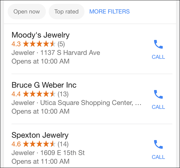
There are notable differences between how this looks on a desktop compared to these mobile results. First, look at how Google doesn't include a website link but chooses to include the handy icon to quickly call the store. I expect Google has two reasons for omitting the website button; first, they want to track and report the calls from the SERP. You can see your own tracking details in your Google My Business account.
Second, they use those call tracking details to entice businesses into paying for Call Tracking AdWords ads. Google makes most of their money through AdWords, but through the years, small businesses have been reluctant to pay for online ads for fear of wasting money without proof of return. Google implemented this free call tracking as a way to provide the proof you'd need before paying for even more call tracking ads. This is probably one of the only ways within the Google universe to show how something benefits you without spending marketing dollars on it.
Look back at the above screen shot and notice the buttons for "Open now," "top rated," and "MORE FILTERS" above the local pack. These are relatively new features that have the potential to spotlight hardworking jewelers.
Google uses their ranking algorithm to determine the order of the default list of local businesses. Sometimes the algorithmic order doesn't make sense to us mere mortals. On the surface, it would make more sense to order the above shown businesses by their average review rating or the number of reviews they've received. In this case, they ranked Moody's Jewelry at the top of the list even though they only have 5 reviews with an average 4.3 rating. Meanwhile, Spexton Jewelry has 14 reviews with a 4.6 rating. It might not seem fair, but Google knows more about Moody's than what it's showing here.
Pressing the "top rated" button changes the order and put the highest average rating up top. This feature is a benefit for those of you who make an effort to solicit Google reviews. Google is investing a lot of effort into measuring the results of user generated content because it's very difficult to find loopholes and game that system like so many have previously done with SEO.
Now is a good time to revisit how you ask customers for business reviews and make an effort to accumulate many more.
Pressing the "Open now" button will re-sort the local list by the current businesses that are open. This is mostly a benefit for businesses that open earlier, close later, and those that are open 7 days a week. Even though Spexton Jewelry would have won top placement when sorting my reviews, they would have been removed from the list if it was just after 10AM and I sorted by "Open now." Spexton Jewelry opens at 11AM whereas the others open at 10AM.
Mobile Ranking Concepts
Google started measuring the usefulness of mobile websites in April 2014. Google usually doesn't outright tell us what will help the ranking of your website other than "write good content" and to somehow be useful. Those of us in the online marketing space are always testing to figure out what Google is telling us.
When it came to mobile ranking, Google uncharacteristically gave us very specific parameters to follow. They say the website must be mobile friendly, which usually means either a responsive design or a responsive content method to display the website using a different theme layout. They also want the font to be easily readable on mobile devices; this usually means large text size to eliminate the need for pinch-zooming.
The latest, very specific, directions are that we should not have popup ads on the website because they interrupt the user experience. We also should not have tall ad blocks at the top of the page that hide the real content until we scroll down.
I only included 4 organic results in the above search results screen capture. From first through fourth they were Moody's Jewelry, Jared, Helzberg Diamonds, and Bruce G. Webber. The order of the organic results don't always match the order of the local pack, but they did this time with Moody's ranked higher than Bruce G. Webber.
Bruce G. Webber Website
Decided to look at the Bruce G. Webber website to see why it might be ranking lower on the list. The website is www.brucegweber.com. Here's a screen grab of it from my phone:
(click to enlarge)
This is a responsive website design that looks a lot different on my iPad than it does on the smartphone. On the iPad the images for Bridal, Jewelry, Watches, and Services all appear as smaller icons, but on the smartphone they are much larger showing more detail in the photo. This adds to the length of the home page and creates a lot of scrolling.
Years ago, I would have complained about the long home page saying that people would not want to scroll down, and that was true back then. But then Pinterest introduced us to the infinity scroll which was copied by Facebook. Everyone is now used to scrolling quickly through long pages and skimming for things they want to read or tap on. Although the long scrolling on this page doesn't bother me anymore, there's nothing on this page that grabbed my attention or gave me an incentive to tap it.
Honestly, I was bored by this home page.
Watch Out For Text and Background Clash
I find that, one of the hardest things to deal with on a website is overlaying text on a background. In print ads you would carefully plan where to position you text or how light to ghost your background image to guarantee that the text was clearly readable.
It seems like Bruce G. Weber overlooked that throughout the entire website. Several pages had text overlaid on photos that make them very hard to read. This example is at the top of their home page, and it's a poor first impression:

It's very difficult to read the message "This is the gift they look for..."
I have a feeling they didn't double check the mobile version of their site when they chose that background image. It looks fine on the desktop and iPad version of the site because the words shifted to a more readable location.
One simple solution to this problem is to apply a style to the font. Through modern CSS settings you could apply a drop shadow or an outline to that text to make it more readable. It's an easy fix that prevents rethinking the background.
The same problem is visible a little further down their home page in this image here:

Again, it's difficult to read the message "Perfect Moments are Made Here" because the white text overlaps a bright part of the photo. Just like before, the text placement on the iPad makes this message easily readable.
Poor Font Choice
Throughout the website they use the "Didot 96 A" font-family for their headlines. It looks like this is a closely related font to the one they used for their Bruce G. Weber logo. Normally this would be a sensible choice, and it works well on the desktop and iPad, but something gets lost when the responsive design is applied for use on a smartphone.
Take a look at this screen shot from another page:

This time they are displaying "Earrings" with black color on a heavily ghosted background. It works. They also have "Cufflinks, Rings & Accessories" in white color on an attempted darker background. That doesn't quite work.
However, it's not the coloring that's the main problem with these examples, it's the Didot font. When resized for the responsive design the thinnest parts of the letters virtually disappear, making this very hard to read.
The fix for this would be to either increase the font size of the Didot font for smartphone, or better yet, have the responsive design flip into a completely different, easily readable, font for use on smartphones.
Social Photos
The home page has an area with photos that seem to be from Facebook and Instagram, shown here:

Each of the photos has either an Instagram logo or a Facebook logo, which makes you think that tapping it would jump you to those posts on the social media accounts. That's not what happens. Instead you get a popup like this one:
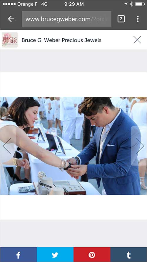
On a desktop or iPad, this box would have been easy to recognize as a popup that could be dismissed by pressing the X in the top right corner. However, on the smartphone, it filled the entire screen like you see above. Notice how the browser back arrow is more prominent than the X in the top right; so much so that I didn't even see that X until after I tapped the back arrow. It was my own fault for not noticing the X on the smartphone, but if I (someone who works on websites every day for a living) made the mistake, how many non website-pros probably make the same mistake.
There are two possible fixes here. First, they could consider making the X more prominent. This could be done with a different color or thicker X. Second, and my preferred method, would be to replace the social photo grid with a real feed from their social accounts which allows people to jump to the actual posts.
Video Popup
I've saved the most annoying popup for last. In my example above I explained how the white font disappeared on the background of the gift box photo. When viewing the website on a desktop computer, you don't see that static photo of the gift box shown here:

That entire background is a video of someone wrapping that gift box and cutting the ribbon. This is a current popular design method that many sites are now using. However, on a smartphone the video is not supported as a background design element. Instead, it forces a popup when you first land on the website.
Here's what that looks like:
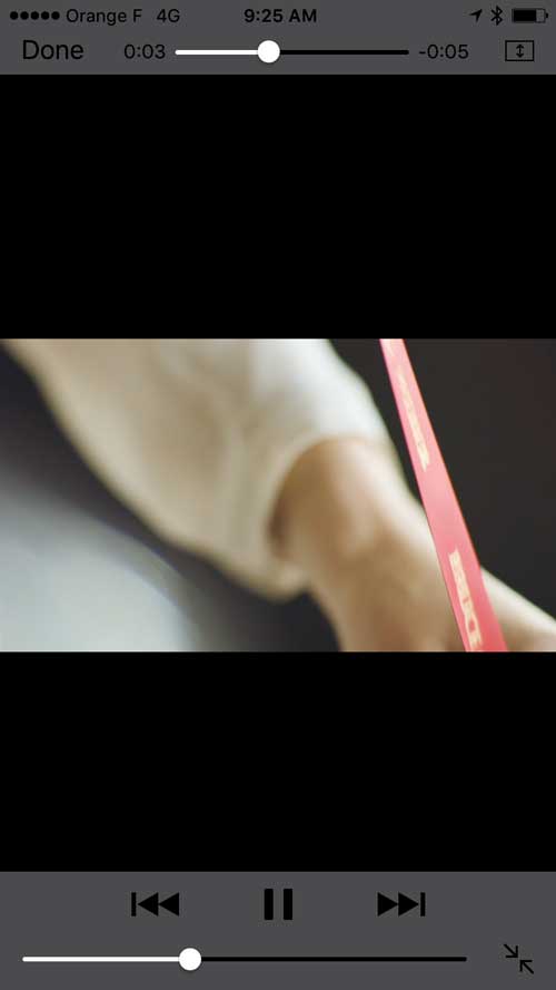
The video is only 8 seconds long and is simple enough to dismiss, but it was annoying because I had to dismiss it a few times before it stopped popping up every time I returned to the home page.
As a background image, the 8 second video works. But on the smartphone that video doesn't provide any value, offer anything important, or show a product. It's just a video of someone wrapping a box.
I would recommend that they set their responsive website to hide this video when viewed on a smartphone.
Conclusions
There's a continual balancing act you have to play between content you place on your website to make sure it looks equally good on a smartphone as it does on a desktop. There's no easy way around it, you have to test everything you add to your site for readability and usability on desktops and smartphones.
That's it for this week; I'll see you next time...
FTC Notice: I randomly choose this website and won't be telling the retailer jeweler that I'm giving them these flop fix ideas. Unless someone else tells them, they will only find out about this Nugget if they use Google Alerts or examine their Google Analytics and Google Search Console. I'm not doing this to solicit business from them, but rather as an educational exercise for everyone. This #FridayFlopFix is completely impartial and all my comments are based on previous experience in my website design and marketing agency, and from my personal research data.


