
In this issue of the Golden Nugget, I'm on the lookout for a jewelry website that isn't correctly suited to help customers this holiday season. I'll document my first thoughts as I look at the website. The hope is that I can uncover problems and explain solutions so you can learn from the mistakes of others.
In the spirit of the holiday season, I'd like to look for some jewelry gift ideas, perhaps something I could buy locally. For this week I'm pretending to be in South Bend, Indiana, so I searched for "jewelry gifts south bend in" on Google and saw these results:
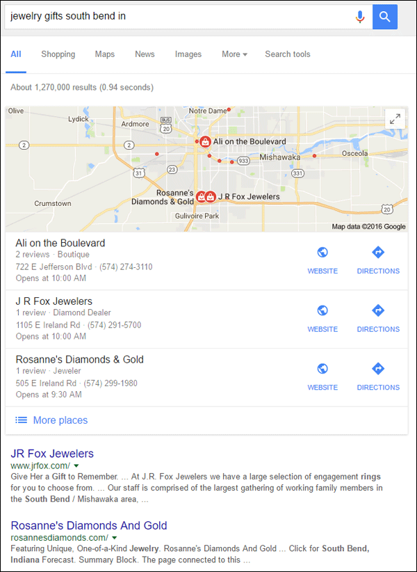
After quickly looking at the 3 jewelers listed in the local results, I felt JR Fox Jewelers would be the best review candidate to learn from this week. Their website is http://www.jrfox.com/.
First Impressions
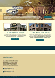
This is what the website looked like when I first visited:
(click to enlarge)
At first glance, I liked the look and simple layout of this home page. The top menu isn't cluttered, I like the realistic looking photo, and the headline on the page says "Give Her a Gift to Remember," which is what I'm looking for. It lures me into thinking this is the right place to shop.
But then I read this subtext below the headline and I felt a little confused:
"Showing her your love and commitment with a stunning diamond engagement ring will be a memory she will never forget. At J.R. Fox Jewelers we have a large selection of engagement rings for you to choose from. Stop in and see our friendly staff and give her something to remember."
In this scenario, I'm on the hunt for a gift, not an engagement ring. Their subtext talks about an engagement ring as if it's a gift to remember. This might be the first time I've heard of a jeweler referring to an engagement ring as a gift, and I feel this is a mismatch of home page sales copy.
The "Give Her a Gift" headline works for the holiday season, and it ties well into the "give her something to remember" shown in the subtext, but neither one ties well with the mention of engagement rings.
Continuing further down the home page, I see they have 2 impressive looking stores; one on Grape Road and one on Ireland Road. I assume both are in South Bend because they do not list town names.
Scrolling down to the bottom, I found a brief description in the footer along with full addresses for both of their stores. It turns out that Grape Road is in Mishawaka and Ireland Road is in South Bend. I might know that if I actually lived in South Bend, but for the sake of clarity, they should have mentioned the town names below each of the photos.
See Our Collections
Once I figured out that I need to go to the Ireland Road location, I decided to look at their online catalog. From the home page, I clicked the "See Our Collections" button you see here:

Clicking that button brought me to this page:
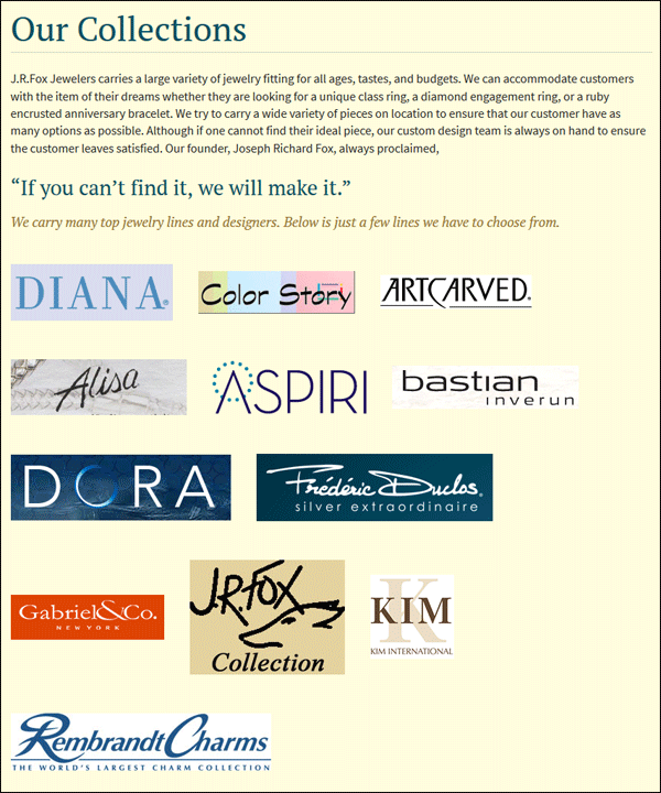
Remember that I'm pretending to be on the hunt for a holiday gift. I'm looking for ideas of what's in stock before I visit the store in person. I don't know any of these logos, but I assume they are high end designer names. I click the DIANA logo first and end up here:
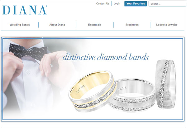
Although I expected to see a product catalog, I was hurled outward to the home page of another website. Should I dig through this website for a gift idea? Oh wait, the navigation at the top says "Wedding Bands" but nothing about other jewelry. This is probably not the correct place to look for gift ideas. I close the window and go back to the collections page again.
I then click on the Color Story logo and am thrown over to their website here:
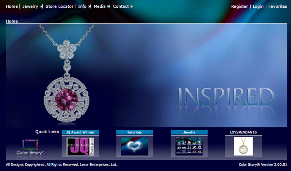
I close the window and go back again, this time quickly clicking through all of the other logos only to find that every one of them leads to the home page of someone else's website. After a few minutes of frustration, I now realize that they don't have their store inventory online.
That means their website is not designed to save me time from my busy holiday shopping schedule. If I want to spend my gift money on jewelry I also have to spend my precious time in their store looking at jewelry. It might seem petty, but I'd rather quickly browse through their inventory, at my leisure, on their mobile website than spend an hour of dedicated time. I'd even be willing to call them and ask them to hold an item aside for me if I find the right thing on their website.
Alas, their website is useless as a holiday shopping tool for me this year.
Their SEO Is Lacking
I'm still surprised to see how many jewelry website have not spent time to fine tune their SEO. Every website owner should spend some time working through every page to at least write a good page title and meta description for each page.
Most content management systems will auto fill the page title for you now, but few will auto fill the meta description. According to what I see in the source code of the JR Fox website, it looks like they are using the ONELAN Digital Signage content management system, perhaps an older version considering the copyright in the JR Fox footer says 2013.
The CMS auto filled the page titles for JR Fox according to the name of every page. The page title for the home page, naturally, says "home" as you can see here:

None of the pages on the site have meta descriptions. Without the meta description, you force Google to take text excerpts from your web page to display in the search results. That's why the SERP listing for JR Fox wasn't very coherent as you can see here:

Because Google won't always do what you hope, you should not leave it all up to a machine. The way you appear in the search results is your first and best chance of getting someone to click on your website. Take the time to write your own meta descriptions for every page.
Fooled Me Again
While clicking around their website, I thought I found something that was of good use on their Jewelry repair page. The page has a few sentences to introduce each of their repair services followed by 8 small photos to represent each service. You can see them here:
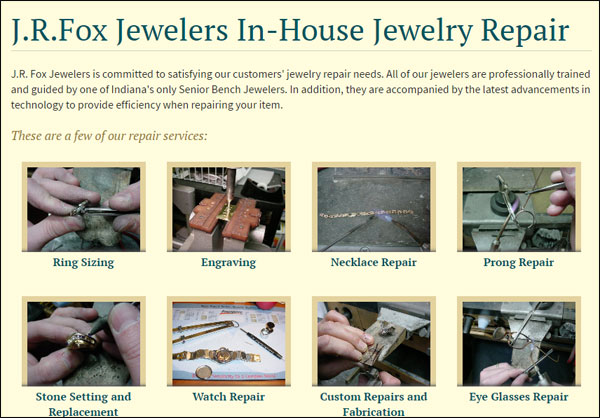
I realized each image was clickable when I hovered over them, but clicking each one brings me to their contact page.
I expected to see larger version of those small photos with more information about the specific service. It's likely that other website visitors will also believe that they can click to see larger images of that service too. But it's just a trick.
There's no reason to link all those images to the contact page, indeed this page would have been fine without any linking to the contact page, because, at least then I don't feel like I was fooled into wasting my time again.
Conclusions
I did my best job pretending to be a real customer trying to find a jewelry gift for the holiday season. I tried to document my thoughts as I worked through the first part of this review. My hope is that you will realize how differently your customers are thinking during the holiday season and how that will change the way they navigate your website and how useful the feel it is.
I would have a completely different point of view if I was looking for an engagement ring and wasn't in such a rush, but that's not the case today and therefore the JR Fox website is quite aggravating.
That's it for this week's lambasting; I'll see you next time...
FTC Notice: I randomly choose this website and won't be telling the retailer jeweler that I'm giving them these flop fix ideas. Unless someone else tells them, they will only find out about this Nugget if they use Google Alerts or examine their Google Analytics and Google Search Console. I'm not doing this to solicit business from them, but rather as an educational exercise for everyone. This #FridayFlopFix is completely impartial and all my comments are based on previous experience in my website design and marketing agency, and from my personal research data.


