
In this week's website review, I'm going back to re-review the first website I ever wrote about way back in April 2013. At the time, I chose Franzetti Jewelers with the website http://www.franzettijewelers.com/. You can read the old review from April 19, 2013 here.
My review process was pretty unsophisticated 3.5 years ago. It took a while for me to realize that I should be taking screen shots of the sites I was reviewing and I don't have any screen shots of the old Franzetti website. I'll have to write this re-review based solely on my written comments.
First Impressions
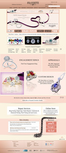
This is what the website looked like when I reviewed it today:
(click to enlarge)
According to web.archive.org, this version of the website was launched sometime around November 2014, which makes it 2 years old already. From what I can tell,they are using Adobe Business Catalyst (ABC) as their content management system. Current pricing for that system is from $12 - $39 per month and it includes several business reporting tools that are forward thinking and beneficial. I'm quite impressed to see that they are using this system.
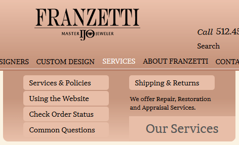
Speaking of impressed, I clicked around their website and found a lot of easy to use features, and subtle technology benefits that are commonly lacking among other sites. For instance, they are using a large drop down menu format, known as a mega menu. Normally I don't like these menus because they tend to blink off while you are slowly reviewing the list of links, and then they tend to accidently blink on and in your way when you are trying to read a page. The mega menu created by ABC is very stable and very user friendly. Here's a screen grab of it:
I also found well thought out pages of content, like this diamonds page:
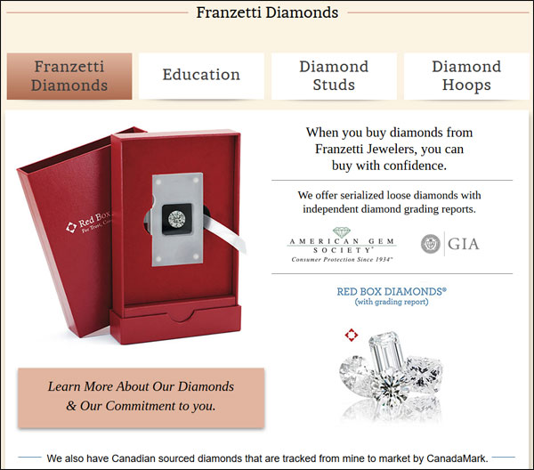
That page has 4 large buttons along the top leading to information that's organized in such a way that it makes sense as you read through it. I have a feeling that a marketing person or a graphic designer put this site together without the help of a professional copywriter; I say this because I found a few areas of the written copy that were clumsy to read.
Overall, it's obvious to me that they spent a lot of time organizing their content, taking their own photos, and approaching this website as a solid marketing brochure for their business.
What It's Not
This is not an ecommerce site, even though they have a tempting shopping cart message in their top header as shown here:
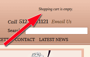
I couldn't find any "Add to cart" buttons anywhere on their website, so I assume their shopping cart features are deactivated right now. In that case, they should have hidden the "Shopping cart is empty" message in their header too.
Even though I like the overall features on the site, it does look a little outdated. Specifically, the font size used on websites in 2016 is several degrees higher than what we were using in 2014. In 2016, we also use a lot more white space in website design, whereas this Franzetti site looks cluttered on a few pages.
Revisiting what I previously liked about the site
Previously, I said I liked how they had the top navigation organized, and I still like it on the new site.
On their previous site, they spent a good amount of time making banners for the top of all their landing pages. They put a lot of thought into website content back then, and they are still doing a good job at it today.
Their old website had a blog that I liked, but I could not find a blog on their new site. They failed in that regard.
The page title, URL, and headers tags on their old website all matched, and they still do on the new site. I'm glad to see they are paying attention to these important SEO details.
Revisiting previously identified usability issues
According to my previous review, their old website was a little slow. The hosted environment from Adobe fixed that problem.
I also noted that their old website didn't have a mobile version. This time I was very happy to see that they have a self contained mobile website that looks similar to their desktop site, but built specifically for mobile. Good job here.
My previous review mentioned a few empty pages that I found, and this still seems to be a problem for them. As I look at their site today I found their "Upcoming Events & Sales" pages is empty. This page should always have something, otherwise it should be hidden. This can probably be automated.
In the previous review, I cited that the product images were inconsistent, in that some were taken by them and some were sourced from the vendors. This time around, it looks like all the images are more uniform. I'm glad to see this improvement.
Conclusions
I think it would be worthwhile for any retail jeweler to look through this website. There are a lot of good features about it that make it easy to use. I can tell that most of the features are built into the Adobe Business Catalyst theme they chose, and they chose wisely.
I would also like you to look at this website as if it were a complete business brochure. In my opinion, it looks like they had a marketing manager spend a lot of time designing and organizing it. Sourcing the photography is usually harder than writing the content. I have a feeling this website took more than 6 months to pull together and probably another 3 months of tweaking before it went live.
Lastly, it's refreshing to see someone using Adobe Business Catalyst. This shows more forward thinking than simply buying into the hype of WordPress, Shopify, and BigCommerce. That said, it only makes sense to use Adobe Business Catalyst if you also plan on using their analytics tools to better your business.
That's it for this week; I'll see you next time...
FTC Notice: I randomly choose this website and won't be telling the retailer jeweler that I'm giving them these flop fix ideas. Unless someone else tells them, they will only find out about this Nugget if they use Google Alerts or examine their Google Analytics and Google Search Console. I'm not doing this to solicit business from them, but rather as an educational exercise for everyone. This #FridayFlopFix is completely impartial and all my comments are based on previous experience in my website design and marketing agency, and from my personal research data.


