It's time for the weekly case study of a website that's pretty old and in desperate need of a makeover. I call these weekly posts my Friday Flop Fix review. During these reviews, I look for websites that are implementing search engine optimization strategies poorly, or have poor website designs and I suggest ways to make them better.
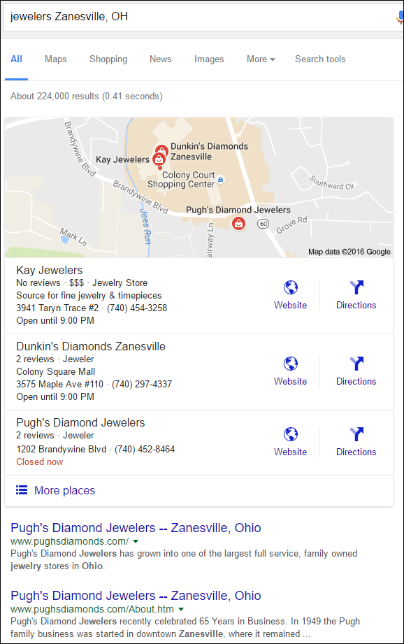
This week, I searched Google for the phrase "jewelers Zanesville, OH" and was shown these results:

I skipped over Kay and Dunkin's because they are both chain stores. My hope is that independent retail jewelers and jewelry designers will find these reviews useful, which is why I always choose single location stores as my review candidates. This week I'm choosing Pugh's Diamond Jewelers.
First Impressions
This is what the site looked like when I first visited:

(click to enlarge)
The first thing I noticed about this site was the static width of fewer than 800 pixels. Static website designs of this size have not been made in many years. After a little digging in the Wayback Machine at http://web.archive.org, I discovered that this design was originally launched in February 2003. The content on the home page has moved around a bit, but the design remained the same.
I usually recommend 18 months as lifespan for a new website design; 13 years might be a new record as the oldest website design I've stumbled upon so far.
This website is in desperate need of a refresh, and the other flops I'll mention might be moot points, but I'm going to continue for case study purposes.
Small Text
Computer resolutions in 2003 were a lot different than what's normal today. Back then most people were still using 800x600 screens, and even 640x480 was still very popular. This older website would look perfect on those older screens, but today the text is way too small to read because screens have a lot more pixels.
Take a look at this screen grab from the designers page:

If the screen you're reading from is anything like mine, the top menu in white text is too small to read and the description of Gabriel & Co. in the pop-up brown box is really tiny.
The default font size through every page of their website needs to be increased. Choosing the right font size is vital to the success or failure of your website today. People won't stay long if you make it difficult for them to read your site.
Embedded Text Images
One of the most common questions I'm asked at trade shows is how to improve a website's ranking. There's an easy way and a hard way to answer that question. The hard way is to do a lot of competitive analysis, website analysis, and keyword analysis and come up with a new game plan for ranking. The easy way is to simply do a quick check to see if the coveted search phrases are even on the website to begin with.
Far too often, I'm asked to rank a website for words or phrases that don't exist anywhere on the website. Google matches words on your website with the search terms that people type in. If the words don't exist on the site then it makes it very difficult for Google to match and rank a site for keywords.
The Pugh's website seems to have a lot of words on it that Google can't see. Most of the pages have decent layouts with reasonable photos. It also seems like they might have updated the information over the years.
This is a screen grab of the Pugh's engagement page:

That page looks like it's filled with fantastic keywords like these:
- Why a diamond
- Diamond return policy
- engagement ring warranty
- diamond trade in guarantee
- Getting your engagement ring from Pugh's
In reality all the words on that page are embedded in this image that I copied directly from their website:

(click to enlarge)
Google is unable to read the words embedded inside an image, even images like this one with clean white backgrounds and easy to read text. This engagement ring page has the same SEO value as a blank page, which is to say, little to none.
Product photos and lifestyle photos are always great to have on your website, but you should never blithely upload an image version of an ad you ran in a magazine or newspaper. Those ads should always be recreated on your website as text and images so Google can correctly read what you're saying.
That's it for this week; I'll see you next time...
FTC Notice: I randomly choose this website and won't be telling the retailer jeweler that I'm giving them these flop fix ideas. Unless someone else tells them, they will only find out about this Nugget if they use Google Alerts or examine their Google Analytics and Google Search Console. I'm not doing this to solicit business from them, but rather as an educational exercise for everyone. This #FridayFlopFix is completely impartial and all my comments are based on previous experience in my website design and marketing agency, and from my personal research data.


