
Welcome to this week's edition of the #FridayFlopFix website review. This week's destination is Plantation, FL, which is right next to the Everglades wildlife area in Florida. Here are the Google results when I searched for "jewelers in plantation florida:"
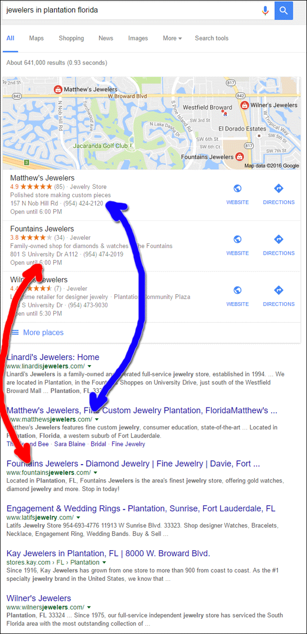
The first two jewelers in the Google Local results are also located in the 2nd and 3rd place organic results. Linardi's Jewelers is in the 1st place of the organic listing but not in the Local Pack. I find that odd since, when I looked them up, I found that they had a higher review rating than Fountains Jewelers and Wilner's Jewelers. There was only one difference I noticed about the Google Business listings for Fountains, Wilner, Matthew's, and Linardi's. Linardi's Jewelers has not yet claimed their business listing.
The Wilner's Jewelers website is a good candidate for a review, but I think I would just tell them to start over from scratch with their website. Instead, I'm choosing my namesake store, Matthew's Jewelers with the website http://www.matthewsjewelers.com/
First Impressions
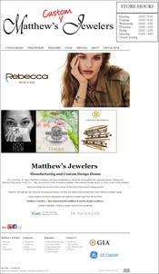
This is what the Matthew's Jewelers home page looked like when I first visited:
(click to enlarge)
The first thing I noticed was the low quality of the header logo. Something seems wrong with it, almost as if it was a scan of company letterhead with the word "custom" handwritten above it. I feel it's a little too sloppy looking for a fine jewelry store.
There are 13 slider images on the home page. Slider images really shouldn't be used any more, and no one will wait around to watch 13 of them slide by. If you do intend on using them, try to limit yourself to 3 or 4 and changed them out monthly. Additionally, make sure all your slider images are the same pixel dimensions.
Speaking of pixel dimensions, there are 3 different size images sitting side-by-side below the slider. They look a bit awkward aligned to the left. They would look better if they were centered, or perhaps if they were all enlarged to be the same 1/3 width of the page.
Did they Bother to Test?
I found several small issues on the home page which could easily aggravate a customer. The following errors should have been easy to notice, if only they had tested their site.
Social Icon Blunder: Pinterest, Google+, and Facebook icons shown above are included in the footer of every page on the site. Normally these icons would link to those social accounts, however, on the Matthew's Jewelers site, these are social share buttons. Clicking each one will socially share the page you are on instead of jumping you to their social accounts. Usually the social share buttons are at the top of a product detail page or a blog post and icons in the header or footer link directly to those social accounts.
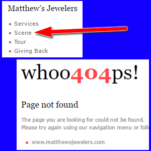
"Scene" footer link: Take a look at the "Scene" link in the above screen shot. The top menu also has a Scene link that leads to a landing page for celebrity news, press releases, advertising, and events. However, the footer link leads to a 404 page. They should have someone clicking through their website on a monthly basis to make sure nothing like this is broken.
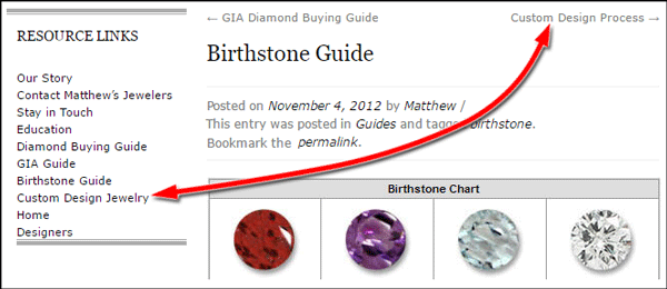
Breadcrumb Navigation Glitch: While clicking through the resources section of their website I was following the breadcrumb links instead of the left navigation links. The above screen shot shows a left link that says "Custom Design Jewelry" and a breadcrumb link that says "Custom Design Process." This is what I saw when clicking the breadcrumb:
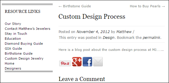
Somehow they created a blank page and linked it to the breadcrumb trail, but not to the navigation. Look closely at the above screen shot and you'll see the next breadcrumb link says "How to Buy Pearls," which was also another blank page. The pearls page is not listed in the left navigation, which might mean that they knew not to link it until they added content.
WordPress Stubs Gone Awry
This WordPress seems to have fallen prey to a common URL stub problem. WordPress tries to be helpful by generating URLs according to page names. It creates "stubs" (that's what they call the shortened URLs) that match the page name, which is very helpful for smaller sites and when you're just learning how to use the system.
However, it seems like Matthew's Jewelers started building their website and changed the names of several pages as they added more content. The stub names changed as they changed the page names, but they didn't realize they were breaking a lot of internal linking.
The result is a very messy website where I found links to 404 pages on almost every page of the site.
Lacking Current Updates
A default feature in WordPress is to date stamp every page of the website. The most recent date stamp I found was from 2014. The footer copyright also says 2014. Therefore, I have a feeling this website has been floundering since 2014.
Lastly, I see that the GE Capital logo is still in their footer. GE Capital changed their name to Synchrony Financial at least 2 years ago, so this logo needs updating too.
Conclusions
It's unusual to see websites like this one rank so highly in the search results. With all the 404 pages and disappointing pages, I would assume that Google would penalize the site, instead, it is being rewarded for the good content that's throughout the rest of the site.
Even though the site has good content, there are enough usability issues to make it confusing for a customer. They should click through every page and link on their website and clean up all the broken links and misdirected pages.
That's it for this week; I'll see you next time...
FTC Notice: I randomly choose this website and won't be telling the retailer jeweler that I'm giving them these flop fix ideas. Unless someone else tells them, they will only find out about this Nugget if they use Google Alerts or examine their Google Analytics and Google Search Console. I'm not doing this to solicit business from them, but rather as an educational exercise for everyone. This #FridayFlopFix is completely impartial and all my comments are based on previous experience in my website design and marketing agency, and from my personal research data.


