In honor of the jewelry shows taking place in Miami this weekend, I've chosen a Miami Beach jeweler for this week's website review. It all started with a Google search for "jewelers miami beach, fl" and these search results:
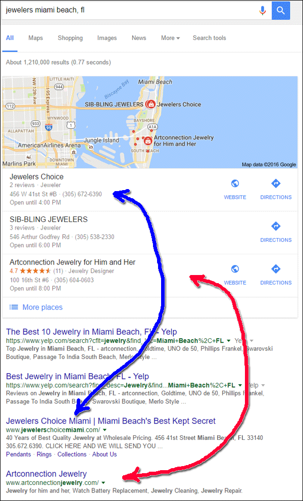
I found it interesting that the directory listings for Yelp were higher in the organic ranking than the two highest retail stores. I often come across Yelp answers in the organic results, but they are usually below the first few retailer websites. For this week's review, I looked for a website that could evolve what they already have into a better ecommerce site.
I decided to go with the first jeweler in the local listing, Jewelers Choice, with the website http://www.jewelerschoicemiami.com/
First Impressions
This is what the home page looked like when I first visited:
(click to enlarge)
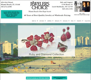
I'll be in Miami Beach this weekend at those trade shows, but at the time of this writing, I've never been there before, so I can only assume the big background photo on their home page is actually Miami Beach. My first thought was that the oversized beachfront photo overshadows the Rudy and Diamond Collection photo they are trying to spotlight.
I love red gemstones, and that jewelry photo is nice, but there's a reason that a lot of marketing companies use beachfront photos, and that's because the sight of a beach is calming and brings wishful thoughts of travel and adventure. I realize they are trying to promote themselves as being in Miami Beach, but the photo misrepresents them as a jewelry store.
The next thing I noticed is their tag line "Miami Beach's Best Kept Secret." I truly loathe this expression and I know a lot of businesses use it. I always interpret this expression as the business's excuse, or even a badge of honor, that they don't spend enough money on marketing and social outreach. Businesses that are a "secret" are just not spending enough money on their marketing plan. You shouldn't want to be a secret.
The header has this "click here" invitation:

I'm a little confused by this because it says "Click here and we will send you pictures for your latest event, simcha, birthday, anniversary," yet it doesn't say what photos or why someone would want that. This website doesn't have a services page to explain it either. This link points to an email address without any further instructions.
Similarly, this watch button is in the footer:

I thought this button would lead to a watch closeout page, but just like the link in the header, this one also points to an email address.
Clicking either of these links will pop open your email client prepopulated with "aciment@aol.com" in the TO field. An AOL email address is a little hint that this jeweler might be behind on the times. AOL is not a professional email service, and delivery to their service is often troublesome because of heavy spam filtering. At minimum, they should move to Gmail, but they'd be better off using emails associated with their domain name.
Catalog Approach
It seems like they are trying to move towards ecommerce on this website. The website has pages for their cufflinks, earrings, bracelets, necklaces, rings, and pendants, but they don't have any information about what they do as a local retail jeweler.
The About Us page doesn't explain who they are or what they do; in fact, the only thing on the About Us page is a 30 second commercial that says they "manufacture or import jewelry at good prices," and they "won't be pushy sales people."
Every other page of their site is some type of product catalog. It looks like they are working towards building an ecommerce website, but they still have a lot to work on. Right away I notice that they are missing product descriptions, ways to add items to a wish list, and a convenient product search feature.
They are also missing the full featured shopping cart and checkout features, but those are not needed until the ecommerce site is ready to go live.
Warped Product Images
Each of the 6 main product category pages look alike, but they have slightly different functionality that I found frustrating.
I first visited the cufflinks page and was immediately attracted to the gold cable and diamond cufflinks and clicked on them for more information. Instead of bringing me to a product detail page, a popup window appeared with a warped version of the cufflinks. This is what it looked like:
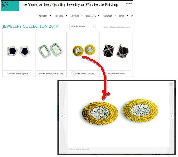
This warped image is the result of trying to fit a square image into a rectangular hole. The WordPress software they are using stretches or compresses all images to fit into that popup window, causing distortion.
What they should have done was cropped the images to a proportionally similar size that would correctly enlarge to fill that popup window. This does take a lot of planning, and image editing time, but it's the type of work that must be done for this setup. Otherwise, the website is misrepresenting the beautiful products that are trying to be sold.
Incorrectly Used Large Images
Managing how your product images appear on your website will directly impact user experience. You should always strive for fast pages with just enough information that a person would need.
While clicking around the site, I notice a very slow load time on all the product photos. I took a screen grab just as they were loading so you could see the partial images, take a look:
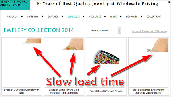
Slow loading images are a hint that the website is using the wrong size images on this page. The area you see on the screen for these photos is about 380 pixels by 780 pixels which means the photos should also be about that size. A good product catalog system would automatically resize the images on the server and show the 380x780 image here, but that's not what's happening on this website.
Instead, this website is using the original, full size photo and shrinking it to fit into that 380x780 box. Some of the images in this catalog are 850 pixels by 1134 pixels, or larger. Those are full resolution images that you don't need to see unless someone clicks for more detail. Use of those full resolution images will always slow a website down and create a dissatisfying user experience.
Customers who are looking for more information will continue to click deeper into your website and wait a few extra seconds to find all the details, but you should never force those large details, and good quality photos, until they request them.
Closing Thoughts
They've chosen WordPress as their website platform. Although WordPress can be programmed to do just about anything, it really takes a lot of work to make it function nicely as a product catalog system. Jewelers Choice is trying, but they seem to be struggling.
The website design is a little clunky. I noticed the navigation menu moved around depending on the desktop screen I was using. When looking at it on a smartphone, the information in the header takes up too much room and requires a lot of scrolling on every page. That could be better.
There are also two very obvious dates showing through the website. There are several mentions of "Jewelery Collections 2014" and "preview our 2015 latest collection" but no mention of 2016 anywhere. By the way, I also found it odd that this is a US retail jeweler using the UK "jewelery" spelling instead of the US "jewelry" spelling. This might be the reason they didn't rank above Yelp in the SERP.
This site has a lot of potential, but it also needs a lot of reworking. If ecommerce is their goal, it might be best for them to just move to a website platform that has ecommerce built in.
That's it for this week; I'll see you next time...
FTC Notice: I randomly choose this website and won't be telling the retailer jeweler that I'm giving them these flop fix ideas. Unless someone else tells them, they will only find out about this Nugget if they use Google Alerts or examine their Google Analytics and Google Search Console. I'm not doing this to solicit business from them, but rather as an educational exercise for everyone. This #FridayFlopFix is completely impartial and all my comments are based on previous experience in my website design and marketing agency, and from my personal research data.


