This is the Friday website review where I randomly choose a retail jeweler and scrutinize their website for problems. I look for design mistakes, SEO mistakes, functionality mistakes, content mistakes, and even marketing mistakes.
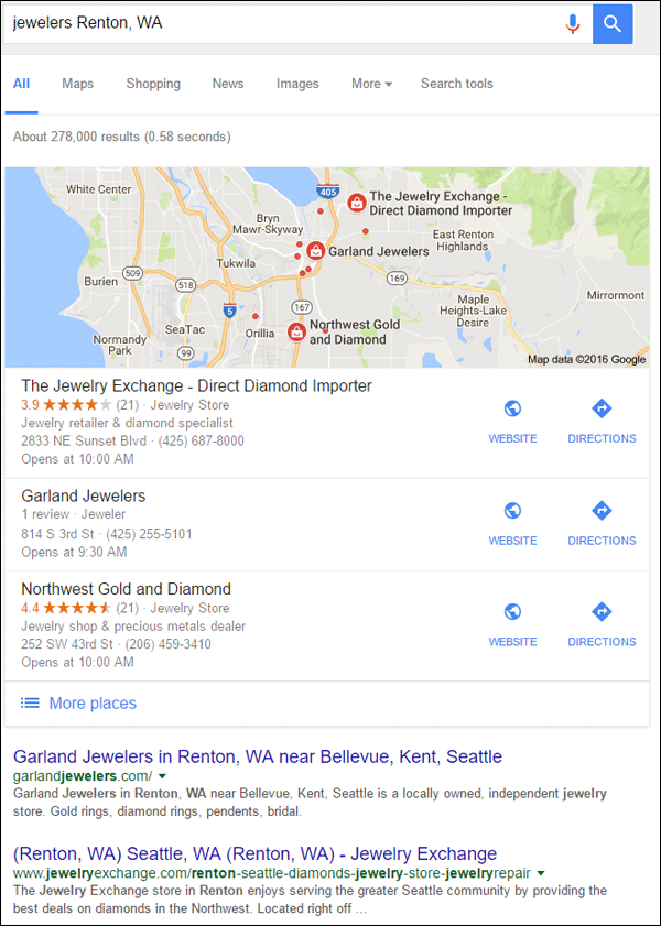
This week I searched for "jewelers Renton, WA" to find a review candidate. Here are the results I saw in Google:

Most of the organic listings in the first three pages of Google were from Yelp and Yellowpages. There were very few independent retail jewelers, so I chose the first in the organic list, Garland Jewelers and their website their website http://garlandjewelers.com/.
First Impressions
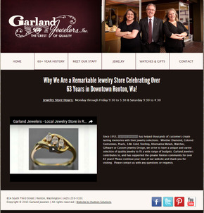
This is what the home page looked like when I first visited:

(click to view larger)
The design of the site looks old to me, and it also took a while to load. I would not have noticed the background image had it not been for the long time it took for it to download.
While waiting for the images to load, I scrolled down to review the page and the footer. I immediately noticed that the footer has a copyright of 2013. Since it's late September 2016 as I write this, I can't help but wonder if the entire site is out of date.
They are running a Wordpress website, which would make it easy for them to hire a programmer that can auto-set the year in the footer. Because this is not a manual process any more, there is no reason for any website to have the wrong year in the copyright.
Out of date copyrights are usually a sign that the entire website is out of date or might even be abandoned.
Confusing Headline
I was very confused by the headline on the home page. It says:
"Why We Are a Remarkable Jewelry Store Celebrating Over 63 Years in Downtown Renton, Wa!"
The more I read it the more confused I was about it. It seems like a lead in for an article that explains who they are, but the next thing you see on the page is their store hours. Surely their store hours don't make them remarkable. Honestly, I'd think they were more remarkable if their store hours were Noon - 8 pm every day to allow for the customers who can only shop after work.
The next thing on their home page is an introduction video side-by-side with a description of their store.
After watching the video, it makes more sense to have that headline right above the video. Perhaps they could even change the headline to say "Watch this video to find out why we are a remarkable jewelry store celebrating over 63 years in downtown Renton, WA."
I have a feeling that their home page has gone through a few updates since they launched it 2013, but they never updated the headline.
Staff or Services?
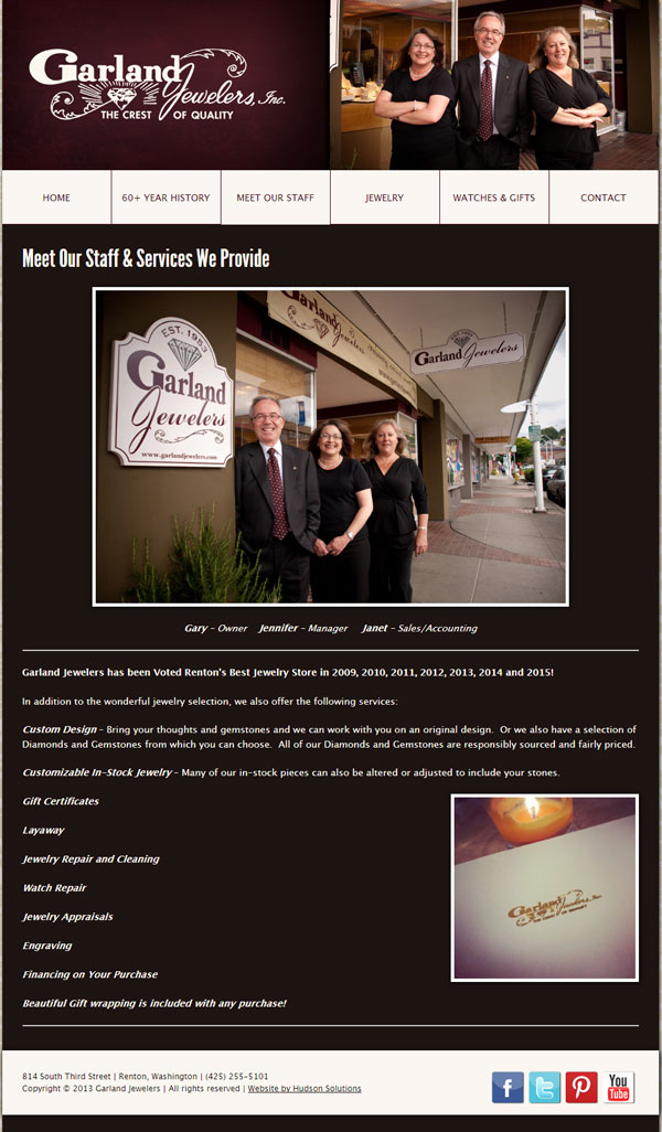
After waiting an inordinate amount of time for their Meet Our Staff page to load, I saw a large photo of the three store employees, Gary, Jennifer, and Janet. You can see it here:

The next thing on the page told me they were voted Renton's best jewelry store from 2009 - 2015. With 2014 and 2015 dates listed I now know that they have updated their website without ever noticing the 2013 in the footer.
I have to point out that the button on their top menu says "Meet Our Staff" but nothing about their services. When I got to the page I noticed that the headline says "Meet Our Staff & Services We Provide" and the SEO title of the page also says "Meet our Jewelry Store Staff - Custom Design - Independent."
Typically, the Meet Our Staff page isn't a very popular page on a jewelry site, so I found it odd that they would hide their services inside that navigation button.
The better method would be to have separate pages on the website for the staff and services. Every page of your website should be dedicated to a single topic so Google can correctly classify your website and serve it to the right people in search results.
They could improve how Google reads the website by converting their staff page from a single group photo to individual photos with a bio for all three of them.
The next step to making this better would be to write longer descriptions of each service they provide on that dedicated services page. They would have to reorganize their top navigation once they add this extra page.
For extra credit, and to really work better in Google, they should expand the services page even further and create a single page for each of their services. Each of those pages would fully explain the services and should supporting photos as examples.
Slooooow
I'm usually quite patient when waiting for a web page to load, well; I'm more patient on the desktop than I am on a smartphone. This website is so slow that I have to mention it here. I think this might even be the first time I'm talking about website speed in one of these weekly reviews.
In the time it's taking me to write the above headline and the previous paragraph, and so far this sentence, the Jewelry page of their website is still loading! That must be about 90 seconds so far.
Google measures your website speed and they use it as a ranking factor. Slow websites like this would not compete well in a location where other jewelry stores are competing to higher ranking.
There are a lot of website speed measuring tools. You can look up a few in Google or refer to your Google Analytics for speed test results.
While I'm on the topic of website speed, I should mention that the typical website programmer does not worry about speed when building the website. Accounting for website speed takes a higher level of technical skill than most everyday average website programmers have. You might have to hire a website specialist to fix your speed issues.
Conclusions
Overall, I think the Garland Jewelers website suffers from a common problem: the owner doesn't critically look at the site. I'm guessing that they have someone make updates to the site but do not bother to look at it the way a customer would.
I recommend that everyone read over their website at least every few months just to make sure everything still makes sense. Slight layout changes might depreciate the impact of good headlines, or as I illustrated above, might even nullify their effectiveness.
Garland needs to run a few speed tests and rethink how they have their website organized. Due to the speed issues, I didn't even bother trying to review their jewelry catalog this week.
That's it for this week; I'll see you next time...
FTC Notice: I randomly choose this website and won't be telling the retailer jeweler that I'm giving them these flop fix ideas. Unless someone else tells them, they will only find out about this Nugget if they use Google Alerts or examine their Google Analytics and Google Search Console. I'm not doing this to solicit business from them, but rather as an educational exercise for everyone. This #FridayFlopFix is completely impartial and all my comments are based on previous experience in my website design and marketing agency, and from my personal research data.


