
Can you learn from someone else's mistakes? That's exactly what I hope you'll get out of this Friday Flop Fix. This week, I'm venturing over to Tupelo, MS in search of a retail jeweler that might be making a mistake with their online presence.
This is the result I saw when searching for "jewelers tupelo ms" in Google:
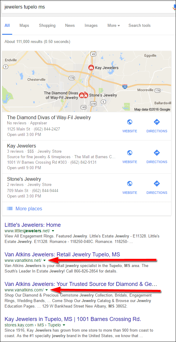
In order to find mistakes to learn from, I usually skip over the top ranking websites shown in the search results. While looking past the Google Local pack, I noticed two similar domain names for the same jewelry store. Businesses should never have competing websites because it can cause a split in customer focus and confusion.
Van Atkins Jewelers is the retailer in question with the websites www.vanatkins.net and www.vanatkins.com.
Exactly which one should a customer look at? Which one will answer the customer's needs? Will one of these disappoint the customers more than another? Let's find out...
There's a Sucker Born Every Minute
With so many options for online advertising it's easy to be lured into marketing ploys by seemingly reputable, large companies. YellowBook is one such company that uses their reputation to sucker small businesses into a package deal at a great price and one that seems to make a lot of sense.
The typical YellowBook marketing deal includes a special toll free number, a website, a listing in their online directory, and inclusion in their paper directory (which no one uses any more anyway). The www.vanatkins.net website is part of the YellowBook marketing package that Van Atkins is paying for.
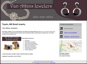
This is what it looks like:
(click to enlarge)
This single page website has a brief description of the business, a toll free number, a link to get directions, and a link to view the full website. There are a few reasons why this website is a bad idea for Van Atkins:
- It's a single page site that doesn't help further a customer's discovery process.
- The toll free number is a temporary number associated with this page. That number will be deactivated when they cancel their YellowBook marketing plan, causing a disruption for any customer who might have it saved in their phones.
- This single page website will also be erased, and the domain name deleted, when they cancel their YellowBook marketing plan; which would also cause a disruption for anyone who has the page saved or bookmarked.
In a world where the first few seconds determine if a customer stays on your site or ignores you forever, do you want them to base their decision on a website that doesn't correctly represent the store?
Even though Google wants all businesses to build websites that provide value, information, and user friendly features, their ranking algorithm still allows simple 1-page websites to outrank large sites. YellowBook knows about this ranking loophole and they use it to their advantage in their marketing.
As part of the YellowBook sales pitch, they will tell you that their website will rank highly, which will sound like a benefit when you have a lot of other competitors. What they won't tell you, is that their website will rank higher than your main website or the other negative points I mentioned above.
The only time any small business should pay for one of these YellowBook websites is when they are just starting out and have yet to build a real website. Consider YellowBook to be the first step of a never ending climb to a good website.
Control: Is Your Website Money Spent Wisely?
Building and maintaining a website and online social media identity isn't easy and often requires a long term plan and a dedicated person to manage it. Even with a dedicated employee, the management of the website itself often requires outside help to take care of the technical aspects of website maintenance.
The cost of maintaining your online identity is forever growing. Most small businesses do not appropriately track their online results in order to make improvements to their process, thereby increasing their ROI and overall profitability over time. The existence of websites and social media accounts don't simply improve business, it takes a lot of work to turn them into useful marketing tools.
Unfortunately, most jewelers believe that they can slap up a website without much work, and then just let it sit there without testing, learning, and maintenance. It's these same jewelers that will then complain that their website isn't attracting new business which eventually leads them to believe that the website is useless and should be deactivated to save money.
Some vendors have realized that retail jewelers are struggling with the cost of website maintenance, that struggle eventually leads to a drop in sales, and that drop in sales has a domino effect on vendor sales. As a way to help their own bottom line, many vendors have created website templates that are pre-populated with inventory, educational information, and full ecommerce features.
Jewelers have little or no maintenance responsibility for these vendor sites, and some vendors will even provide them for free as long as the retailer maintains a specific sales volume.
Ashi Diamonds is once such vendor that provides these templates websites. They built an entire website division just for this purpose. Their signup process consists of a series of forms that looks a lot like Mad Libs. Through these Mad Libs type forms the retailers simply choose colors, logos, enter their contact information, and type in their store history. A full website is set up for them very quickly.
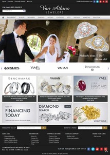
That's how the www.vanatkins.com website was created. This is what it looked like when I visited:
(click to enlarge)
This website might look attractive, but everything about it helps further the Ashi name without providing long term online value for Van Atkins Jewelers. Some of that long term value can be measured in the number of pages Google can see, how often customers share pages of the website to social media, and how well different areas of the website rank for specific keywords.
Lost Long Term Website Value
Whenever you add something to your website, you hope that people will read it, like it, share it, and that it will convince them to purchase your products or services. Google usually reads your website first and surfaces it in search results when people look for related keywords. The more you add to your website the better the chances are that you'll be found in search results.
The Ashi website is one example of a vendor created website that uses advanced JavaScripts to control the product catalog. Even though the functionality might seem fantastic, the long term benefit is zero because Google can't interpret the JavaScripts.
Here's an example of a product page on the Van Atkins website as viewed through my web browser:
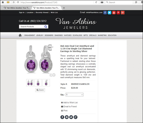
Now here's how Google sees the page:
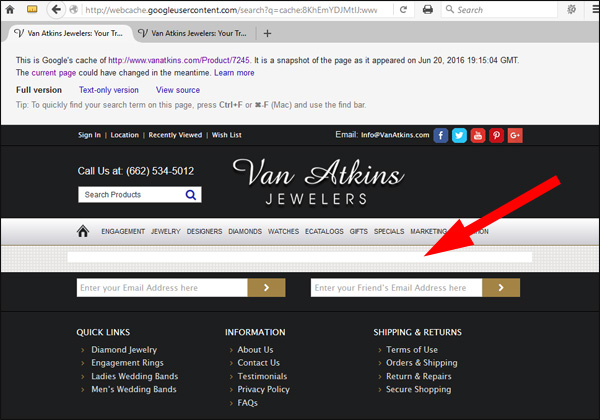
In the above screen grab, notice the thin white box I'm pointing to with that large red arrow. That's where Google should be displaying the Oval Cut Amethyst Earrings, but they can't translate the complicated JavaScript used to display them.
What does this mean for Van Atkins, and why is this bad? Remember that the goal of putting anything on your site is in hope that you will attract a future customer through search results. Here's an example to illustrate why this Ashi template backfires for the jewelers using it...
Let's assume that someone in Tupelo, MS is searching for a birthstone gift for someone born in February. They open Google and type in "amethyst earrings." Google quickly looks for local proximity results and ecommerce websites and returns a list including Macy's and Sams Club along with a few gemstone sites and Pinterest accounts. Google has no idea that Van Atkins is the truly closest local result because Google can't read the above amethyst earring page.
Even though the website seems to be a good option, vendor provided websites like this should only be used as an early stepping stone while the retailer builds their own website with a product catalog that they control.
Today's Conclusions
As I said, the goal of each of my reviews is to help you learn from someone else's mistakes. In this case, Van Atkins Jewelers is paying for a YellowBook marketing package that is creating an extra step, and a blockage, for customers to go through before finding their real site.
The real site, which is a vendor created website, looks nice and has some nice functionality, but it has no long term value that will help attract people to their store.
The ROI on both websites is probably very small and I have a feeling that the owners at Van Atkins Jewelers are questioning if their small website expense is even worth it.
That's it for today; I'll see you next time...
FTC Notice: I randomly choose this website and won't be telling the retailer jeweler that I'm giving them these flop fix ideas. Unless someone else tells them, they will only find out about this Nugget if they use Google Alerts or examine their Google Analytics and Google Search Console. I'm not doing this to solicit business from them, but rather as an educational exercise for everyone. This #FridayFlopFix is completely impartial and all my comments are based on previous experience in my website design and marketing agency, and from my personal research data.


