 In this edition of the #FridayFlopFix review, I'm venturing over to Pasadena, CA in search of a jewelry store. These are the results I saw when using Google Chrome while in incognito mode. I searched for "jewelry stores pasadena ca."
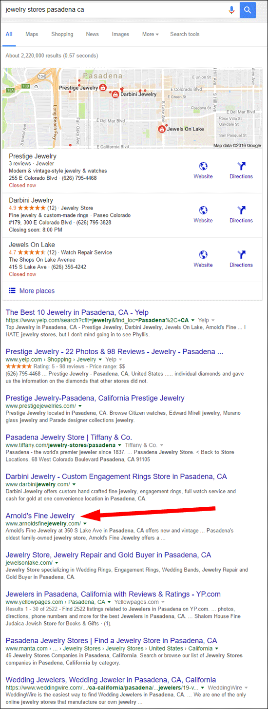
The goal of this Flop Fix Review is to give ideas on how to improve a website that isn't functioning at its best. Websites that need improvement usually do not rank right up at the top of the results. In this case, I skipped past the Google 3-pack local listing and went down to the 6th organic result.
Today, I'll take a look at the Arnold's Fine Jewelry website located at:
http://www.arnoldsfinejewelry.com/
First Impressions
This is what the website looked like when I first visited:
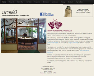
(click to enlarge)
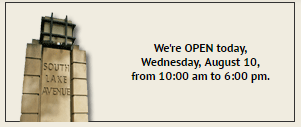
At first glance, I liked the store hours feature in the top right corner of the website. It showed the current day and the store hours for that day. Here's a close-up:
My second thought was that the font size was way too small, and it makes the site look like an older site when it actually isn't. The site has a mobile responsive design that looks like this on a tablet:
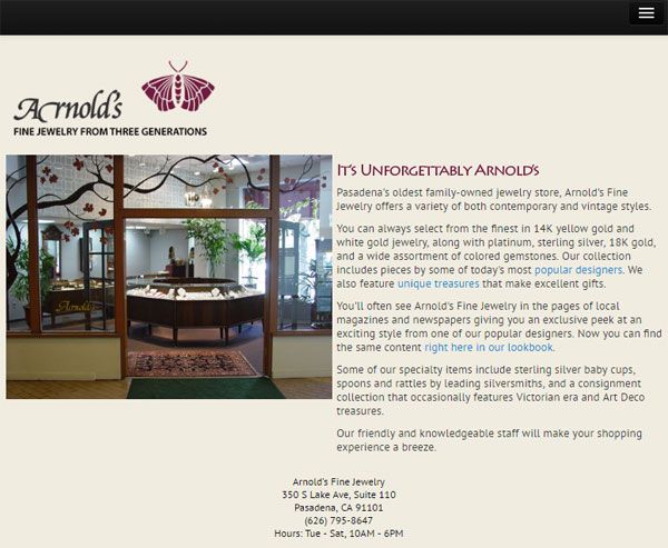
And it looks like this on a smartphone:
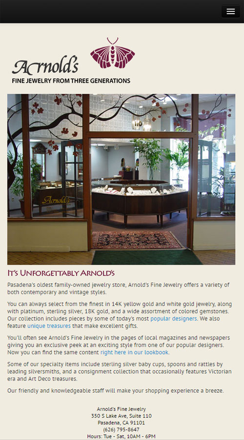
The font size remained the same in all three versions of the site. A better approach would have been to enlarge the font as the device got smaller. In other words, have the largest font size showing on the smartphones.
This font resizing isn't just a good idea; it's one of the ways Google determines if your website is mobile friendly. Google says it doesn't want users to have to pinch-zoom to read your mobile website, but that's exactly what you'd have to do in order to comfortably read this website on your smartphone.
Their responsive layout works well, but their font is a flop that needs to be fixed. It should be easy for them to fix this in their CSS in under an hour.
SEO Issues
The website has 9 main pages and a bunch of product pages that are easy to miss unless you are looking for them. The page title for each of these pages can use some improvement.
The pages titles are as follows:
- Arnold's Fine Jewelry
- Arnold's Fine Jewelry - About
- Arnold's Fine Jewelry - Store Tour
- Arnold's Fine Jewelry - Services
- Arnold's Fine Jewelry - Our Treasures
- Arnold's Fine Jewelry - Our Designers
- Arnold's Fine Jewelry - Lookbook
- Arnold's Fine Jewelry - 100th Anniversary
- Arnold's Fine Jewelry - Contact Us
The title of your pages is supposed to give a clear indication of what that page is about. The first 2 or 3 words of the title are usually considered to be the most important keywords that identify the page.
For Arnold's, the repetitive use of the store name in every page title is unnecessary, it's only needed on the home page. The title for each of the other pages should be improved upon. For example, the "Our Treasures" page could be renamed as "Custom Jewelry Designs" because that's what this page seems to show. "Treasures" is a fancy way to put it, but it's too far removed from the general user's thought process to be effective.
Similarly, the "Our Designers" page could be called "Jewelry Designers" because the phrase "our designers" doesn't specifically relate to jewelry and therefore it's a poor choice as a page title.
The "Lookbook" page suffers from the same poor naming convention. It's best to write your page titles in an attempt to match the keywords that a customer might search for, and since no one is going to search for the word "lookbook," this is a bad choice. Perhaps a better name for this page would be "Unique Jewelry Designs."
Hidden Treasures
During my first perusing of the website, I didn't notice that the Treasures page had arrows leading to more information. You can see them in this image:
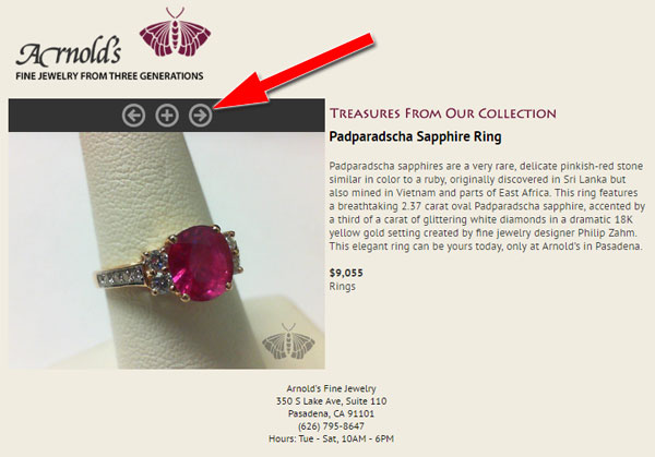
At first I assumed that those arrows would show me a different angle for this same Padparadscha Sapphire Ring, but it actually leads to another product page. There are 7 product pages in total, but they are very difficult to find unless you specifically look for them. This is another flop in their design.
They could improve this layout by showing all 7 items in a grid format with links to the individual product detail pages.
Another SEO issue I noticed was that all 7 of the product pages had the page title "Arnold's Fine Jewelry - Our Treasures." They should change their catalog so it displays the name of the product in the title, for example "Padparadscha Sapphire Ring" and "Vintage Aquamarine Ring in Yellow Gold."
The keyword phrases "sapphire ring" and "vintage ring yellow gold" would easily match those two examples.
Closing Thoughts
I was surprised to see a Google Business View virtual tour on their website. This tells me that they are thinking ahead. I also noticed that the website programming code is extremely neat and clean, which tells me someone is taking a lot of pride in making the website work smoothly. Most programming code I look at, including mine at times, is ugly and confusing.
It seems like they've put some thought into making their website work, but they have missed the biggest issue: basic search engine optimization.
My best recommendation for them right now is to hire someone to work through their site and adjust all their SEO settings. That should bump them up a little in the search ranking.
That's it for this week; I'll see you next time...
FTC Notice: I randomly choose this website and won't be telling the retailer jeweler that I'm giving them these flop fix ideas. Unless someone else tells them, they will only find out about this Nugget if they use Google Alerts or examine their Google Analytics and Google Search Console. I'm not doing this to solicit business from them, but rather as an educational exercise for everyone. This #FridayFlopFix is completely impartial and all my comments are based on previous experience in my website design and marketing agency, and from my personal research data.


