
Last week, I went shopping for a water proof iPhone case; something that would be good enough to protect the phone while canoeing on a river. After a bit of searching at the local mall, I found a potentially good case made by THULE. Due to its price, the THULE Atmos X5 case was locked in one of those anti-theft store packages that covered most of the important details. Before buying it, I needed to make sure it was really waterproof rather than just splashproof, and to what depth, but the security packaging prevented me from reading the case.
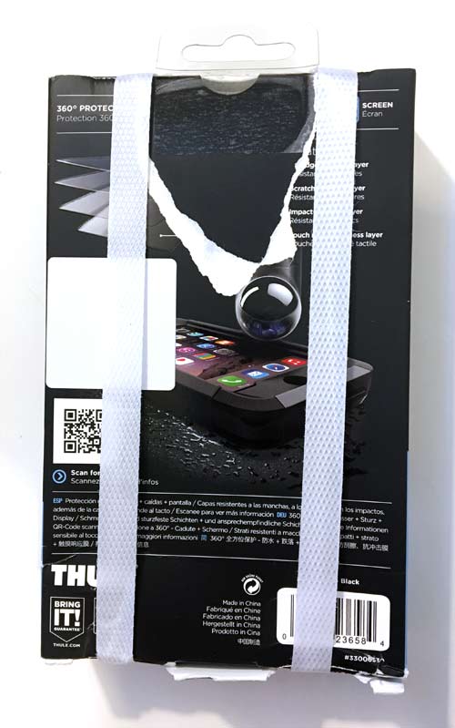
Luckily, there was a QR code that I could see through the back of the packaging. It was still partially obscured by yet another security strap, but it was good enough to scan. Here's a photo of the back of the box:
Problem solved, or so I thought until I got to their responsive mobile website, shown here:
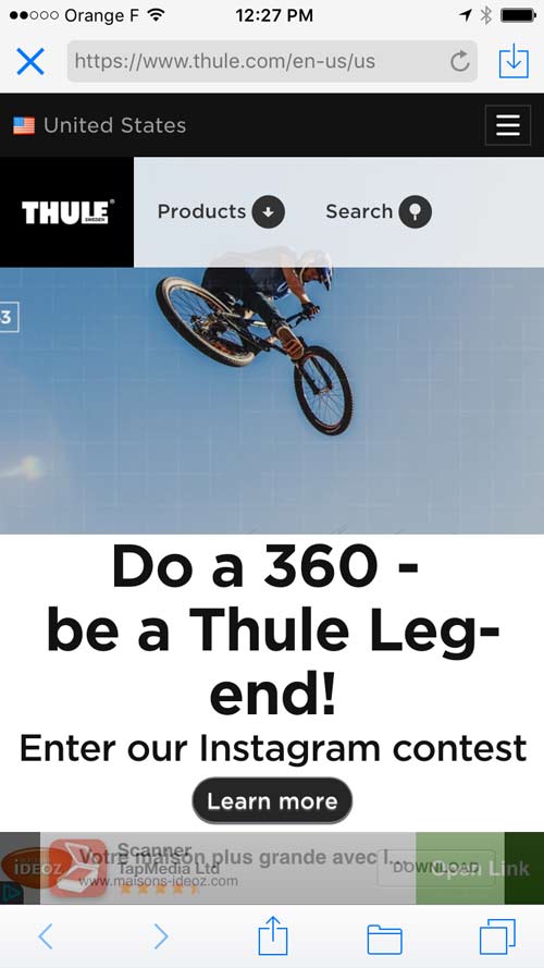
Even though Thule is a large, publicly traded company with a keen eye for outdoor products that help you live your active life, they failed to understand the importance of an easy to use mobile website. Their website uses too many JavaScript animation effects and AJAX scripts that work well on desktop computers, but create huge difficulties on mobile.
The search feature used a sweep-open/sweep-close animation feature that didn't correctly recognize a screen touch. Several of the other navigation tabs also failed to respond to taps.
After wasting about 3 minutes trying to use their mobile website just to find the Atmos X5, I had to ask a store employee to unlock the security packaging and cut off the straps so I could read the box.
I do give Thule credit for trying to correctly connect their packaging with a QR code to their website, but the result was a lackluster failure spanning their packaging design, website design, online product management team, and their marketing team.
This is not an isolated incident for me; I frequently find myself overly frustrated by the usability difficulties that responsive design create. Many web developers creating these responsive designs are not working with a design team to create best experience, but also, the design teams are not properly researching the real world usage of these designs.
It might seem like this story does not relate to your own small business website, and I didn't expect to be writing about it until I started looking for this week's website review candidate.
On The Hunt
I started my hunt for a website review candidate with the search phrase "jewelry chester pa." These are the Google results I found:
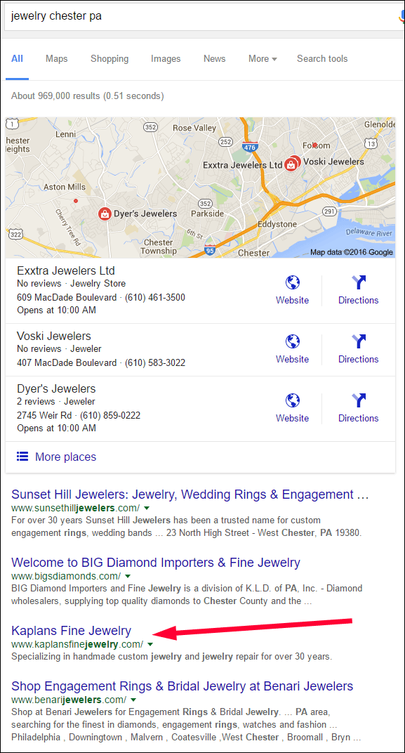
The goal of these weekly website reviews is to find websites that need a little help, and to suggest fixes to make things better. Lower ranked websites usually need more help than the ones at the top, and they make for a better learning experience. This week, I chose Kaplans Fine Jewelry and their website http://www.kaplansfinejewelry.com/.
First Impressions
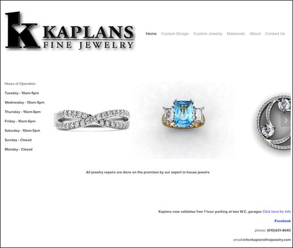
This is what the home page looked like when I visited:
I thought this might be a responsive website design so I reduced my browser site to see how the content would shift. This is what it looks like in a thin web browser:
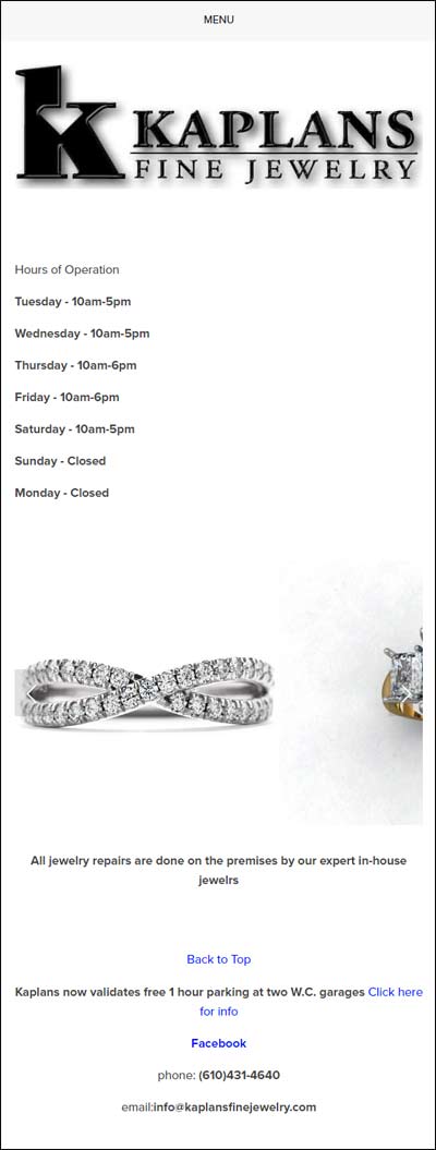
I'm not very impressed with this home page for a fine retail jeweler. All the photos in the home page conveyor belt are CAD renderings and they look fake, which is not a good representation of a store that calls themselves a fine jeweler.
On the other hand, the navigation menu across the top says "Custom Design," "Custom Jewelry," and "Diamonds," which are all pages explaining what type of custom jewelry service they provide. After a quick look at those pages, I started to think that they should change their name and advertise as "Kaplans Custom Jewelers."
About Page
It wasn't until I read their About page that realized that they were indeed a family owned local jeweler providing the service you'd expect from a fine jeweler. They even say that they won awards as the "Daily local Best Jeweler of Chester County 1999, 2000, 2001, 2002, 2003, 2008."
The About Page also has a few designer jewelry logos that I recognize, but the general public probably wouldn't. Each of these logos links to their respective company websites, but it would be better for them to explain each of these designers right on their site.
Here's a screen shot of that page:
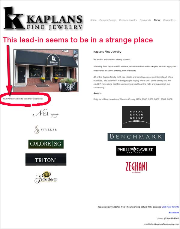
Above the logos to the left, and in small print, I notice the lead-in "Our Partners(click to visit their websites):" The placement seemed very strange to me so I reduced my browser window size again to see how it looked in the responsive view. Shown here:

The flow of information in the thinner responsive mode is disorganized, which makes me believe that the webmaster at Kaplans has failed to look at their own site on a smartphone to see if it made sense in practice.
In the mobile view, we see the storefront photo first, which is good, but then we see the lead-in "Our Partners(click to visit their websites):" followed by a grouping of 5 designer logos. After that, we have the description of the family owned business and their awards followed again by another grouping of 4 designer logos.
The better layout here would be to have the store photo, write-up, and then the logos; which I hope they would have realized on their own if they had viewed the mobile functionality.
Don't Trust In Responsive
Far too many businesses are relying on responsive website features without proper testing. I demonstrated that even Thule, a large company, can fall prey to responsive design screw-ups. I attribute their failure to their size and multiple departments not working together. Small businesses like Kaplan should not have the departmental hurdles like large companies and they should not allow for responsive design mistakes like this. All it takes is some simple testing.
The Kaplan website is very small with only 12 pages, and a responsive design would work well for them, if they had taken the time to test it and organize their content properly. The larger a website becomes, the harder it is for responsive website designs to provide a good user experience on both desktop and mobile.
Today's Conclusion
Forget responsive design. It's almost impossible to perfect the user experience for desktop and mobile devices using the same set of website templates. Responsive design was originally created to help lower the cost of developing and managing two websites: desktop and mobile.
Time and time again we see plenty of examples of thriving companies that provide good experiences to their customers during their in-store shopping, pre-sales support, post-sales support, and online interaction. Customers will complain about the most trivial details that create angst, and clumsy responsive mobile websites certainly fit into that category.
When you create a better customer experience it will eventually lead to happier customers, better reviews, and a thriving business. Stop trying to save short term money by cutting corners with a responsive website design and start building that better experience with a dedicated desktop site and a dedicated mobile site.
That's it for this week; I'll see you next time...
FTC Notice: I randomly choose this website and won't be telling the retailer jeweler that I'm giving them these flop fix ideas. Unless someone else tells them, they will only find out about this Nugget if they use Google Alerts or examine their Google Analytics and Google Search Console. I'm not doing this to solicit business from them, but rather as an educational exercise for everyone. This #FridayFlopFix is completely impartial and all my comments are based on previous experience in my website design and marketing agency, and from my personal research data.


