
This is my weekly #FlopFix website review. Each week, I find a random retail jeweler's website and suggest fixes that could make it better. I never know what I'll find when I start these reviews and I do my best to document my first impressions as I look at the site.
This week I'm venturing to Olympia, WA where I'll search Google for "jewelry stores in olympia wa." Here's a screen grab of the returned SERP:
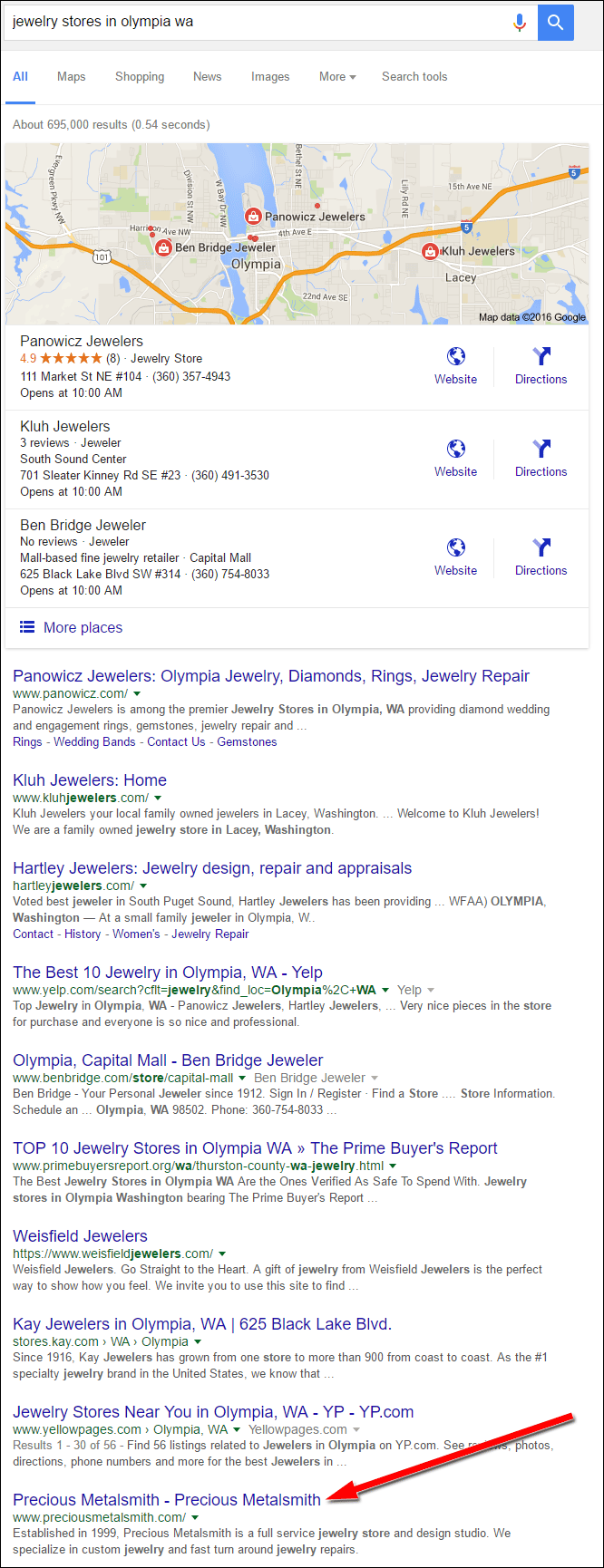
Instead of selecting one of the top websites in the ranking, I'm jumping down to the bottom of the list to look at the last jeweler, Precious Metalsmith. Their website is http://www.preciousmetalsmith.com/.
First Impressions
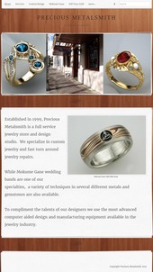
This is what the home page looked like when I first visited:
(click to enlarge)
This is a simple website design using the Weebly service. It has a desktop version and a mobile version, but it does not use a responsive design. I prefer websites that are designed for both desktop and mobile without using the same responsive design that usually never works correctly on all devices.
Although they have a good website setup on desktops and mobile, their content is very light. Their home page says they are a full service jewelry store, but the rest of their website doesn't correctly portray what they do. As I quickly click through their pages, I feel they have missed several pages like their story history, staff page, and more specific details about the services they offer.
Services They Offer
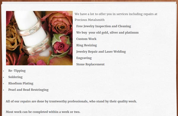
Their services page shows a bulleted list of what they offer without any detailed descriptions. Although many jewelers use this same approach to list their services, the technique doesn't provide enough information for search engines to digest and then match to random search queries.
Here's a screen shot of their services page:
I suggest the following fixes for this page:
- They should link the We Buy Gold gold bullet to that page on their site.
- They should link the Custom Work bullet to their page that explains their custom design service.
- The rest of the bullets should have a few sentences to explain each one, or write full pages and link to them.
Custom Design Page
Their custom design page has a really good write-up explaining their design process. Although it does read well, it also looks like a large, boring block of text. After the text, they have 24 photos which correspond to what was written.
Here's what it looks like on an iPhone:

(click to enlarge)
This page would be a lot more interesting if they included the photos and the text side by side. They could even take every sentence from their write up and use it as a caption under each of the photos.
This restructuring would make the page more enlisting to look at and probably would increase the amount of time people spend on the page and the likelihood that someone would remember that Precious Metalsmith offers custom design services.
Online Shop
When looking at the home page of the website on a desktop computer, there's no way to tell that it has an online catalog. The link to the Online Shop is hidden in their desktop menu as shown here:

It's much easier to discover the online shop when you open the mobile menu as shown here:
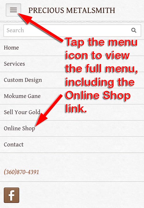
I suggest that they reorder their menu choices by, at least, swapping the positions for their Sell Your Gold link and the Online Shop link. Ideally, I'd rather that they change the layout of the top menu and remove the search feature so all 7 of their page links are visible. Their website is small enough not to need the search feature right now.
Product Photography
It's so infrequent that I see good jewelry photography that I have to mention it when I see it. I was surprised to find their online product catalog because it's hidden in a drop down menu, but I was more surprised to see the quality of their photos.
Most jewelry photography suffers from low lighting which then leads to higher ISO settings and smaller f-stop settings. The resulting photos under those conditions always appear dark and with a narrow depth of field. That narrow field causes the part of the jewelry to be blurry in the back and blurry in the front. Usually only a small portion of the jewelry is in focus.
That's not the case with Precious Metalsmith; they figured out how to use the right lighting and camera settings to take photos that are fully in focus as you can see here:
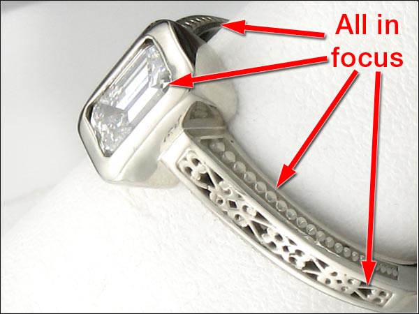
I give them a lot of credit for figuring that out, especially since so many high-end jewelers are spending a lot of money and haven't figured that out yet.
That's all for today; I'll see you next time...
FTC Notice: I randomly choose this website and won't be telling the retailer jeweler that I'm giving them these flop fix ideas. Unless someone else tells them, they will only find out about this Nugget if they use Google Alerts or examine their Google Analytics and Google Search Console. I'm not doing this to solicit business from them, but rather as an educational exercise for everyone. This #FridayFlopFix is completely impartial and all my comments are based on previous experience in my website design and marketing agency, and from my personal research data.


