
Maintain Your Momentum No Matter Where You Are
Your customers and online followers will eventually become familiar with the routine and presentation of your content. Your content, and how you post it online, eventually becomes part of your brand's positioning, which is why planning ahead is so helpful for building that brand identity. The routine is just as important as the visual look because eventually your followers, whether paying customers or just readers, will expect things from you.
In my case, every Friday, I publish this website review as a case study to show how to improve a less than ideal website. It is available on the www.jwag.biz website at midnight, but then we use Hootsuite to schedule the rest of the social posts throughout the day. This is also sent out as an email at 5AM Eastern Time. When using Hootsuite and our email program, it doesn't matter where I am because this will be published on time according to what readers expect. As it turns out, when this particular Golden Nugget was published on Friday April 29, 2016 I was at Schiphol Airport in Amsterdam just boarding my connecting flight to Bordeaux, France. The right tools allow for the routine publishing of content.
As a business owner, you have to build your own procedures that can be followed, even in your absence and when you travel. Traveling might be good for business, but floundering in your content process will allow customers to forget who you are and why you are important to them.
And now for the review...
Finding A Local Jeweler
Earlier this week I was in Milburn, New Jersey, searching for jewelers using the Google Search app. As typical, the app surfaced a list of jewelers based on their proximity to me and their worthiness in Google's eyes. Here's the local results as shown in the app:
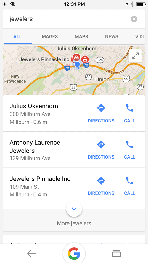
According to Google, I should give my attention to Julius Oksenhorn Jewelers, Anthony Laurence Jewelers, and Jewelers Pinnacle because they meet the best criteria for SERP ranking. I want to dig a little deeper and find a website that isn't so highly praised. For that, I have to examine the rest of the Google results shown here:
(click image to enlarge)

Google's Search app shows me one organic result (Kay Jewelers) followed by the Top Stories and then more organic results. Notice how the results are a full mix of news, blogging sites, organic websites, and Google+ posts. This quick review is a simple reminder of the need to post your content out to more places than just on your website.
Most of the results are marked as "mobile-friendly," although Sidney Thomas Jewelers has a desktop site that looks horrible on mobile devices.
For today's review I'll choose Trimarco Jewelers all the way down at the bottom of the mobile SERP. I'll use screen shots from their mobile website for this review. Here's their site:
http://www.trimarcojewelers.com
First Impressions
This is what the mobile home page looked like when viewed on my iPhone 6S:
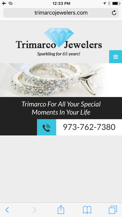
On this minimalist home page, you can only tap on the phone number or the 3-line menu icon. Tapping the phone number will trigger your phone to call them. Tapping the menu icon opens up the menu you see here:
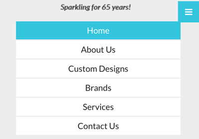
They are using a responsive website design to rearrange their content based on the screen size the visitor is using. Even though this mobile site has the same information as the desktop site, when I look at it as a mobile user, I feel we are missing a few key website features.
In October 2014, Google published findings to show how important it to have a mobile website that meets customers needs. Specifically, they explained that 74% of people using smartphones for local business searches are looking for nearby product availability. They also explained that 75% of local mobile searches are looking for pricing at a local store.
The Trimarco Jewelers mobile site doesn't satisfy either of those needs because it doesn't have a product catalog. The Think With Google website frequently publishes fascinating ideas and points of view that might improve your business. They've been talking about the importance of online catalogs for several years and they urge all businesses to set them up.
I consider it a website flop that Trimarco's site doesn't have a catalog. They should start with a small catalog showing all the popular items they carry and then build upon it from there.
Mobile Usefulness?
In addition to missing the product catalog, I question the overall mobile usefulness of the information on their site. I was sitting in my car in Millburn, NJ when I first found Trimarco Jewelers. I often find that my point of view is completely different when I put myself in a different physical location other than in my office or in front of my computer. From behind the wheel of my car (sitting in a parking space, not driving), I couldn't help but wonder what type of jewelry they carried and if I'd be able to buy a Mother's Day gift at their store.
I was specifically interested in charms, beads, or pendants, but their website doesn't mention these at all. Here's a snapshot of their services page:
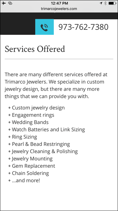
The services page mentions engagement rings, ring sizing, repairs, and a few other things, but no real mention of the general products they carry.
On their Brands page they do show the logos of a few of the lines they carry. Here's a screen shot of that page:

The average customer will not recognize the logos and will rely on the slogans to figure out what they sell. Trimarco flopped on this page because these logos don't help customers understand exactly what is being sold. I've transcribed the logos here:
- Stuller. Choose. Change. Create
- Citizen
- Overnight. Mountings. Semi-Mounts. Finished Jewelry
- Classic of New York
- Lieberfarb. For a love that lasts a lifetime.
- Unique Settings of New York
- Quality Gold. Your complete jewelry source.
- Jonart Metals
- IPT Name & Design
Before slapping logos on your website, you should ask yourself if your customers would honestly understand who these companies are. Trimarco could fix this by adding a brief description under each logo.
Off Site Linking
Your website needs several pages of written information in order for Google to correctly match you with random search queries. Of all the logos they have on their site, the Citizen logo would probably be most recognized by consumers as a watch brand. In order for Trimarco to rank for Citizen Watches they would need to mention the name "Citizen Watches" as text somewhere on their website. Right now, they only have a logo. As a reminder, Google can't read the words we see inside images and therefore Google won't be able to associate Trimarco with local searches for Citizen.
Trimarco could solve this problem by including a page on their site that mentions Citizen along with some photos. Since they are already using Wordpress as their website platform, the easiest way for them to accomplish this might be through a blog post. They could link to that post from the logo. Right now when tapping on the logo you are brought to the citizenwatch.com website. The Citizen website is smart enough to know that they should show the mobile version of their site as you can see here:
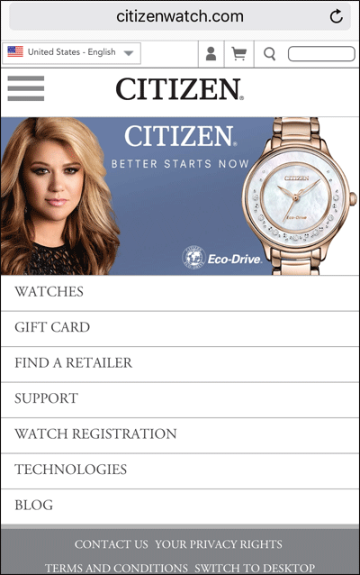
Your website should provide the best customer experience possible. If you do decide to link to a vendor website, then you should check what happens with that site when visited from a smartphone. The Citizen website was fortuitous, but the Lieberfarb website you see here doesn't look so good on a smartphone:

This Lieberfarb website doesn't provide a good mobile experience and it should be avoided. This is another reason to have a dedicated Lieberfarb page on the site.
Contact Page
Their contact page has a brief intro about the store, their address, email, hours, and a contact form; all of which is perfect when viewing this on a desktop computer. I feel there's too much information here for a mobile site; take a look:

By the time a mobile user reaches the contact page, they already know who you are, so that descriptive blurb isn't needed. The phone and fax number both appear as links on a smartphone that allow people to tap to call. What they missed was directly linking their address to Google Maps, which would allow for quick GPS navigation to the store.
The contact form has required fields for name, phone, and email address, and an optional message field. I'm always hesitant to make too many required fields on a contact form. They should change it so only the name and email are required and see if that increases the number of requests they get.
That's it for this week's review. Check out my Instagram post to see an related comment about the Kay Jewelers mobile site and my Facebook account to see another related post about Fords Jewelers mobile site that also appeared in the SERP for this review.
FTC Notice: I randomly choose this website and won't be telling the retailer jeweler that I'm giving them these flop fix ideas. Unless someone else tells them, they will only find out about this Nugget if they use Google Alerts or examine their Google Analytics and Google Search Console. I'm not doing this to solicit business from them, but rather as an educational exercise for everyone. This #FridayFlopFix is completely impartial and all my comments are based on previous experience in my website design and marketing agency, and from my personal research data.


