I have a love/hate relationship with the placement of social network icons on a website. Some websites have them in their header and some put them in the footer. In this Golden Nugget, I'll give you my point of view of where and why you should place your social icons.
Are They Important Enough?
Back when MySpace and Friendster were the latest craze, it seemed like everyone was adding large icons for those networks to their website header. Websites without those icons were made to feel like they were behind on the times. Those social networks faded away as Facebook gained popularity.
Since 2008, we've seen the rise of Facebook, Twitter, Google+, Pinterest, and Instagram as the social networks of choice for businesses. It's now common to see icons for those social networks prominently displayed in the header of a website, yet I often wonder if the website owner put any thought into why they put them there.
If you run a scrollmap test on your website you'd probably find that 99% of your website visitors will see the header of your pages. That means the header is the most valuable place on your website, and it should be reserved for the most important things you'd want your website visitors to see.
If your header has limited space, then it's probably best to only include your most important links up there instead of social media icons. Even the simple links to your store hours and contact page are more important than social media links.
If the design of your website already incorporates important links in appropriate places, with room to spare in the header, then it makes sense to have those icons up top.
Some companies rarely update their website in favor of updating their Facebook page several times a day. Although I don't condone this practice, it does makes sense to give website visitors a quick jumping point from where they can find more accurate information about your store. In this case, it's more important for them to find your social media pages than to look through your website.
Sending The Wrong Message
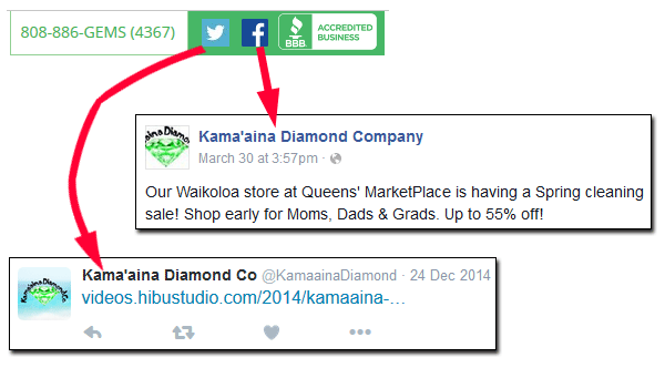
Time and time again, I find websites that include social icons in their header, only to discover that their social accounts are practically abandoned or rarely updated. Many of the websites I've reviewed in the past fall into this category, including the review I did in the previous Nugget. This screen shot shows the icons that appeared in their header and the most recent posts to their social media accounts:

The Facebook post was only 19 days old at the time of this writing, but the last tweet was 52 months old.
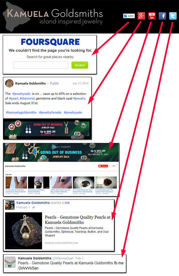
Here are screen grabs from another Hawai'ian jeweler I found with prominent social icons for Foursquare, Google+, YouTube, Facebook, and Twitter in their header:

What we see in their social accounts is extremely misleading. Their Foursquare page is defunct. The last post to their Google+ account was from June 17, 2014 saying they are going out of business. The header of their YouTube channel says they are going out of business, and their last uploaded video was in 2013. Their last Facebook post was from February 1, 2016. Their Twitter account is linked to their Facebook account, so their last tweet was also February 1, 2016.
At first I thought this was just a defunct website and that this jeweler went out of business without deactivating their website. Instead what I found was that the jeweler closed their retail store but still does custom orders and gemstone sales.
What this jeweler doesn't realize is that their social media accounts are clearly sending the wrong message to their potential customers. A potential customer might judge you based on the age of your last social media post. They might be lead to believe that your floundering or defunct social accounts are an indication that your website is also out of date. Outdated online information leads to dissatisfied customers.
The Nugget
My overall point of view for social media icons is this: If you are proud of your social media activity then it's a good idea to show it off by placing those icons right up top. If you have a really active social account you probably have a way to track your social engagements and ways to bring them back to your website, so go ahead and flaunt them.
Put them in the header if you are active on the social networks and updating your accounts at least once per week. Put those icons in your footer if you update them less than once per week.
On the other hand, I also recommend that you remove any social icon for any account that you've abandoned or has become defunct. Leaving them there just makes you look foolish.


