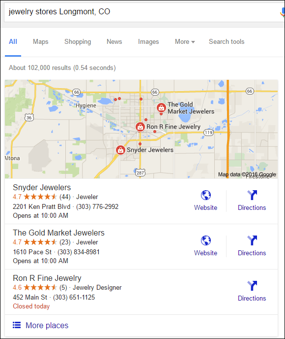
This is the #FridayFlopFix website review where I take a critical look at a jeweler's website to find important mistakes and suggests ways to fix them. To kick off this week, I'm searching the "jewelry stores Longmont, CO" in Google. Here's a snapshot of the returned Google local listings:

Let me first mention the entry for Ron R Fine Jewelry in that list. They don't have a website at all, and therefore I consider them to be a complete flop. The fix there is simple; get a website!
After a quick glance at the website for Snyder Jewelers and The Gold Market Jewelers, I'm choosing Gold Market because their site has more flops that could be fixed.
This week's review candidate is The Gold Market Jewelers with the website:
http://www.longmontjewelers.com/
First Impressions
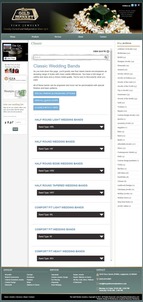
The home page was way too long when I first visited. This is a composite screen shot from it:
(click to enlarge)
The structure of the site is quite old looking with a thin page width and small font size. They chose to include their latest blog posts on the home page which is why it became so long. That small font size doesn't feel inviting, and it really does not inspire any desire to read their home page at all.
I do not like how the list of all their old blog post appear in the right margin, but then I realized that they were using Wordpress as their content management system and that's the simple design layout they chose. On one hand, I'm glad to see they are adding blogs to their website, but this layout is a flop.
The fix I suggest is to choose a more modern Wordpress theme and remove that blog index from the right side. That blog index should only be shown in the blog area of their website.
Product Catalog Widgets
They have several product catalog pages set up on their website using the product catalog widget from Stuller. That widget allows their catalog to appear within your website, making it seem like your own inventory.
I consider widgets like this to be a first step in the evolution towards building your own ecommerce website. I'll recommend these widgets for retailers for a year or two, just long enough for them to get their own system up and running. However, according to the copyright in the footer, this site was last updated in 2011; I confirmed that date with archive.org too. That's 5 years ago as of this writing.
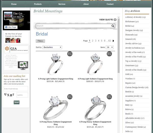
Over those 5 years, Gold Market has not paid attention to how the Stuller catalog looks on their site, specifically in the narrow design format of the site. The Stuller widget is detecting the window size and switching to a mobile format, which looks clumsy on their site as you can see here:

(click to enlarge)
I was surprised to see how many of their catalog pages looked clumsy in that thin format. This bridal mounting page was one of the few that looked good:

I'll have to call their entire product catalog a flop. They could fix this by redesigning their website with a wider theme and then remove the left and right navigations to allow the Stuller widget to fill the design from left to right.
Social Icons
Up in the top right corner of their header, you'll find icons for Twitter, Facebook, and Google+. The first thing I want to point out is the old style of those icons that date back to 2011. All three networks have updated their logos a few times since then.
One of the flops that many website fall prey to is the upkeep on social logos. Although customers might not consciously notice that the social logos on your website are out of date, they will sense that something isn't quite right. These logos should be updated whenever you notice a change.
Even if you don't notice a change, you should at least make an effort to double check the current logos at least once every year. Each of these social networks have updated their logos 3 times since The Gold Market set up this website in 2011; that's 5 years ago.
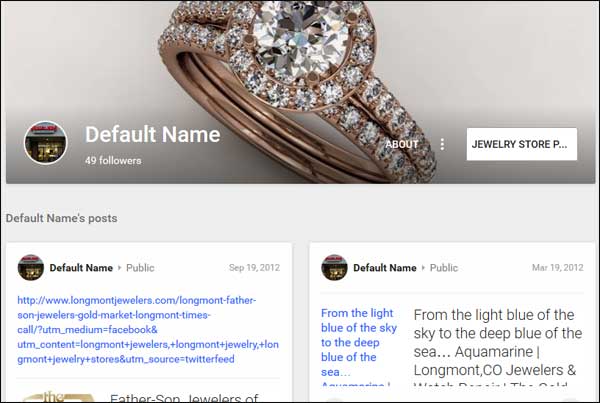
The last flop I'll point out is the frequency that they are updating their social accounts. At the time of this writing, the last update to their Google+ account was September 12, 2012 as you can see here:

I should also point out that the name on their Google+ account says "Default Name." That's a pretty big flop that should be fixed immediately by logging into their Google account and updating their Google My Business brand page.
They update their Facebook account on a regular basis, and they cross-post their Facebook updates to Twitter. I also noticed that they update directly to Twitter once every few months. The better approach would be to tweet more frequently and directly to Twitter.
That's it for this week's review; I'll see you next time...
FTC Notice: I randomly choose this website and won't be telling the retailer jeweler that I'm giving them these flop fix ideas. Unless someone else tells them, they will only find out about this Nugget if they use Google Alerts or examine their Google Analytics and Google Search Console. I'm not doing this to solicit business from them, but rather as an educational exercise for everyone. This #FridayFlopFix is completely impartial and all my comments are based on previous experience in my website design and marketing agency, and from my personal research data.


