
This is the #FridayFlopFix website review edition of the Daily Golden Nugget. Every week, I scrutinize the website of a random retail jeweler and make recommendations for how to improve the site. I seek out bad websites for these unsolicited reviews so you, the reader, can learn how to identify and improve upon your own websites.
I'm changing up my approach this week. Normally I choose a review candidate from the first few that appear in the Google search results; this week I'm digging into the second page of the search results. After all, who goes to the second page anymore? Perhaps those websites have more flops that need fixing.
Here's the Page 2 of the Google search results when I looked for "jewelry stores Orem, UT."
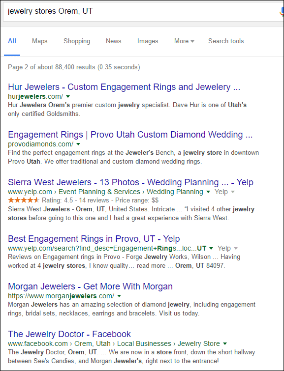
The first result in the list turns out to be a good candidate, Hur Jewelers, and their website http://hurjewelers.com/
First Impressions
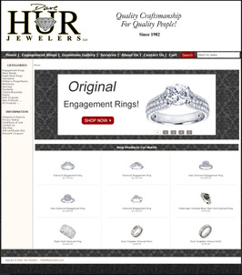
This is what the website looked like when I first visited:
(click to enlarge)
The first flop I'll quickly point out is the overall font size used throughout this website. Larger text sizes are easier to read, and certainly better when looking at a website on a smartphone. The fix here is to increase their font size by at least 50%.
Speaking of smartphones; this is what their website looks like on my iPhone:
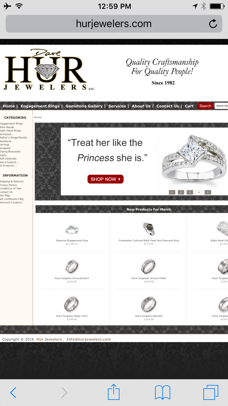
As you can see, the text here is too small to see without pinch-zooming, and I'll also point out that this is not a mobile-friendly website. According to my own research, mobile users comprise 34.86% of the visitors to jewelry websites. Google's policy on non mobile-friendly websites like this one will prevent it from appearing in mobile search results.
Poor Page Titles
This next flop might be the reason their website appears on page 2 of Google's results. Every page of their site has this exact same page title: "Hur Jewelers - Custom Engagement Rings and Jewelery Servicing Orem and Provo. We buy gold silver diamonds. On site repair."
Take notice of the misspelling of the word jewelry as "jewelery." Perhaps if you can't spell the product you are selling, then maybe no one should be buying from you at all. That's a big flop that needs to be fixed, but let me go deeper.
This is a screen grab showing two pages with the identical page title I showed above:

As I said, every page of their site, including all the products in their product catalog, has the same title. This SEO mistake is referred to as a "duplicate page title," and it should be avoided. There's even a test tool in Google Search Console (Search Appearance - > HTML Improvements - > Duplicate title tags) to help you prevent this problem. From my point of view, Google only provides testing tools like this as a way to tell us that something is very important. In this case, every page title on your site needs to be unique.
Hidden Pages Should Stay Hidden
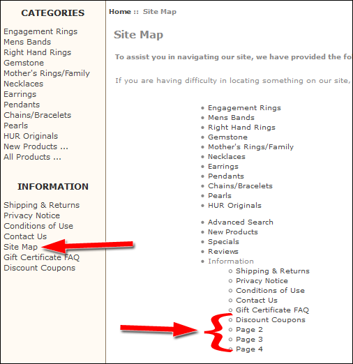
Every website should have a site map page to help more advanced users navigate around your site. The link to that site map page should be located in the footer of your website design, but Hur Jewelers has it in the left navigation where people are more likely to randomly click on it.
Here's a screen grab of the site map I found on that page:
There are countless internet marketing reasons as to why you would not want all the pages of your website to appear on a site map page like this one. When using Facebook Ads and Google AdWords you should hide your landing pages to prevent inaccurate tracking results. You should also hide pages from the site map while you are testing them.
In the above screen grab I indicated the 4 test pages I found in their site map: Discount Coupons, Page 2, Page 3, and Page 4. Here's a screen shot of two of them:
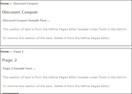
The flop here is to deactivate them somehow until they are ready to be used.
Conclusions
Google doesn't want you to over think how you manage the SEO of you website; they just want you to make a website that is good for your customers. The flops I mentioned above are probably big contributors as to why Hur Jewelers is on Page 2 of Google's results.
Specifically, the site is non mobile-friendly, difficult to read with the small font, and the pages all have the same title. Fixing these three issues will probably be enough to edge them into the first page results.
That's it for now; I'll see you next week...
FTC Notice: I randomly choose this website and won't be telling the retailer jeweler that I'm giving them these flop fix ideas. Unless someone else tells them, they will only find out about this Nugget if they use Google Alerts or examine their Google Analytics and Google Search Console. I'm not doing this to solicit business from them, but rather as an educational exercise for everyone. This #FridayFlopFix is completely impartial and all my comments are based on previous experience in my website design and marketing agency, and from my personal research data.


