Welcome to a very special #FridayFlopFix website evaluation. I call these weekly posts the "Flop Fix" because I specifically look for website problems, i.e. flops, for which I can offer improvement ideas, i.e. fixes, that everyone can learn from.
Well, this week is a doozy. I have been TRYING to publish this review every week since I ORIGINALLY wrote it back on December 16, 2015! Today is March 3, 2016; that's 11 weeks ago. There's a story behind this that should make you all cringe. Forewarning, I'm about to reveal some website mistakes that might even make you feel a little secondhand embarrassment.
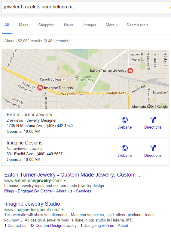
This review originally started out as a search for "jeweler bracelets near helena mt," for which Google returned this:

I chose to review the website for Imagine Jewelry Studio. Their website is:
http://www.imaginedesignsmt.com/
This is what the home page looked like when I first visited:

I proceeded to write the full review you see below, and then just as I was finishing up, their website was deactivated and I saw this:

That's the GoDaddy placeholder page that is meant to be a wakeup call for website owners that they forgot to renew their domain name. Look closely at the yellow ribbon along the top of that page and you'll see it says the domain expired on 12/11/2015. Remember, I was writing this on 12/16/2015. GoDaddy always sends email reminders 90 days, 60, days, 30 days, and then 5 days before the renewal of your domain. Then, they send you a notice the day your domain expires. Clearly, the owners of Imagine Jewelry Studio were not reading their emails.
Clearly.
If you don't renew your domain name, GoDaddy will wait 5 more days before they block your website and activate this placeholder page.
Interestingly enough, this was not the first time that a website I reviewed got put on hold. The first time was on October 2, 2015 with this review. They quickly renewed their domain name and things went back to normal within a day. But that was not the case with Imagine Jewelry Studio. With Imagine Jewelry Studio, they let a day pass, then another day, and then almost a week before renewing their domain name.
Domain names that don't get renewed are put into a "redemption" status. It's up to each registrar to set the number of days to wait before placing domains in redemption. Some registrars do it immediately, but I think GoDaddy waits 14 days. You have to pay an unusually high fee to reclaim your domain name from redemption.
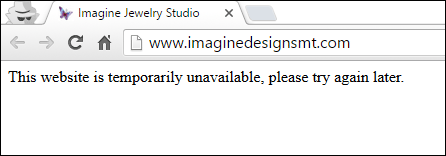
I had hoped this website would come back online within a week so I could publish the review I wrote; after all, it does take about 2 hours to write these, and I didn't want that work to go to waste. I was checking the website every day to see when it came back online. By the middle of the following week (December 23rd), the GoDaddy placeholder page was replaced with an empty white page with the message you see here:

It reads: "This website is temporarily unavailable, please try again later."
I recognized this as a DNS misconfiguration issue, and assumed they would fix it in another day or so. Domains that get placed in redemption often have all their DNS settings cleared out. You have to manually reapply them once you get your domain back.
Keep in mind that this was happening to them during the height of the 2015 Holiday Season. Can you imagine having your website down during the most important part of your sales year? Another week went by, and now it's January 6, 2016 and their website is still down. I continued to check back every week, but after a few weeks, I could not help but think that they went out of business.
Eleven weeks have now passed, and to my surprise, I found the website back up and running this morning. Not only was it back up, but the message on their home page is just... bizarre. Look:

To quote: "WE'RE MOVING!!! OUR NEW ADDRESS IS 62 N. LAST CHANCE GULCH IN HELENA, THE CORNER OF 6TH AND THE WALKING MALL (by Big Dipper Ice Cream). WE'LL BE CLOSED FROM 12/25-1/6. IF YOU HAVE QUESTIONS, PLEASE CALL OR EMAIL US."
First of all, that message was only intended for December 25th through January 6th. Again, I'm writing this on March 3rd. Obviously, they do not update their website.
But wait a minute; their website was in a down state since mid December, so how could they have changed their home page message with a downed site? That's when it hit me; they are using Squarespace to edit their site. Systems like Squarespace, Shopify, and Weebly all have central websites where you edit your site and then you have to manually publish your changes. You don't directly log into your domain name to edit them.
For example, Imagine Jewelry Studio could be editing their website through a URL like this one:
http://imagine-jewelry-studio.squarespace.com/
It would look something like this if they were using Shopify:
https://imaginejewelrystudio.myshopify.com/admin/
Unfortunately, you could edit your site and never know anything is wrong unless you look at your site! Let me be perfectly clear here... They added that moving notice to their website and never bothered to look at their home page to see how it looked.
A downed website will seriously hurt your business. It takes months for Google to correctly index your website. When Google detects a deactivated website, it will start to check all the pages it has in its index. It removes pages one at a time as they are confirmed to be dead, eventually removing your entire site from the index.
Avoiding This Debacle
There are numerous flops that need to be addressed here. The first is for them to go back into their GoDaddy account and check the email address that GoDaddy has on file. I just looked up their domain name public records and found that they are using a proxy service to obfuscate their contact information. Perhaps they need to check the information on file with the proxy service because they obviously didn't get their renewal notices.
The next flop that needs fixing here is that they should not be editing their website without checking their work once it's published to the live site. They need to add this step into their typical website update process.
The other specific flop I've pointed out is the outdated information on the top of their home page. They need to fix that, and they need to update their website more often.
To add insult onto their existing injury, here's the original pie in the face review I wrote about them back in December. I just read through it to make sure everything was still valid...
Original Review

Both of the retail jewelers listed in the Google local pack have website errors that need to be fixed.
The website for the first one, Eaton Turner Jewelry, http://www.eatonturnerjewelry.com/, is updated often but looks a few years old. It needs a refresh. It also uses two of the iframes I mentioned in this Nugget, specifically a diamond search iframe and a microsite from Gabriel & Co.
The second jeweler in the list, Imagine Designs, http://www.imaginedesignsmt.com/, is a more modern looking website using Squarespace that also has its share of flops to fix. I'm selecting this website as my candidate today since it looks more up to date and it this review is more likely to be helpful for readers.
Home Page First Impressions
This is what the home page looked like when I visited:

(click to enlarge)
The top navigation is quite simple with 4 links:
- New Folder
- Home
- Blog
- About
- http://www.imaginedesignsmt.com/#/19-photographs/
- http://www.imaginedesignsmt.com/#/new-gallery-1/
- http://www.imaginedesignsmt.com/#/diamond-and-gemstones/
- http://www.imaginedesignsmt.com/#/white/
- http://www.imaginedesignsmt.com/#/alps/
- http://www.imaginedesignsmt.com/#/eastward/
- http://www.imaginedesignsmt.com/#/ivory/
- http://www.imaginedesignsmt.com/#/highlands/
- http://www.imaginedesignsmt.com/#/alps-1/
- http://www.imaginedesignsmt.com/#/alps-2/
- http://www.imaginedesignsmt.com/#/monthly-specials/
- http://www.imaginedesignsmt.com/#/urban/
- http://www.imaginedesignsmt.com/#/buying-a-diamond/
Although it might appear to be a simple 4 page website, every one of those home page photos clicks to a different page. Because of the way their website is organized, I have to refer to the grid of 18 photos as their main navigation. Here's how it works...
Of the 18 photos on the home page, 13 of them will refresh the screen using AJAX. AJAX is a sophisticated way of using JavaScript that allows a partial screen refresh that only replaces your main content. This technique saves bandwidth because it prevents the refresh of header code, footer code, and any reusable images. In their case, they have 18 reusable images that are part of their "main navigation."
They should reconsider revamping their navigation so it doesn't use those 18 images. A larger top menu navigation is a better method.
Navigating The Site
From that grid of 18 images I clicked on the first. The page refreshed to show this very long page. The images are large and show the needed detail for a jewelry site, but the layout is bad. Take a look:
(click to enlarge)
That page has 14 bridal jewelry items stacked on top of the same 18 navigation images at the bottom. The only way to navigate to the next screen is to scroll down and click the next icon. I always find this scrolling to be a laborious method common in Squarespace design templates.
Only 5 pages, out of 18, will fully refresh the screen and show something new. Here's a screen shot of their "Shop Earrings" page:

When on pages like this one, the only way to navigate other areas of the site is to return back to the home page and scroll down to the next icon. Very tedious.
This navigation is a complete flop. They need to replace it with either a top menu or simply have a navigation menu on the left side.
New Folder?
I'd be remiss if I didn't mention the "New Folder" link in the top menu that you see here:

The words "New Folder" are simple placeholders within the Squarespace template that should have been replaced with a real link before the site was published. They have 18 potential real links that could have been used.
AJAX Flop
They are using AJAX code to refresh 13 of their pages. Here's a list of the URLs for those 13 pages:
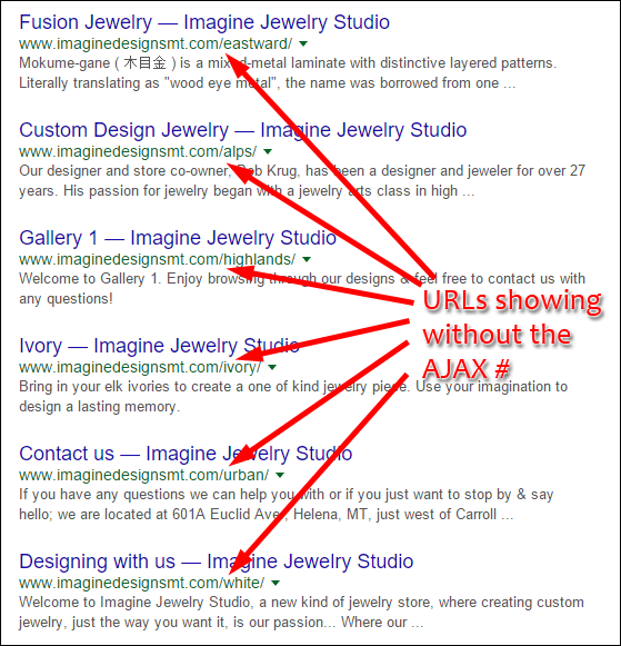
Notice the use of the "#" in the URL. That hash symbol allows for the AJAX functionality to work, but it's not something that Google recommends using. In years past, Google was unable to read pages using the "#" symbol, or the combination of the "#!" symbols, which forced programmers to create alternate ways to allow readability.
Today, Google has figured out how to read these pages, but the results are unexpected. Here's a screen shot of Google's SERP showing how they modify those URLs:

Unfortunately, Google is slightly misinterpreting each of those pages from what was intended. Google has a set of website guidelines that you should follow. Ignoring those rules always lead to unexpected results.
The fix here is to remove all the AJAX navigation and rebuild the pages to correctly include all the information.
The Blog
The last thing I want to point out today is the status of their blog. The link for their blog is in the top menu, but clicking it brings you to this blank page:

This blank page is another Squarespace template. They've added the blog to their website but they haven't formatted the page or added their first blog yet.
Fixing this flop is quite easy. Just deactivate the page until the setup is complete and there's at least one blog post to display.
Bottom line
These guys should not be allowed to edit their own website. I simply do not understand how any business could allow their website to be offline for 11 weeks the way this one was. This is such a poor reflection on the way they run their business. They need to admit they have a problem and hire someone to help them. Websites are now an intrinsic part of the public identity for every local business. Having your website go offline is worse than never having one in the first place.
Your website supports your business and drives customers to your front door. When your website goes down, it will trigger a drop in the number of people finding you. I can only imagine them wondering why business was dropping off over the last 11 weeks. They are not watching their Google Analytics or Google Search Console to see the drop in traffic, which is another flop that needs serious fixing. Every website owner should be watching their monthly website reports.
Whew, that was a long one; I'll see you next week...
FTC Notice: I randomly choose this website and won't be telling the retailer jeweler that I'm giving them these flop fix ideas. Unless someone else tells them, they will only find out about this Nugget if they use Google Alerts or examine their Google Analytics and Google Search Console. I'm not doing this to solicit business from them, but rather as an educational exercise for everyone. This #FridayFlopFix is completely impartial and all my comments are based on previous experience in my website design and marketing agency, and from my personal research data.


