 Don't want to read? This week you can also watch the video recording of this review here!
This is the weekly #FridayFlopFix edition of the Daily Golden Nugget. Every Friday, I search for a really bad website in a random town, and provide ideas for how to fix all of its flops.
This week when I searched Google for "jewelers Scottsbluff, NE" I saw these results:
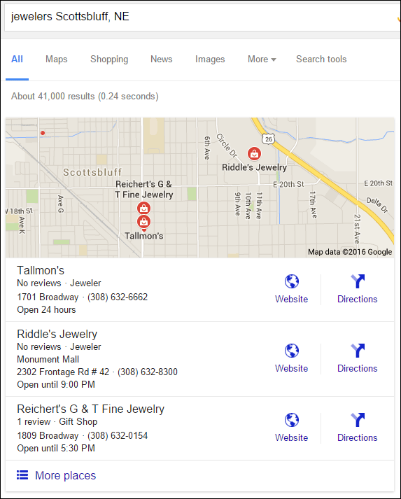
Immediately, I see that's a big flop that needs to be fixed in that listing for Tallmon's. It says they are open 24 hours. I have a feeling that their Google My Business account is a bit messed up. Luckily for them, there's this wonderful website called JewelersGetOnline.com that has a free webinar showing how you can claim your Google My Business account and update incorrect information, like being open 24 hours, 7 days a week.
It turns out that the Tallmon's Jewelry website is quite a flop too, making it a good candidate for this week's review; take a look:
http://tallmons.com/
First Impressions
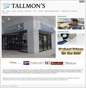
This is what the home page looked like when I visited:
(click to enlarge)
This design has an older look to it, and without even testing I can tell it's not mobile-friendly. Looking closely at the top menu, I see that it wraps around to a second line. Most likely, this is because they added an extra menu link without realizing that it wrapped.
The "ON SALE" link in the top menu caught my attention because it's in caps, but as you can see below, the page isn't very helpful when you get to it:
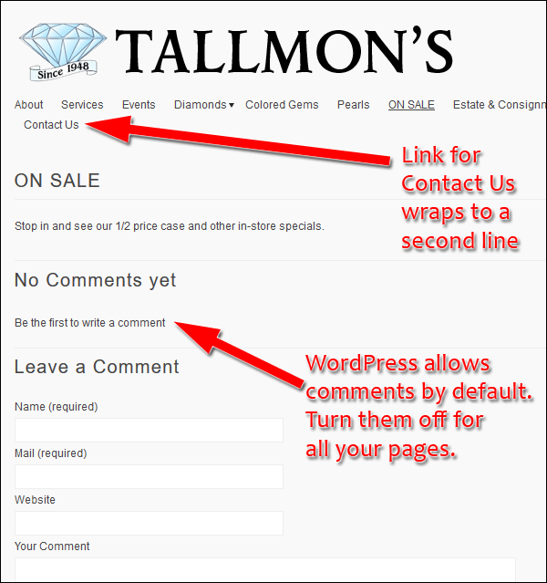
They should only show that link on their top menu when they have products to display; otherwise, turning it off would solve the wrap around problem in the top menu too.
Also, the empty On Sale page draws attention to the "Leave a Comment" feature that's active on their site. This feature is turned on by default on all WordPress sites and should be deactivated.
Website History and SEO Issues
According to archive.org, the original Tallmon's website was launched on December 19, 2003. The website I see today is the 3rd design version of the site which was launched n March 19, 2011. The site has changed a little bit since then. Click here to see the archive.org version of the site.
Here's a screen shot of the original top menu and the reorganized top menu we see today:
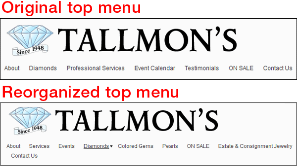
Normally, I would think that they were appropriately expanding their website over time, but then I found their Diamond Jewelry page and realized there was more going on than meets the eye.
Take a look at this page here:
http://tallmons.com/index.php/diamonds/diamond-rings/
Here's a screen shot:
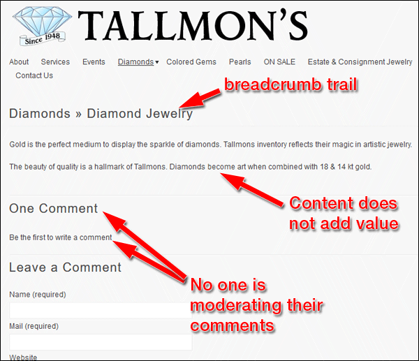
The breadcrumb trail on this page says "diamonds > diamond jewelry" but the URL says "diamond-rings." The best SEO is achieved when you match your page title, breadcrumb trail, and URL together. The approach they are using here is an older style of SEO when you try to include as many different keywords as possible on a page. These need to be fixed.
However, let's also look at the copy on the page to see if it has any value. Here it is:
Gold is the perfect medium to display the sparkle of diamonds. Tallmons inventory reflects their magic in artistic jewelry.
The beauty of quality is a hallmark of Tallmons. Diamonds become art when combined with 18 & 14 kt gold.
I don't consider that valuable information for a website, and I doubt the search engine will either.
I suspect this page was added, and their top navigation was reorganized, when they paid someone for SEO services.
I also want to point out that no one is moderating their comments. Most of the pages of their website indicate that they have comments, yet the message "be the first to write a comment" is still there. This is another reason to deactivate the comments feature on this site.
Broken Links
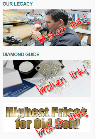
Unfortunately, I found a pretty bad flop on their home page. When they reorganized their navigation they neglected to realize that they had 3 links right on their home page that lead to the old navigation structure. Having broken links on your home page will lead to very high bounce rates. Those broken links are a sure sign that you don't pay enough attention to your site, and it sends the clear message that it's not worth wasting time looking at it.
Here's the screen shot of the three broken image links:
Each one sends the user to a 404 error page like you see here:
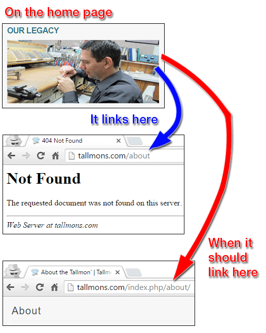
Other than the 3 broken link flops that needs fixing, their website also needs a real 404 error page other than the generic message you see above. Every website should have an official error page with a friendly message, but by default that is not set up unless you or your webmaster do it.
That's it for this week's review; I'll see you next time...
FTC Notice: I randomly choose this website and won't be telling the retailer jeweler that I'm giving them these flop fix ideas. Unless someone else tells them, they will only find out about this Nugget if they use Google Alerts or examine their Google Analytics and Google Search Console. I'm not doing this to solicit business from them, but rather as an educational exercise for everyone. This #FridayFlopFix is completely impartial and all my comments are based on previous experience in my website design and marketing agency, and from my personal research data.


