
This is the Friday Flop Fix edition of the Daily Golden Nugget. Each Friday, I search for a website that isn't living up to its full potential, and I give suggestions on making it better; my fixes for their flops. I started my search today with the query "jewelers Rolla, MS" and received this as a result:
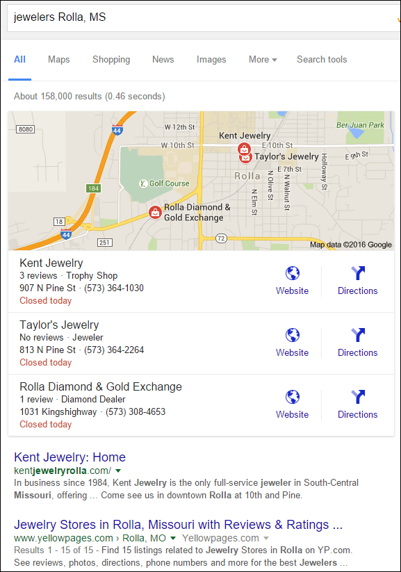
Kent Jewelry is listed in first place in the Google local 3-pack, but oddly it shows "Trophy Shop" as a store type. That certainly is a strange classification for a jewelry store. I suspect it's one of those automatic, and incorrect, Google classifications. Clicking that listing revealed this Google Maps information:
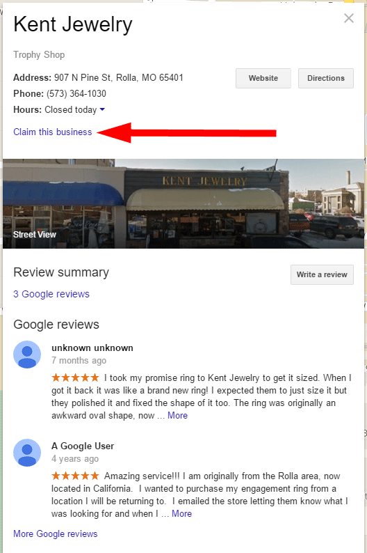
Google does its best to source business information from other business directory companies. Somewhere out there exists a business directory where Kent Jewelry is tagged as a trophy shop. Take note of the link to "Claim this business" I've pointed to in the above screen grab. The reason Kent Jewelry is misclassified in Google Maps is because they have yet to claim their business and correct the information.
The Website
The official Kent Jeweler website is http://kentjewelryrolla.com/, however a quick scan of that site reveals that Google's trophy shop classification isn't too far off. It looks like Kent Jewelry runs a secondary business known as Route 66 Engraving, which I found a link to at the top of their jewelry website. This is what the jewelry website looked like when I wrote this review:
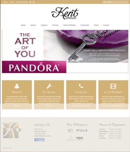
(click to enlarge)
Main Nagivation
I think their top menu is a little different than what's expected for a jewelry store, or for any business for that matter. Take a close look:

The link for "Suppliers" is out of place. A common trade show question is to ask "who are your suppliers," but it's a bit out of place to see that on a website. The suppliers they list are, in fact, several different jewelry designer lines, like Pandora, Rego Designs, Elle, Hugo Kohl, Frederic Duclos and many more. This is a flop, and they should swap out the word Suppliers and replace it with Designers.
The link for Gems of Wisdom is cute. This is their blog. They could build an entire ad campaign around their "Gems of Wisdom" blog, that is, if they decide to update it again. The flop here is that, as of this writing, their blog hasn't been updated since September 2, 2014. It's mid January 2016 as I write this.
The link for "Praise" points to their reviews/testimonials page. This is not a bad link name; it's just a little unusual than what a consumer will expect. I don't mind things being unusual, but not in a main navigation. It's best to stick to standard phrases in the main navigation, otherwise you're forcing your website visitor to think too much.
Home Page Heros
The trend of home page hero images won't seem to die. All you jewelers seem to love them, but you are all using them wrong, or updating them far too infrequently. The best use of those honkin' large home page hero images is to show eye-popping images that make people say "wow." Instead, what I always see are just reproductions of print ads, or vendor ad slicks. What I want are images that will seriously impress me, close up details of diamond facets or filigree would be a start. Create intrigue with finite details.
Instead, most jewelers continue to make the same mistakes Kent Jewelry is making. They have 5 home page hero images in a JavaScript slider animation. Far too many for me to sit here and want to watch. Here's the breakdown:

This first hero image is simply a reproduction of a similar Pandora ad. Give me a close-up of the entire pendant that fills the screen from left to right, or even just a close-up of the heart. Allow the person to become curious and click it to see the full product.
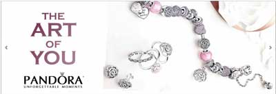
Most of the Pandora ads I see are as horrible as this one. The problem is that you can never see the details. It'd be better to have a filled bracelet blurry in the background and with large individual beads in the foreground so we can see the detail.
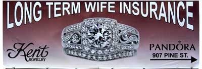
This next image is a photo of their local billboard. This is one of those infamous ads from the Jewelry Ads That Work marketing company. Sadly, I find all their ads to be quite trite. I find this ad, "Long Term Wife Insurance," to be degrading. Anyone who understands how to make a relationship last knows it's much more than expensive gifts. Jewelry should be the icing on the relationship cake, not viewed as insurance to hold the relationship together. Additionally, now that we're in an age of same-sex marriage equality, this ad simply archaic and needs to die. Sadly, most jewelers must love this ad because I see it coast to coast.

As I said, it's mid January 2016 as I write this, meanwhile this holiday ad is still in rotation on their home page. Additionally, the image was very poor quality to begin with. The only "wow" factor this will achieve is a "wow, I can't believe they used something so horrible."
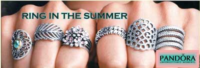
This image comes close to the appropriate "wow" factor for a home page hero. I would have limited it to 4 rings and zoomed in more to fill the entire space from left to right again. The Pandora logo in the bottom right corner is all that's needed. However, look at the headline... "Ring in the Summer." Summer? Either this ad is 4 months too early or it's 8 months old! Of all the hero images they have on the home page, this one comes closest to correct usefulness, but it is ruined by the headline. The fix here would be to put the image up there without the headline, then it can be used all year around.
Future for This Site
The CMS powering the Kent Jewelry site is WordPress. They have Google Analytics installed and they're using the popular Yoast SEO plugin, but it doesn't seem like they are paying attention to what their analytics are telling them. There's a lot more opportunity for them to build out additional content about each one of their designer lines, to add product to their site, and build a site that better matches their store, and their personality. I know they have a cute personality too because I watched their 6 video commercials with their models flipping signs while standing on a beach, in front of a cow, and in front of the fun mural they painted on the side of their building.
They really need to refresh this site and take a better approach overall.
There are several more flops I could write about on this site, but I will stop here. Until next time...
FTC Notice: I randomly choose this website and won't be telling the retailer jeweler that I'm giving them these flop fix ideas. Unless someone else tells them, they will only find out about this Nugget if they use Google Alerts or examine their Google Analytics and Google Search Console. I'm not doing this to solicit business from them, but rather as an educational exercise for everyone. This #FridayFlopFix is completely impartial and all my comments are based on previous experience in my website design and marketing agency, and from my personal research data.


