
During my internet travels over the last few days, I came across the website for Goodman's Jewelers in Madison, WI. It caught my attention and I immediately decided to use it for today's #FridayFlopFix review. I hope to make a few suggestions that will help them improve how they use their site, and give you a few ideas on what to avoid on your own site. Let's dig in...
The website I'm looking at today is Goodman's Jewelers at:
http://www.goodmansjewelers.com/
This is that the home page looked like when I first visited:
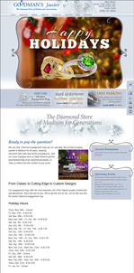
(click to view larger)
First Impressions
If I had found and reviewed this website 30 days ago, I would have congratulated them for updating their site with relevant holiday information. However, now it's mid January and their website is still referring to Black Friday, Small Business Saturday, and wishing everyone Happy Holidays. Apparently the holidays are over and they do not care about their customers in January. Let's look closer...
Home Page Slider Images
Many websites are using home page slider JavaScripts to rotate multiple large images. Those large images are also known as hero graphics. Typically, each hero graphic includes a message and a call to action to entice someone to click the image. As the image changes so does the clickable link.
I found some problems with the links they are using, as explained here:

This is the general Happy Holiday hero image. Not only should it have been remove about 2 weeks ago, but it is also linked back to the home page. This is a circular hyperlink that should not be there. If your hero image that does nothing more than wish the visitor well, then don't bother linking it to anything.

This Hearts On Fire hero image links over to this HOF microsite:
http://www.heartsonfire.com/?busRel=00001349
I'd prefer to see this link to a dedicated HOF area on the website rather than the microsite. Adding Hearts On Fire to the site will help attract local customers to the website, this microsite link doesn't help at all. What's worse is that, when clicked, this link does not open the microsite in a new window, it overwrites the current window and prevents the chance for the consumer to back track to the Goodman's Jewelers website.
Even if they choose not to remove this offsite link from their home page, they should at least program the JavaScript slider to open the link in a new window.
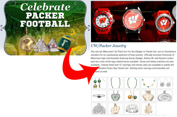
The above hero image shown on the left links to the page shown on the right. Here's the link:
http://www.goodmansjewelers.com/designer-jewelry/uwpacker-jewelry/
I felt a bit disoriented when I got to the page because it doesn't list any of the charms shown in the hero image. There's no sense having a clickable hero image if you are not leading the customer to the same products shown in that hero image.
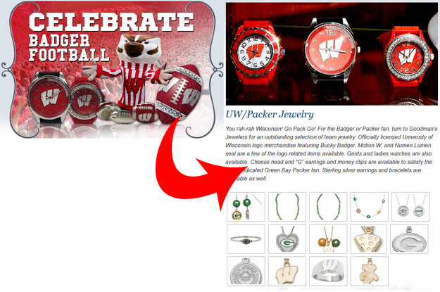
This next hero image shown above left correctly portrays the page it clicks to. This one was done correctly.
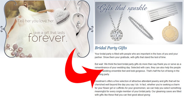
This next image was another disconnect. The hero image shown on the above left says "Tell her you love her, give a gift that lasts forever." Here, it links to the "Bridal Party Gifts" page here:
http://www.goodmansjewelers.com/diamonds/bridal-party-gifts/
Either the link or the image is out of place. Someone didn't double check their work when setting this up.

This hero image is still referring to Black Friday and the holidays. Once again, someone is not paying attention to the details of their website.
Holiday Hours
As I said, if I was reviewing this website 30 days ago, I would have congratulated them on adding their holiday store hours to the home page, but these hours are now 15 days out of date as of this writing:
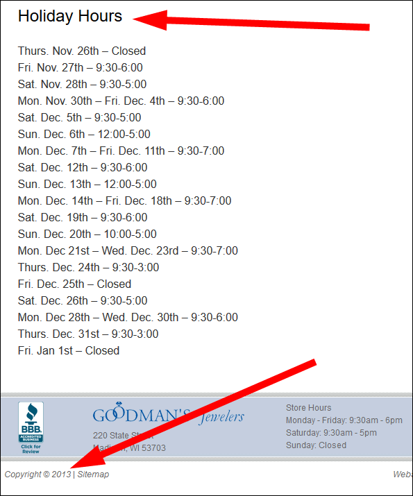
Also, I winced a little when I noticed the 2013 copyright notice in the footer of the website. With the technology of today, there's no reason for the copyright to ever be out of date. Your website programmer should set it up to change automatically.
Conclusions
It's important to keep your website up to date, especially your home page. You need to stay on top of time sensitive information and either remove it on time or have it programmed to turn off after the appropriate time has passed.
You also should never have off-site links on your home page which take you away from your website without any easy way to return back. It takes too much effort to get someone to your website to then immediately send them away.
That's it for this week; I'll see you next time...
FTC Notice: I randomly choose this website and won't be telling the retailer jeweler that I'm giving them these flop fix ideas. Unless someone else tells them, they will only find out about this Nugget if they use Google Alerts or examine their Google Analytics and Google Search Console. I'm not doing this to solicit business from them, but rather as an educational exercise for everyone. This #FridayFlopFix is completely impartial and all my comments are based on previous experience in my website design and marketing agency, and from my personal research data.


