This is my weekly #FridayFlopFix website review where my goal is to find a website that has a few problems and suggest potential fixes. I start this review with a jewelry store search in a random town and then I quickly look through the search results for websites with problems I can talk about in a terse evaluation like this.
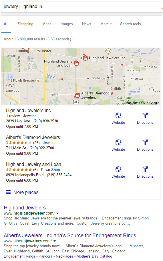
I started my hunt for a candidate website this week with a search for "jewelry highland in." Google showed me these results:

Highland Jewelers Inc is a good candidate with their website at:
http://www.highlandjeweler.com/
First Impressions
Here's what the home page looked like when I visited:

(click to enlarge)
The Simon G. hero graphic was one in a series of five they had on their home page. I want to specifically mention that Simon G. photography because it was part of a larger Simon G. marketing campaign from a few years ago. Could it be that this image has been on the home page of Highland Jewelers for 4+ years? If so, they have a problem.
The home page of your website should be updated regularly. One of the core metrics you must analyze on your website is the percentage of first time visitors vs. return visitors. The industry average for returning visitors right now is 20.4%.
While the 79.6% of new visitors won't know the difference, it seems like your home page must cater to the 20% of visitors that do come back. I dug a little deeper in my data to find that only 4.75% of returning visitors will come back more than 7 days after their initial visit.
During the holiday season, it's pretty common for a website home page to change on a daily basis, during the rest of the year, you should update it at least once a week. Unless you give visitors a reason to keep coming back, they will eventually get bored of seeing the same things and forget about you.
The fix for these home page image flops is to source new Simon G. photography.
Designer Links
According to the internet archive for highlandjewelers.com (here), the website I see today is only the 3rd design version, and it was launched sometime in mid 2015. While the look has changed, the content remains somewhat the same.
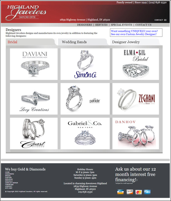
This is what their designers page looks like today:

Each of the nine designers shown there is linked to the respective designer websites. This is the same strategy that Highlands has used since their first site was launched in 2004, and it's time that they killed this strategy.
Instead of jumping to a designer website, they should fix this by replacing all these off-site links with their own product catalog.
On the other hand, if the product catalog approach is too much for them right now, then they should change the target links for each designer. Right now every one of the designer logos and images are linked to the home page of the respective designers. That forces the customer to figure out how to browse the designer site.
Instead of using such a generic home page link, Highlands could fix them by browse through each of their designer's sites and find the most appropriate page to link to.
For example, instead of linking to the home page of Coast Diamond here:
http://www.coastdiamond.com/
they could more accurately link to the Coast Diamond Romance collection here:
http://www.coastdiamond.com/collections/bridal-romance_c12/
Sitemap Pages
The last little needed fix I'll mention today is what I found on the site map page here:
http://www.highlandjeweler.com/sitemap.htm
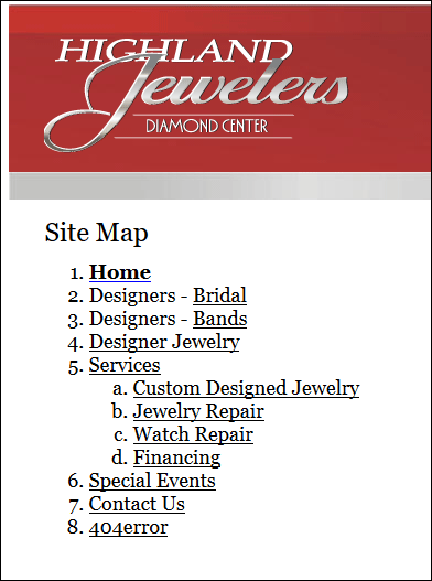
Website sitemap pages are often automated without any work by you, but that automation can also create a few silly results like the one you might notice here:

This site map shows 12 different pages, but the last one should not be visible on the list... The "404 error" page.
The 404 error page should be a hidden page on your website that is never linked to from any other page on the site. The only way that page is found is when something goes wrong.
Hopefully this is an easy fix for them; otherwise they might need their programmer to change the automated process that created this site map page.
That's it for this week, until next time...


