In this edition of #ThrowbackTursday, I'm jumping back to October 2011 to the topic of website holiday themes.
In that Nugget, I explained how you could add a few small, cheerful holiday design changes to your website as well as some quick links to help holiday shoppers.
Most retail websites maintain the same design throughout the entire year even though those same businesses will decorate their physical stores for different holidays or seasons. It's quiet easy to add a little flair to a website design to match the current happenings in a store.
Here are a few examples of website changes I found during the 2015 holiday season...
Navigation Menu Changes
This year, Riddle's Jewelry added a special item to their top menu and they changed all the slider images on their home page to include holiday offers or phrasing. Here's a sample of what that looked like:
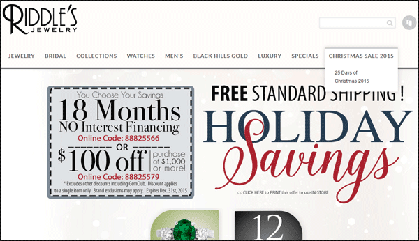
Their top navigation allowed for the extra "Christmas Sale 2015" menu item without disrupting the overall design.
Here you can see another example of a main navigation change:

In this example, Goldsmiths approach is more subtle. They added "Christmas" to their top menu between Watches and Brands. I almost didn't see it, and I have a feeling that many other visitors will completely miss it. It should be in a more prominent place, in a different font, or even a different color.
However, the main home page photo does clearly state "Christmas Savings on this season's must have brands."
Marketing For Known Events
According to this marriage proposal survey 33% of respondents say Christmas Eve is the best day of the year to propose and 15% say that Christmas Day is the best day. If you sell engagement rings, then you already know that this is the big season for your sales, so why not use that in your marketing?
The jewelry Exchange did just that with this home page ad:
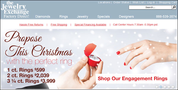
The headline "Propose This Christmas" will immediately resonate with those looking to buy rings.
Change of Backgrounds
Helzberg Diamonds changed the background on their home page to show a couple embracing in front of a red background and heavily blurred out (presumably) twinkle lights that you see here:
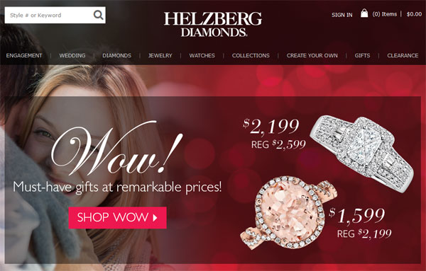
Also, they chose not to mention Christmas anywhere on their site, but they did introduce different "gift" phrasing throughout their site. In the above image, you will notice their "Must-have gifts" phrasing. Use of the word "gifts" helps capture the attention of the visitors who are searching for good gift ideas.
Holiday Product Photos
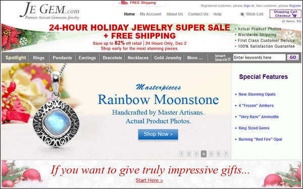
Je Gem is well known for taking real photos of all their products even though many of them are one of a kind. For the holiday season, they've chosen a few products to showcase on their home page. They've removed the original photo backgrounds and superimposed the items on the same holiday themed background you see below.
Here we see another example from The Jewelry Exchange:
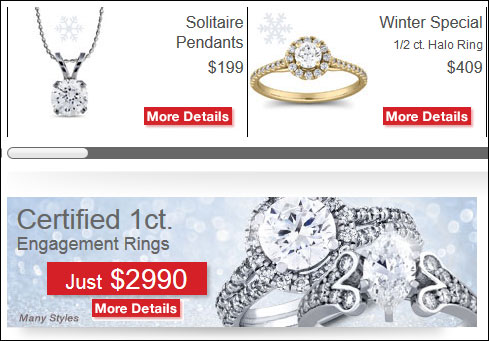
In these examples, we see the subtle addition of a snowflake in the two smaller photos and a snow/ice background in the larger photo. They obviously chose these background to prevent visual distractions.
Conclusions
Making changes like those shown above will certainly benefit your website. Naturally, it shows your website visitors that your site is up to date and active, but your ultimate goal is to help with the gift buying process. During the holiday gift buying season, your customers are expecting to see holiday imagery and phrasing that will guide their shopping experience, so it makes a lot of sense to make these changes to your website.


