
Welcome to the #FridayFlopFix edition of the Daily Golden Nugget, and it's also Black Friday in the U.S., the largest retail shopping day of the year for U.S. retailers.
The goal of these weekly flop fixes is to identify something on a retail jeweler's website that should be fixed. My suggestions are based on my previous experience and research. In honor of the upcoming Cyber Monday, I decided to specifically look for a retail jeweler with an e-commerce website to find some flops that need fixing. I made my search for "jewelers in Salisbury MD" in Google and was given these local search results:
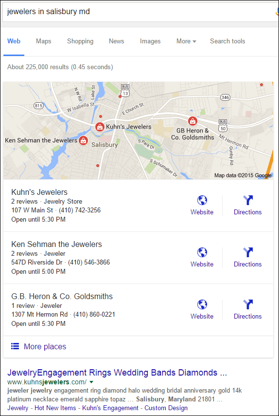
Thankfully I didn't have to search too far since Kuhn's Jewelers is using Shopify and has e-commerce active on their website. You can visit their site here:
http://www.kuhnsjewelers.com
Jewelry Catalog
Since I'm just hunting for e-commerce related issues I dove right into their jewelry catalog on this page:
http://www.kuhnsjewelers.com/collections/non-bridal-jewelry.
This is what it looked like when I visited:
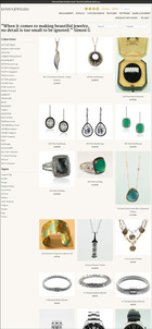
(click to enlarge)
The first thing I noticed was their Holiday Gift Guide, as shown here:
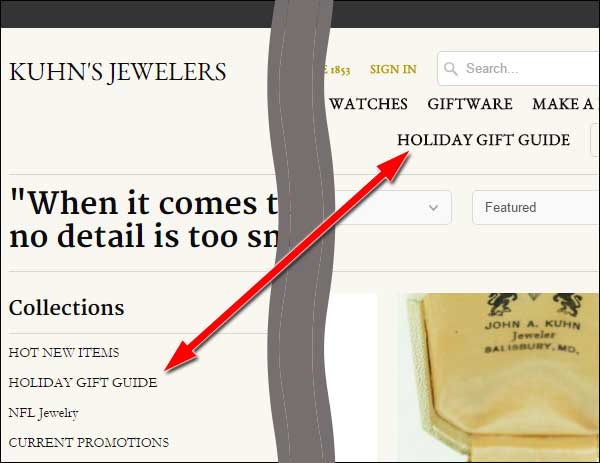
I'm very pleased to see they created a specific section of their website as a gift guide. I've written and spoken about this marketing method before The idea is to showcase different items that would work well as gifts for specific people, like a wife, husband, girlfriends, boyfriends, brother, sister, etc. Let's take a look at theirs...
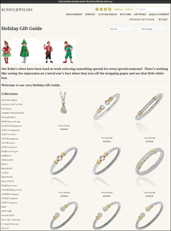
Sadly, I have to call this a #FlopFail! It looks like a standard product catalog page with photos of the Kuhn's elves at the top as a gimmick. I have to say that the page is much longer than what I've shown above, but it was not organized by person or price. I couldn't figure out any organization for the 46 products on that page. Organizing this a little better certainly would help the Cyber Monday shoppers who are looking for good deals and gift suggestions.
To fix this, they should organize the page by expected recipient, and then by gift type. For example, put all the wife/girlfriend/sister items at the top followed by the husband/boyfriend/brother items. Some websites also use model photography to illustrate the product organization.
Confusing Navigation
Website navigation will forever be the most difficult part of a website to design. At first glance I was intrigued by the unique way they used the designer's name next to the jewelry type as their navigation as you can see here:

But then the more I looked at it, the more confused I started to feel. I realized that I'd have to hunt through the navigation to find all the engagement ring designers, yet there's also a dedicated link for engagement.
Another confusing issue is that they have listed all the links without any organization or grouping. A common method of successful website navigation design is to cluster links in groups of 4 or 5 at most, which helps most people recognize words better as their eyes quickly scan a page.
This navigation could be improved a lot if they reorganize it into groups and add a little extra spacing between each group. For example, they could have the links for Holiday Gift Guide and $50-$500 Gifts at the top, followed by a grouping of all the engagement designers and links, followed by an alphabetical list of their general jewelry collections, and ending with a grouping of all their watch makers.
Make A Payment
At first I was happy to see they have a payment page on their website, and I assume this is supposed to be used to help pay off a house account or put money towards an item on layaway. However, I quickly realized, even though this page of their website as asking for credit card information, it's completely unsecure. They should have this page set up with a secure certificate and using https as their URL.
Take a look:
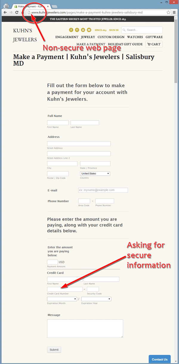
Fixing this should be easy with a Shopify site with the built in e-commerce features, although it might require a call to Shopify support. You should never ask a customer for secure information on a non-secure web page.
And that's it for this week. I'll see you next time!
FTC Notice: I randomly choose this website and won't be telling the retailer jeweler that I'm giving them these flop fix ideas. Unless someone else tells them, they will only find out about this Nugget if they use Google Alerts or examine their Google Analytics and Google Search Console. I'm not doing this to solicit business from them, but rather as an educational exercise for everyone. This #FridayFlopFix is completely impartial and all my comments are based on previous experience in my website design and marketing agency, and from my personal research data.


