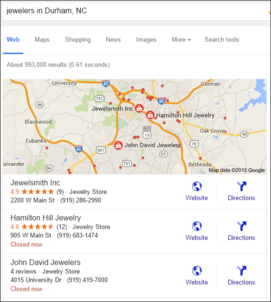
Welcome to the #FridayFlopFix edition of the Daily Golden Nugget, where I intentionally look for a jewelry website that has problems, and I make suggestions to correct them. This week I'm searching for "jewelers in Durham, NC" for my flop fix candidate. These are the Google results I had to choose from:

I quickly looked through the websites for Jewelsmith, Hamilton Hill Jewelry, and John David Jewelers and found that all three of them have a few issues that I could point out quickly, and they could fix quickly. I decided to take the first on the list, Jewelsmith Inc, and their website:
http://jewelsmith.com/
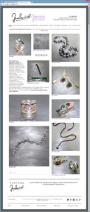
This is what it looked like when I visited:

(click to enlarge)
Virtual Paper
In the above home page screen grab, I intentionally included the entire browser window so you could see that thick gray border all around the webpage. This is a common website design technique that gives the illusion that you are looking at a piece of paper, rather than a website. While I've used this design technique myself, it's very easy clutter up your "paper," which is exactly what Jewelsmith did throughout their website.
Their design also added a large white padding all around the edges of their "paper" to create the look of a 1/2 inch margin. That large margin and the thick top gray border will eventually lead to a subtle amount of scrolling on every page. It might seem innocuous, but visitors will quickly tire from it.
Navigation Clutter
As you can see here, the top menu is very cluttered:

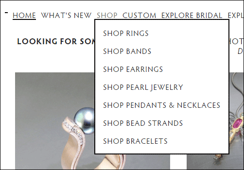
The use of all caps forced them to increase the spacing between the characters, which naturally reduced the spacing between the words. They need to create a better balance to allow faster readability. Drop down menus, like this one, are revealed when you hover over the menu:

They could easily fix the spacing by rewording their navigation, potentially like this:
"ABOUT US/AWARDS" can be shortened to just ABOUT US.
"CONTACT/MAP" can be shortened to just CONTACT.
Those simple changes should add just enough space to unclutter the top menu.
Footer Navigation
While the top menu is overly cluttered, as you see here, the footer menu has space to spare:

There are ten links in the top menu, five of which are repeated in the footer. Another approach to uncluttering the top menu would be to remove one or two links from the top menu and only show them in the footer.
I also noticed that SHOP in the top menu appears as SHOP ONLINE in the footer. Similarly the link for CUSTOM in the top menu appears as CUSTOM DESIGN in the footer. Lastly, the link for ABOUT US/AWARDS in the top menu became just ABOUT US when they listed it in the footer.
They should maintain consistency in wording between the links in the top menu and the footer. Another idea is to split the content of the ABOUT US/AWARDS page into two separate pages; then they can leave the link for AWARDS in the top and have ABOUT US appear in the footer.
I wasn't expecting it, but the CONTACT/MAP link appears to go to a staff page. The contact information and the map are all the way down at the bottom of the page. This is an issue that should be fixed. They should move the staff photos to a specific staff page and add a link to OUR STAFF in the footer. This would leave the store address, map, phone number, and a general email address on the contact page, which is what you would expect.
New Window Linking
In addition to the above itemized problems with their footer navigation, each of the footer links targets and opens their website in a new window or browser tab. Coincidentally, earlier this week I explained when you should hyperlink to a new browser window. Linking to a new browser window should not be used for general top, left, or footer navigation unless those links lead users to other websites.
It should be easy enough for Jewelsmith to correct their footer links to not target a new window or tab.
Web Designers On Staff
This one isn't a #FridayFlopFix, and in fact I have to give them accolades for it. While looking over their staff page (aka contact/map), I noticed they have a dedicated person as their Web Designer/Administrator and another employee that's also listed as Designer/Goldsmith/Website Designer. There've been many times when I've said a jeweler can't succeed with an ecommerce site unless they have dedicated staff to do the job. They've taken the right approach.
However, the overall look and feel of the website has a few other mistakes that could have been avoided if they asked a professional website consultant for their help or opinion. The jewelsmith.com website is currently using the Squarespace service, which is a very easy to use, do-it-yourself method of creating a website. Squarespace provides the tools to get a website up and running fast with a few built in template design choices, but like all DIY systems, there are limitations that only someone with experience (i.e. a website consultant) would be aware of, and might be able to overcome.
That's it for this week; until next time...
FTC Notice: I randomly choose this website and won't be telling the retailer jeweler that I'm giving them these flop fix ideas. Unless someone else tells them, they will only find out about this Nugget if they use Google Alerts or examine their Google Analytics and Google Search Console. I'm not doing this to solicit business from them, but rather as an educational exercise for everyone. This #FridayFlopFix is completely impartial and all my comments are based on previous experience in my website design and marketing agency, and from my personal research data.


