
This is the #FridayFlopFix of the Daily Golden Nugget. I'm on the hunt for a retail jewelry store with a bad website, or at least with something that's broken so I can suggest a way to fix their flop.
My search this week led me to Mukilteo, WA, specifically the Google search for "jewelers in Mukilteo, WA" and these results:
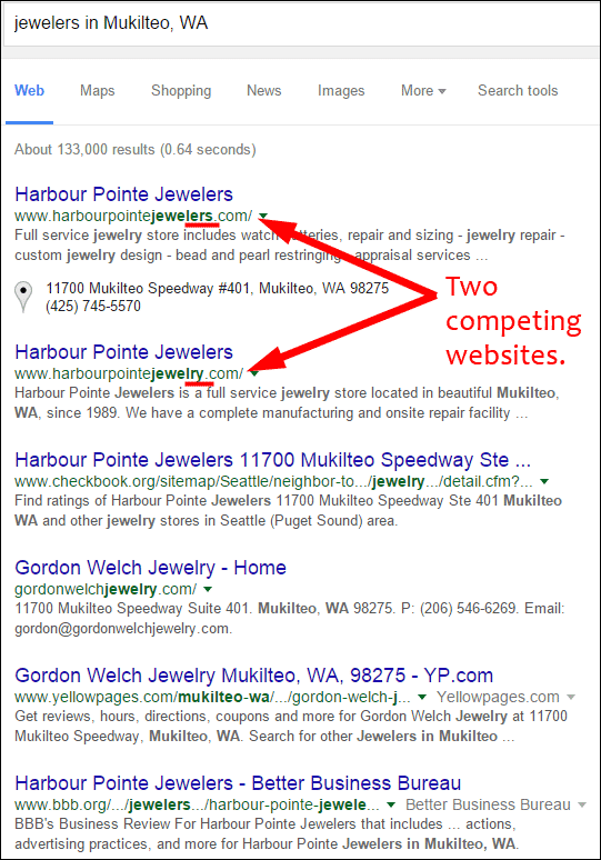
It's pretty easy to see the Flop Fix I need to address today. Harbour Pointe Jewelers has two websites! That's a big no-no.
Multiple Domain Names
I'm a big believer in using multiple domain names to track your ads, but you should not have two or more domain names advertising the same products and services for the same business location. You can have different websites if you have different business locations, as long as the websites are also considerably different, but never for the same business at a single address.
The first fix they should implement is to kill off one of these websites and redirect that domain name to the surviving website.
Oh These Websites...
I was hoping to quickly review both sites and make a recommendation of which one to keep and which to deactivate, but honestly, I can't quite decide.
Here's site number one:
http://www.harbourpointejewelry.com/
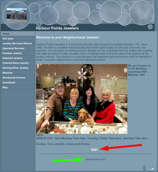
The date stamp on this website says February 1, 2011, but that design looks like something from 10 years earlier! I'm not sure if those are supposed to be just circles or bubbles in the header, but don't understand why a retail jeweler would use them in their website design.
Take notice of the red arrow pointing to the number 5687. That's a hit counter. (A hit counter, really!?) In the mid to late 90s, a hit counter was used to measure the number of times a web page was refreshed. Websites with high hits would always claim big bragging rights, that is, until the world realized how worthless a "hit" actually was.
While writing this review, I must have hit their home page at least 10 times, incrementing that number each time. That hit counter should be removed from the footer of their home page.
Speaking of footer, the green arrow you see in the above image is pointing to the message "Default Footer Text" that appears on every page of the site. That message appears somewhere in the source code of the template design they chose, yet they neglected to change it to something as simple as their store name, address, or telephone number. That also needs to be fixed.
Everything is under construction!
Of the 12 pages showing in the left navigation, 7 of them were under construction as you see here:
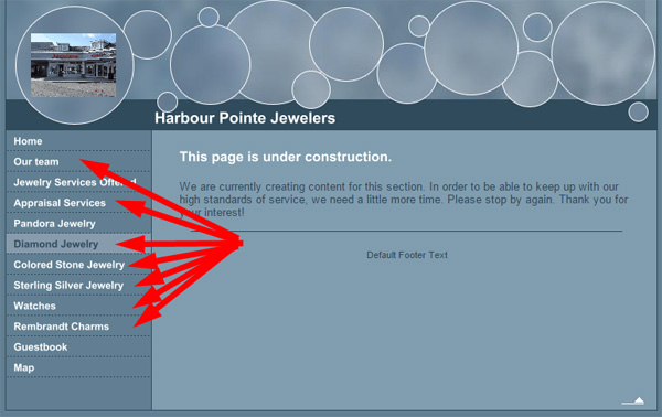
You should never put an under construction page on your website. Instead, hide the page using your content management system until you've added content to it.
Guestbook Spam-Spam-Spam!
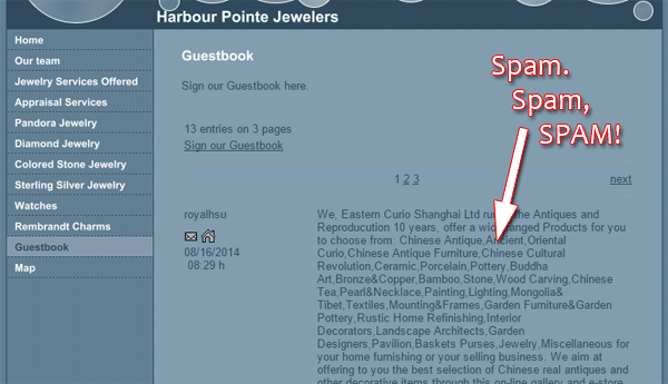
Website forms need CAPTCHA protection, otherwise you are susceptible to automated spamming and hacking attempts.
The guestbook on the Harbour Pointe website allows anyone to post without any type of CAPTCHA protection. The screen shot below shows some of the spam that's already appearing on their site:
Here's site number two:
http://www.harbourpointejewelers.com/
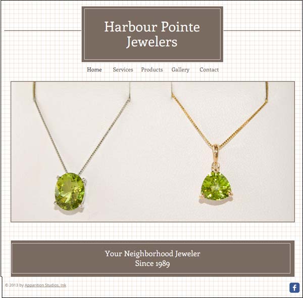
The look of this one isn't a disaster like the first one was. It's certainly more aesthetically pleasing and it has more information that the other site.
What I don't like about this site is that it uses the hash-bag method of page URLs. That's the "#!" combination of characters in the website address that you see in these:
http://www.harbourpointejewelers.com/#!services/c161y
http://www.harbourpointejewelers.com/#!products/c1xvy
http://www.harbourpointejewelers.com/#!gallery/cff9
http://www.harbourpointejewelers.com/#!contact/c1d94
In this previous Nugget and on this page you'll find reasons why the hash-bang is bad for search engine optimization. However, I've seen evidence recently hinting that Google might be able to read through the hash-bang now, but I still don't recommend it. It's never a good idea to make Google spend extra energy to decipher what your site is saying.
Fixing This Flop...
My recommendation here is to kill off the blue color site running with the domain harbourpointejewelry.com. Set 301 redirects to repoint that domain to the other website, harbourpointejewelers.com.
Then I recommend that they change the URLs on harbourpointejewelers.com to remove the #! characters.
Next, they need to add an About Us page or some staff photos to the site to give it some more character.
There's a lot more that could be done to improve this site, but these few pointers will move them from a complete flop to a fixer-upper.
FTC Notice: I randomly choose this website and won't be telling the retailer jeweler that I'm doing a review. Unless someone else tells them, they will only find out about this review if they examine their Google Analytics and Google Webmaster Tools. I'm not doing this to solicit business from them, but rather as an educational exercise for everyone. This review is completely impartial and all my comments are listed in the order that I discovered them.


